mattihp
Registered User
Not the worst but always hated this one

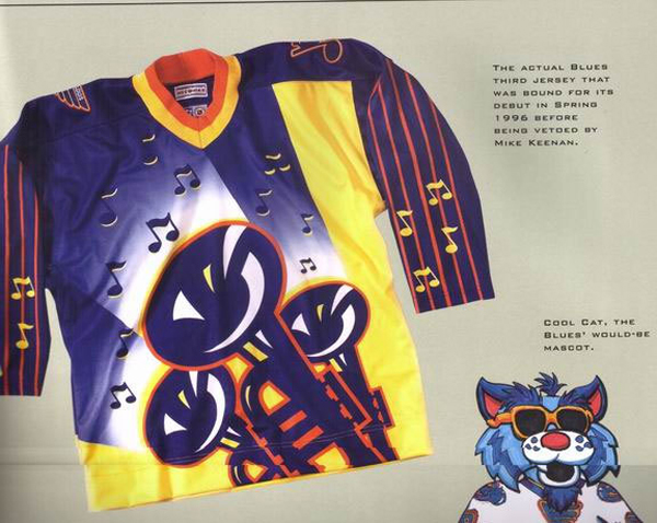
The Mustard Monster!
Not the worst but always hated this one
The Mustard Monster!
I think the Habs centennial jerseys really deserve a break, they were one-offs, actually worn by the team in their history. Not like anyone in modern NHL age designed them.
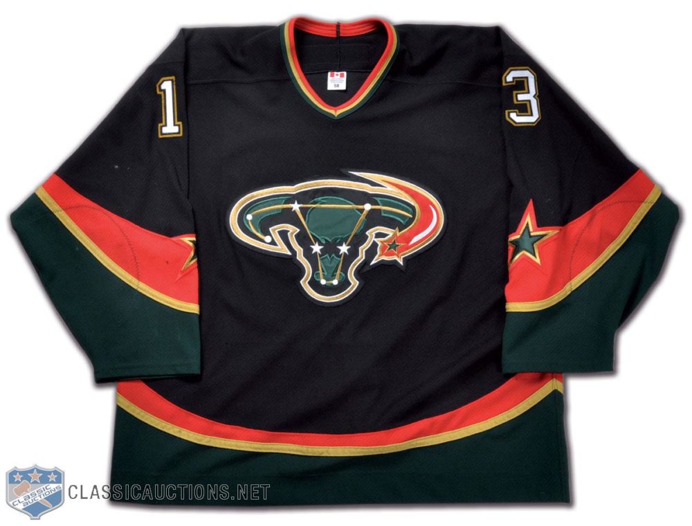
The Buffaslug, Fisherman, uniprons, Flying Duck and most of the Predators nonsense on the other hand are inexcusable .
Ahh yes. Clearly the one thing holding the Whale back was that they didn't look like the 2018 Seattle Seahawks.That particular jersey is kind of ugly. There are too many strips or they are just too big. The logo also looks too small.
These would look really good, IMO. I think the Whaler green is too dull.
View attachment 373727
Haha the Whalers logo with the giant blue and white stripe looks pretty terrible.Ahh yes. Clearly the one thing holding the Whale back was that they didn't look like the 2018 Seattle Seahawks.
I don't think its their best look (I actually prefer the jerseys they wore right before they left to NC more than any of their others) but I wouldn't say its terrible. The colors work together very nicely on the ice (was at the game they wore them this year, and I do say they work well on the ice) and I have seen quite a few others across the league that are worse. Much worse.Haha the Whalers logo with the giant blue and white stripe looks pretty terrible.
Early 2000s most teams in the league had so atrocious jerseys that watching hockey became an eyesore altogether.
Nothing is worse than this:

I also am super meh on Nashville's current look. I really liked their navy and silver scheme of the past.The Ducks current jerseys are horrific. They went from arguably the best Jersey with their Disney Purples, to the atrocity they wear now
Not enough disrespect for the current Tampa kits. They are the Maple Leafs ECHL farm team in appearance... Stamkos looks like he is probably wearing the same uniform he wore when he was 11 years old at this point. Other than that, Tampa is incredible. But dang.
Oilers and Canucks in the late 90s/2000s had some of the most hideous jerseys ever unleashed.

Bonus pic of cool cat too.
Any jersey bad enough to have a nickname is definitely in the running.
Mooterus
Fishstick
Brger Kings
Mustard Monster
Buffaslug
Cool Cat
Wild Wing
Kachina
They're all so bad.
Any jersey bad enough to have a nickname is definitely in the running.
Mooterus
Fishstick
Brger Kings
Mustard Monster
Buffaslug
Cool Cat
Wild Wing
Kachina
They're all so bad.
my only memory of it is when Datsyuk killed and dismembered Marty Turco
Buffaslug is for the logo, not the jersey. The jersey themselves wasn’t too terrible.
wtf, Tampa and Leafs jersey are pretty much the same damn thing... no issues with those jerseys...