SouthGeorge
Registered User
- May 2, 2018
- 7,960
- 3,078
Used to be because they were cheap. As time goes on they become the most valuable, simply because few bought them in the first place!
You don't have bad taste, PhysicalGraffiti: you're a wise investor in the jersey collection market.
They look like a choir in that picture.I found Vancouver jerseys with the V, although this wasn't the one that I thought looked the worst. I believe that you have to switch the areas with the black and the yellow. You get the idea.
Thanks for the posts everybody! Several of these jerseys I never saw or tried successfully to forget.
View attachment 161027
Yo, this is for the WORST jerseys. You heathen. lol
Yo, this is for the WORST jerseys. You heathen. lol
GIMME MAH FISHERMAN.


The Jets regular home uniform is very drab.
I really like their whites though. They look much better with the full sleeve shoulder yoke thingy.
And despite what alot of people seem to think, I really like their new thirds.
/arc-anglerfish-tgam-prod-tgam.s3.amazonaws.com/public/RVBWMYS7CVGUPJI6QLF2TM567U.JPG)
I just love that shade of blue too much to say anything bad about them.

I think it's totally case by case. The 80s jets looked great with it but the 80s Leafs looked terrible.

Depending on one's taste, the original California Seals jersey was questionable too. Later versions were generally panned also.
View attachment 160317
LOL WHAT EVEN IS THAT
Dallas is fine, but the other two....
It was a dark time for NHL sweaters.
that's my point. Its exciting when the team announces a new jersey is going to be released even for just a season but for the leafs, bruins, blackhawks, wings, rangers, canadians they are rarely very different from the usual jerseys. Obviously horrid jersey can be released but atleast its something. The rangers statue of liberty jersey were nice when they came out. The leafs jerseys are always the sameWhy? It’s not like you have to buy a new jersey just because the team updated them. And as you said, all Leaf jerseys look the same anyway.
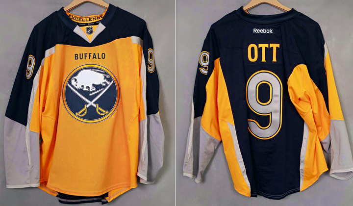
If Buffalo stuck with just the blue and the yellow they’d have been on to something.Oh god I'd almost forgotten about the tudburgers. Those were hideous.
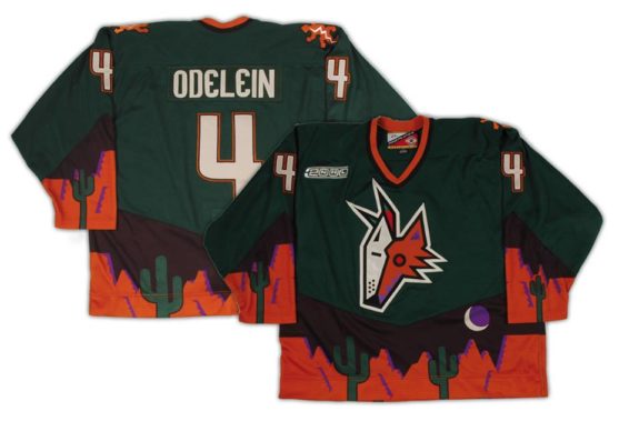
At least they didn't try to get "creative" with the logo? (I'm looking at you, Dallas Uteruses, NY Fishermen, and LA Burger Kings.)
That jersey is a classic. They should bring it back.Hey, never let anyone telly you what you can or can not love.
I grew up with Vancouver's plate of spaghetti jersey. Yeah, it's not the greatest, but I got good memories that go along with that jersey, so I can't hate on it.
View attachment 160319 No offence to To Montreal Canadiens fans but this has got to be the ugliest jersey I have ever seen
that's my point. Its exciting when the team announces a new jersey is going to be released even for just a season but for the leafs, bruins, blackhawks, wings, rangers, canadians they are rarely very different from the usual jerseys. Obviously horrid jersey can be released but atleast its something. The rangers statue of liberty jersey were nice when they came out. The leafs jerseys are always the same
The Jets regular home uniform is very drab.
I really like their whites though. They look much better with the full sleeve shoulder yoke thingy.
And despite what alot of people seem to think, I really like their new thirds.
I just love that shade of blue too much to say anything bad about them.