
blueinbigd
Registered User
- Mar 8, 2012
- 229
- 57
That logo reminded me of the Partridge familyNah, that’s a masterpiece.
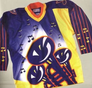
As are these:
View attachment 160329
View attachment 160337
View attachment 160335
Except for the white skates which are hideous
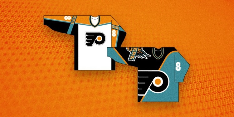
Not as great, but nowhere near the worst and you can see the evolution 15 years later to the Sharks:
View attachment 160333


/cdn.vox-cdn.com/assets/793259/NYI-blackpromo.jpg)
:format(webp)/cdn.vox-cdn.com/uploads/chorus_image/image/65809138/84580781.jpg.0.jpg)
.gif")


