
What was the worst jersey in modern NHL history?
- Thread starter sabremike
- Start date
You are using an out of date browser. It may not display this or other websites correctly.
You should upgrade or use an alternative browser.
You should upgrade or use an alternative browser.

Terry Yake
Registered User
- Aug 5, 2013
- 26,904
- 15,405

John Price
Bet
- Sep 19, 2008
- 374,212
- 25,005
These old school Habs throwbacks are awful. You know which ones I'm talking about. The ones with CAC on the front  They're so bad

They're so bad
Last edited:
John Price
Bet
- Sep 19, 2008
- 374,212
- 25,005
Always hated the Pittsburgh vegas gold jerseys
The stadium series ones they had a few years ago were AWFUL. They are probably the worst. And I'm not saying this because I'm biased.

- The text is awful
- The color is awful
- The patch is inaccurate ("City of Champions")
- The captain patch is a triangle for some reason...three rivers or what?
- The block numbers are awful

ziggyjoe212
Registered User
- Oct 2, 2017
- 3,044
- 2,364
This opinion is wrong. These are awesome. Font could be a little betterThe stadium series ones they had a few years ago were AWFUL. They are probably the worst. And I'm not saying this because I'm biased.
- The text is awful
- The color is awful
- The patch is inaccurate ("City of Champions")
- The captain patch is a triangle for some reason...three rivers or what?
- The block numbers are awful
ziggyjoe212
Registered User
- Oct 2, 2017
- 3,044
- 2,364

Not sure what constitutes as "modern history" but these are the ugliest sports jerseys I've ever seen. Worse than even the Cleveland poop colored NFL team.
I feel bad for whoever watched this team on a regular basis.
Honorable mention to:
Rich Nixon
No Prior Knowledge of "Flyers"
Gonna be unpopular but I hate the current Flyers uniforms (their alternate is sick though) and the purple/yellow Kings jerseys (big fan of the home/away jerseys though)
So you hate colors, basically.
Pens x
Registered User
- Oct 8, 2016
- 16,246
- 8,036
Define modern day?
What’s the ugliest jersey in the NHL today, not including all of the crappy third jerseys this year?
Ducks? Senators? Calgary?
I think the Caps have the ugliest jerseys in the league; the non throwback ones are awful.
What’s the ugliest jersey in the NHL today, not including all of the crappy third jerseys this year?
Ducks? Senators? Calgary?
I think the Caps have the ugliest jerseys in the league; the non throwback ones are awful.
Last edited:
Lays
Registered User
- Jan 22, 2017
- 13,559
- 12,630
Meh I prefer black jerseys but I do like a lot of colored ones (Rangers, Avs alternate, Sharks, Coyotes, Wild, Isles alternate are some current colored jerseys I enjoy)So you hate colors, basically.
Rich Nixon
No Prior Knowledge of "Flyers"
Meh I prefer black jerseys but I do like a lot of colored ones (Rangers, Avs alternate, Sharks, Coyotes, Wild are some current colored jerseys I enjoy)
Bright colors, then.
I dunno, everyone has their own tastes, but the old purp/yella Kings getups were the best they've ever had, and the Flyers unis are gorgeous to me.
John Price
Bet
- Sep 19, 2008
- 374,212
- 25,005
I like the Ducks one. Sure, everyone loves the mighty ducks throwback, but the one now isn't bad. The worst ones are the Stadium Series ones. Yes, even the Caps stadium series are subpar. If it were up to me they'd use the alternate more. That is a good alternate that reflects the OLD capitals before "rock the red" began.
The Canucks have two jerseys for which I have such polarizing views of.Anything with green and blue as the primary colors. I'm looking at you, Vancouver!
One of my favourite NHL jerseys all time is the Blue/Green with the hockey stick.
For me, the worst jersey of all time with no real close comparison is the flying Vs jersey. It’s the worst in all of sports, all-time. If I was a player on that team, I would have probably asked to be traded... just because of the jersey.
")
Lays
Registered User
- Jan 22, 2017
- 13,559
- 12,630
I don’t really have a particular taste in jerseys, the purple and yellow Kings jerseys could look good in a different format. I really dislike the Flyers neon orange but I do like their Winter Classic jerseys from a while back (against the Rangers that turned to alternates)Bright colors, then.
I dunno, everyone has their own tastes, but the old purp/yella Kings getups were the best they've ever had, and the Flyers unis are gorgeous to me.
The league needs purple jerseys though
CartographerNo611
Registered User
- Oct 11, 2014
- 3,049
- 2,933
2006 - 2010 had the ugliest uniforms. Dont even think the 90s were that bad in comparison.
muddywaters
GO FLAMES GO

Porkleaker
Registered User
Porkleaker
Registered User
lmao I'm too lazy to put an Oilers logo there, jk they can't afford him....god I hate Lucic.

Seath The Scaleless
Paledrake
Unpopular opinion: these are great jerseys. Logo + lighthouse on the shoulders = 

and the wave numbers on the back !Unpopular opinion: these are great jerseys. Logo + lighthouse on the shoulders =
DowntownBooster
Registered User
For me, I have to go with either the Ducks "Wild Wing" 3rds or the Isles Gorton's Fisherman jerseys. Both of them had terrible designs on the front *and* the back with the Wild Wing jerseys originally having a nigh-unreadable font and the Isles jerseys having that wave effect.
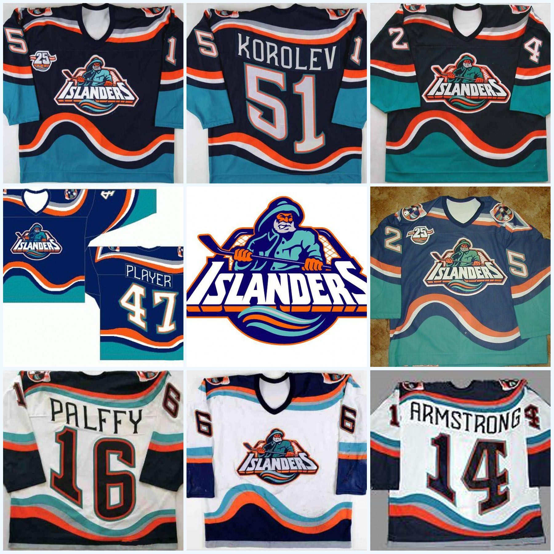
The color scheme and logo for the Islanders fishermen jerseys actually wasn't that bad. I think if it wasn't for the stupid wave effect, they may have been more widely accepted.


Ad
Upcoming events
-

-
-
 2024 NHL Draft Lottery Team that wins #1 pick - PICK ONLY ONE TEAMWagers: 9Staked: $11,200.00Event closes
- Updated: