
Seath The Scaleless
Paledrake
and the wave numbers on the back !
Wow I didn't even notice!! I'm in love!!!
and the wave numbers on the back !
Thank god, they would have looked like clowns.They never wore them.
The ugliest primary jerseys today are the Colorado Avalanche. That 90's clashing color scheme is horrible!!Define modern day?
What’s the ugliest jersey in the NHL today, not including all of the crappy third jerseys this year?
Ducks? Senators? Calgary?
I think the Caps have the ugliest jerseys in the league; the non throwback ones are awful.
I was just going to say, even though the concept is kind of ridiculous, the Fishsticks jersey doesn’t look that bad in real life.The color scheme and logo for the Islanders fishermen jerseys actually wasn't that bad. I think if it wasn't for the stupid wave effect, they may have been more widely accepted.

This might be an unpopular opinion, but I actually really hate Vegas' grey jersey especially. The logo, the colours, the pattern... It looks like a cheap "Create-A-Team" generic jersey template you'd have on the NHL video game..

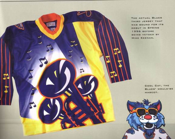
Bonus pic of cool cat too.

Plus the angry Stan Fischler.Unpopular opinion: these are great jerseys. Logo + lighthouse on the shoulders =

Nope, just jazz music.That is too horrible for words drugs must have been involved in the design of that.
"Whatever happened to boogie woogie?"Haha. I can hear that jersey in my head.
They look like something made by the airbrush guy at the honky tonk boardwalk shop at your local biker beach.Haha. I can hear that jersey in my head.
They look like something made by the airbrush guy at the honky tonk boardwalk shop at your local biker beach.
Those jerseys are perfectly fine. Not sure how it doesn't say "hockey."Everything, and I mean EVERYTHING, by Atlanta was terrible. Including the team name, logos (accents too), colors, and jersey designs (not even showing the light blue **** here).
Nothing about these jerseys said "hockey."
View attachment 160325

It’s a coin flip between the canucks history of bad sweaters and the avs current sweater.In honor of the Isles bringing back fisherman jerseys for sale at their team store I thought I would pose the question of what was the worst jersey of the modern era? The Fisherman? The Buffaslug? The Vancouver "V"? The Brent Yormark Islanders Jersey? Any of the 10,000 Habs centenary heritage jerseys? What's your pick?
This jersey is great. It makes me want to go out and buy fish sticks.Unpopular opinion: these are great jerseys. Logo + lighthouse on the shoulders =

 worse
worse
/cdn.vox-cdn.com/uploads/chorus_image/image/49722877/520112032.0.jpg)

