
What was the worst jersey in modern NHL history?
- Thread starter sabremike
- Start date
You are using an out of date browser. It may not display this or other websites correctly.
You should upgrade or use an alternative browser.
You should upgrade or use an alternative browser.

robertmac43
Forever 43!
- Mar 31, 2015
- 23,503
- 15,630
IceNeophyte
Registered User
- Nov 14, 2017
- 10,006
- 7,314
This jersey was amazing.
sabremike
Friend To All Giraffes And Lindy Ruff
A book entitled "We Want Fishsticks" on the entire fiasco just came out.I believe the fans used to jeer: "WE WANT FISH STICKS!"
SmellOfVictory
Registered User
- Jun 3, 2011
- 10,959
- 653
Because they're not colourblind friendly?Anything with green and blue as the primary colors. I'm looking at you, Vancouver!
Dr Black
Registered User
- Oct 31, 2015
- 482
- 368
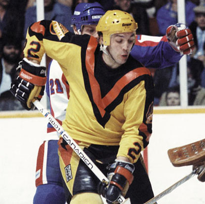
The Canucks were the very first team to have a perfectly good logo and color scheme, then for no good reason, screw around with the jerseys and come up with something completely foreign and hideous. The Canucks were about 15 years ahead of their time in this dubious category.You can't appreciate the full hideousness of the Flying V uniforms without a picture that includes the pants.

HolyJumpin
Registered User
- Sep 30, 2016
- 688
- 355
Nashville's current jerseys are really bad, they honestly are the only team that really used the piping and design of the Reebok Edge jerseys to their aesthetic advantage. Now they are just mustard sweaters.
Senators have such a great color scheme and great classic jerseys that it really boggles the mind that they're still going with the weird 3d Senator logo as the main logo. It'd be ok as a patch but get the side profile shot or the big O as the crest.
The Vancouver Whale C is very terrible but otherwise great jersey and color scheme.
Oilers mains right now are hideous. Go back to the primary blue ones and then go back to the drawing board for another alternate color scheme.
Tampa Bay needs to do something with their create-a-team logo and color scheme. The absolute worst, c'mon guys. Need to do a top to bottom redo like the Panthers did.
Butch 19
Go cart Mozart
Will always hate any Columbus jersey too, yuck..

cbj jersey is just okay - a few shades too dark and needs bottom stripe, but that swirling flag logo is just terrible. Are there no good graphic designers in Ohio?
Cellee
Registered User
- Dec 20, 2014
- 8,951
- 6,168
Thankfully it never made it to the ice.St Loius is one of these teams that had a near perfect logo and color scheme when they entered the league and have the same logo with an equally great color scheme now with their primary jerseys and a great third jersey (which I believe is their original)
I know they screwed around with the jersey in the '80s putting the word blues on the front and making the logo smaller. That was short lived thank goodness. Then they tinkered with the color scheme adding red. I didn't care for that, but at least they had that GREAT original logo.
I thankfully missed the time when St Loius came out with this horrific abomination!! They could not have come up with anything more ugly if they tried!!
yup oldies are way better. They just won't switch that crappy new logo for some reason.
Its cruel what Eugene and the Sens front office do to their fanbase.
So many great possibilities yet they stick with the most boring template and the worst version of all their logos.
If I had my way the Sens would go primary black with red and white accents. There is no primary black team in Canada; theyre all either blue or red.
prob don't want to pay for new office supplies and marketing materials. Actually I'm almost sure of it.Its cruel what Eugene and the Sens front office do to their fanbase.
So many great possibilities yet they stick with the most boring template and the worst version of all their logos.
If I had my way the Sens would go primary black with red and white accents. There is no primary black team in Canada; theyre all either blue or red.
Cellee
Registered User
- Dec 20, 2014
- 8,951
- 6,168
I knew you were a Leaf fan without even checking first
this is pretty bad. the NHL has two Leafs teams now.

You all are obsessed. It is flattering.
prob don't want to pay for new office supplies and marketing materials. Actually I'm almost sure of it.
Sadly this is probably true.
I knew you were a Leaf fan without even checking first
You all are obsessed. It is flattering.
If anybody is copying the Leafs it is Tampa Bay.


Copied right down to the same shade of blue.

Cellee
Registered User
- Dec 20, 2014
- 8,951
- 6,168
If anybody is copying the Leafs it is Tampa Bay.
Copied right down to the same shade of blue.
Agreed.
Also " There is a team called the Stars but other teams use stars in their logos"


I like them a lot. Very original and they pop out there on the ice.Nashville's current jerseys are really bad, they honestly are the only team that really used the piping and design of the Reebok Edge jerseys to their aesthetic advantage. Now they are just mustard sweaters.
The Jets regular home uniform is very drab.
I really like their whites though. They look much better with the full sleeve shoulder yoke thingy.
And despite what alot of people seem to think, I really like their new thirds.
/arc-anglerfish-tgam-prod-tgam.s3.amazonaws.com/public/RVBWMYS7CVGUPJI6QLF2TM567U.JPG)
I just love that shade of blue too much to say anything bad about them.
I really like their whites though. They look much better with the full sleeve shoulder yoke thingy.
And despite what alot of people seem to think, I really like their new thirds.
I just love that shade of blue too much to say anything bad about them.
deaderhead28
Registered User
- Jul 3, 2010
- 5,361
- 3,879
Cellee
Registered User
- Dec 20, 2014
- 8,951
- 6,168
The Jets regular home uniform is very drab.
I really like their whites though. They look much better with the full sleeve shoulder yoke thingy.
And despite what alot of people seem to think, I really like their new thirds.
I just love that shade of blue too much to say anything bad about them.
I mostly agree except I don't like (or hate) the third jersey but do wish that colour was our primary.
gadiamon72
Registered User
- Jun 13, 2013
- 308
- 80
PhysicalGraffiti
Bolts STM
I own so many of the jerseys people are saying the worst
My taste is different I suppose.
My taste is different I suppose.
I own so many of the jerseys people are saying the worst
My taste is different I suppose.
Terrible jerseys are the best ones to buy.
Hoser
Registered User
- Aug 7, 2005
- 1,847
- 403
I own so many of the jerseys people are saying the worst
My taste is different I suppose.
Terrible jerseys are the best ones to buy.
Used to be because they were cheap. As time goes on they become the most valuable, simply because few bought them in the first place!
You don't have bad taste, PhysicalGraffiti: you're a wise investor in the jersey collection market.

ManwithNoIdentity
Registered User
That's a horse, not a dragon.
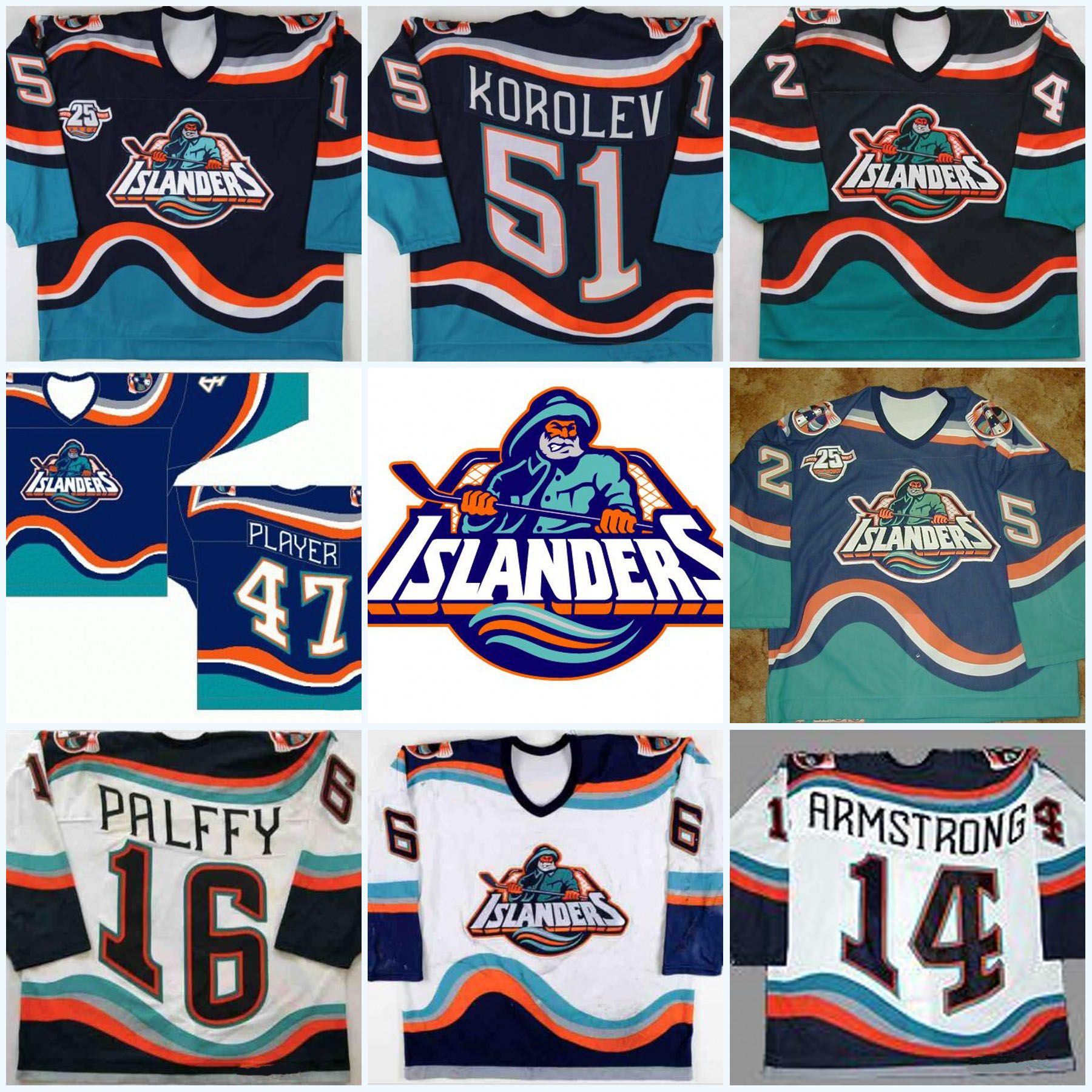
For me, I have to go with either the Ducks "Wild Wing" 3rds or the Isles Gorton's Fisherman jerseys. Both of them had terrible designs on the front *and* the back with the Wild Wing jerseys originally having a nigh-unreadable font and the Isles jerseys having that wave effect.

Looks like something created under the influence of LSD
Ad
Latest posts
-
 Speculation: Offseason coaching thread: Should they stay or should they go?
- Latest: Big Friggin Dummy
-

-

-
 GDT: WCSF | GM 2 | Colorado Avalanche at Dallas Stars | 8:30PM CT | TNT
- Latest: Nikki Potnick
Upcoming events
-
-
-
 Gold Medal 2024 IIHF WORLD CHAMPION - PICK ONLY ONE TEAMWagers: 7Staked: $36,600.00Event closes
- Updated:
-
-