
Win One Before I Die
Cautious Optimism
- Jul 31, 2007
- 5,119
- 4
They use the 85 jersey in some ceremonies because it corresponds to Linden and Bure's draft years. There is no chance that the Canucks bring them back.
The 94 uniforms were seen at the Heritage Classic. They may bring them back but I really hope they don't. There isn't nearly as much nostalgia for that uniform as there once was and the Canucks finally have a colour scheme that has critical mass after 4 decades. The Canucks need to move forward.
Blue and green are Canuck colours. They are here to stay.
The Canucks haven't really embraced their colourful past since the Aquilini's bought the team. Stan Smyl and Pavel Bure both had their numbers retired and the Canucks raised blue and green banners yet neither wore uniforms in those colours. Ditto for Trevor Linden - who spent the majority of his Canucks career in a skate jersey including his best years. As controversial as that was to a few fans, I think it was the best thing this franchise ever did in terms of branding. The Canucks finally have a little stability now.
Bringing back the skate jersey is a really really bad idea. It's been nothing been debate and acrimony regarding the Canucks uniforms for the last 4 decades and this will only reignite that.
What is the point of wearing them now anyway? Only a small minority of Canucks fans are nostalgic for the 94 uniforms and that support is dwindling. Those uniforms aren't seen around town or at games like they used to be. Many older fans have moved on and the younger fans have no attachment to that period.
As a fan I am very glad to finally see this franchise rally around the blue and green uniforms. We have formed a very positive identity. We are no longer the laughing stock that we were prior to 2007 when any number of different coloured jerseys were seen at games.
The Canucks have moved past the dark years of this franchise. Blue and green forever.
I can definitely agree that the Canucks have built an identity with the blue and green colours because of that SCF. The fanbase is bigger and younger, and will likely have more attachment to that run than '94's.
Blue and green is a perfect colour scheme for this team and city I feel anyways.
I never clued into that until now. But yeah, blue and green is perfect for Vancouver. Ocean and foliage. Gotta be why they picked it.
I feel dumb.
The colours just describe everything about Vancouver, and BC in general. I don't think there is any going back now. The logo is likely the only touchable thing at this point.

Yeah, I think when Linden hinted that we might be seeing the Skate jersey pretty soon, that this is the one he's referencing. Pavel Bure wore it to all of his events, and he, Kirk and Trevor were sporting them last night.
No and no. That first one is awful. The RBK jersey layout is awful and you can see why teams who went with it are shying away now.

It's a practice jersey template, and the numbering/lettering typeface looks like Verdana, if not some other stock font which comes pre-installed on Windows computers.
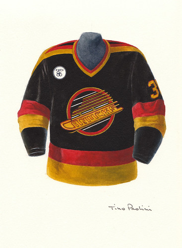
. Zombo, me and you are both jersey connoisseurs....would you like to see the 86 blacks come back for a game or two? I happen to like the use of V's on the shoulders and pants.Zombo, me and you are both jersey connoisseurs....would you like to see the 86 blacks come back for a game or two? I happen to like the use of V's on the shoulders and pants.
I'd be very happy with any of those.
I agree with others who cite retaining blue-green-white as the top priority with the unis going forward. I'd prefer keeping the orca for the sake of establishing a long-term look, although I'm fine with minor tweaking here and there. Every team tweaks their look from time to time, and I'm all for dropping the wordmark and possibly adding a green outline to the orca to tie it into the jersey scheme a little better. Maybe switch the shoulder patch to white stick and rinks on the home jersey... subtle things.
I think everyone agrees we don't need to relive the navy/silver/red.
Black/yellow/red reminds me of Calgary too much, and I can't think of anything more embarrassing than looking like Calgary's uglier cousin.

