What Jersey Should the Canucks use as Primary Going Forward?

carolinacanuck

Registered User
Apr 5, 2007
2,549
92
The Carolinas
They use the 85 jersey in some ceremonies because it corresponds to Linden and Bure's draft years. There is no chance that the Canucks bring them back.

The 94 uniforms were seen at the Heritage Classic. They may bring them back but I really hope they don't. There isn't nearly as much nostalgia for that uniform as there once was and the Canucks finally have a colour scheme that has critical mass after 4 decades. The Canucks need to move forward.

Blue and green are Canuck colours. They are here to stay.

i agree the blue/green colors are here to stay..

but there's absolutely no reason why they won't bring those jerseys back as a third or whatever. the great thing about being a canucks fan is we can all choose which jersey we like and we have access to it.

i've got a millionaires V t-shirt, a new stylized stick-n-rink hat and my BBQ cover is the orca (bleh, was a gift from a friend)

the canucks have embraced their multi-jersey past and run with it.

i agree with you they definitely won't be the primary tho.
 

touchnotthecat

Registered User
Dec 29, 2014
66
30
Id love to see what the Flying V looks like in blue and green!

EDIT: Nope. Googled that and it was a terrible mistake. Looked much better in my imagination ahaha
 

Seattle Totems

Registered User
Apr 14, 2010
3,894
1,138
The Canucks haven't really embraced their colourful past since the Aquilini's bought the team. Stan Smyl and Pavel Bure both had their numbers retired and the Canucks raised blue and green banners yet neither wore uniforms in those colours. Ditto for Trevor Linden - who spent the majority of his Canucks career in a skate jersey including his best years. As controversial as that was to a few fans, I think it was the best thing this franchise ever did in terms of branding. The Canucks finally have a little stability now.

Bringing back the skate jersey is a really really bad idea. It's been nothing been debate and acrimony regarding the Canucks uniforms for the last 4 decades and this will only reignite that.

What is the point of wearing them now anyway? Only a small minority of Canucks fans are nostalgic for the 94 uniforms and that support is dwindling. Those uniforms aren't seen around town or at games like they used to be. Many older fans have moved on and the younger fans have no attachment to that period.

As a fan I am very glad to finally see this franchise rally around the blue and green uniforms. We have formed a very positive identity. We are no longer the laughing stock that we were prior to 2007 when any number of different coloured jerseys were seen at games.

The Canucks have moved past the dark years of this franchise. Blue and green forever.
 

carolinacanuck

Registered User
Apr 5, 2007
2,549
92
The Carolinas
The Canucks haven't really embraced their colourful past since the Aquilini's bought the team. Stan Smyl and Pavel Bure both had their numbers retired and the Canucks raised blue and green banners yet neither wore uniforms in those colours. Ditto for Trevor Linden - who spent the majority of his Canucks career in a skate jersey including his best years. As controversial as that was to a few fans, I think it was the best thing this franchise ever did in terms of branding. The Canucks finally have a little stability now.

Bringing back the skate jersey is a really really bad idea. It's been nothing been debate and acrimony regarding the Canucks uniforms for the last 4 decades and this will only reignite that.

What is the point of wearing them now anyway? Only a small minority of Canucks fans are nostalgic for the 94 uniforms and that support is dwindling. Those uniforms aren't seen around town or at games like they used to be. Many older fans have moved on and the younger fans have no attachment to that period.

As a fan I am very glad to finally see this franchise rally around the blue and green uniforms. We have formed a very positive identity. We are no longer the laughing stock that we were prior to 2007 when any number of different coloured jerseys were seen at games.

The Canucks have moved past the dark years of this franchise. Blue and green forever.

James Lepp rocked the '94 skate logo on The Big Break on the golf channel haha

i'm old enough to remember when the team actually wore the stick n rink logo and the skate logo era actually elicits the best memories for me, even more so than 2011. i'd be fine with them wearing the skate for a third jersey, those were good times watching the cup run during my college days.

i'm with you on the branding aspect tho. there needs to be a sense of continuity in the branding message in the arena with banners and backdrops and website etc. blue and green is obviously the right choice for that.
 

PG Canuck

Registered User
Mar 29, 2010
63,020
24,261
I can definitely agree that the Canucks have built an identity with the blue and green colours because of that SCF. The fanbase is bigger and younger, and will likely have more attachment to that run than '94's.

Blue and green is a perfect colour scheme for this team and city I feel anyways.
 

The Jesus*

Guest
I can definitely agree that the Canucks have built an identity with the blue and green colours because of that SCF. The fanbase is bigger and younger, and will likely have more attachment to that run than '94's.

Blue and green is a perfect colour scheme for this team and city I feel anyways.

I never clued into that until now. But yeah, blue and green is perfect for Vancouver. Ocean and foliage. Gotta be why they picked it.

I feel dumb.
 

PG Canuck

Registered User
Mar 29, 2010
63,020
24,261
I never clued into that until now. But yeah, blue and green is perfect for Vancouver. Ocean and foliage. Gotta be why they picked it.

I feel dumb.

The colours just describe everything about Vancouver, and BC in general. I don't think there is any going back now. The logo is likely the only touchable thing at this point.
 

Zombotron

Supreme Overlord of Crap
Jan 3, 2010
18,340
9,878
Toronto
The colours just describe everything about Vancouver, and BC in general. I don't think there is any going back now. The logo is likely the only touchable thing at this point.

2JLk7bg.jpg
 

The Stig

Your hero.
Feb 14, 2013
15,620
3,794
Maple Ridge B.C.

No and no. That first one is awful. The RBK jersey layout is awful and you can see why teams who went with it are shying away now. The second one is too busy to be anything other than a third.

I went with the current. We have an identity now. The whole rink is blue and green. Lets stick with it. If were to change at all, I'd just make out thirds our primarys and make a white version. We look good in blue and green. It's a colour scheme no-one else has right now. Stick with it. Let it become us. If we went back to the 90's jerseys (as much as I love them and consider them our best), we would share a colour template with Calgary. Nooooooooooo thanks.

Blue and Green
 

The Stig

Your hero.
Feb 14, 2013
15,620
3,794
Maple Ridge B.C.
Yeah, I think when Linden hinted that we might be seeing the Skate jersey pretty soon, that this is the one he's referencing. Pavel Bure wore it to all of his events, and he, Kirk and Trevor were sporting them last night.

As long as its not the home version of that one, I'm all for it. Those were really cool. If the other version had been white and not yellow, they would have been classics.
 

Zombotron

Supreme Overlord of Crap
Jan 3, 2010
18,340
9,878
Toronto
No and no. That first one is awful. The RBK jersey layout is awful and you can see why teams who went with it are shying away now.

It's a practice jersey template, and the numbering/lettering typeface looks like Verdana, if not some other stock font which comes pre-installed on Windows computers. :laugh:
 

The Stig

Your hero.
Feb 14, 2013
15,620
3,794
Maple Ridge B.C.
It's a practice jersey template, and the numbering/lettering typeface looks like Verdana, if not some other stock font which comes pre-installed on Windows computers. :laugh:

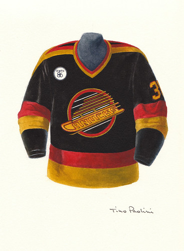
Reminds me of the Oiler ones from the Reebok switch over :laugh:. Zombo, me and you are both jersey connoisseurs....would you like to see the 86 blacks come back for a game or two? I happen to like the use of V's on the shoulders and pants.
 

Interior Cascadian

Registered User
Apr 2, 2007
1,076
188
Olympia, WA

I'd be very happy with any of those.

I agree with others who cite retaining blue-green-white as the top priority with the unis going forward. I'd prefer keeping the orca for the sake of establishing a long-term look, although I'm fine with minor tweaking here and there. Every team tweaks their look from time to time, and I'm all for dropping the wordmark and possibly adding a green outline to the orca to tie it into the jersey scheme a little better. Maybe switch the shoulder patch to white stick and rinks on the home jersey... subtle things.

I think everyone agrees we don't need to relive the navy/silver/red.

Black/yellow/red reminds me of Calgary too much, and I can't think of anything more embarrassing than looking like Calgary's uglier cousin.
 

PG Canuck

Registered User
Mar 29, 2010
63,020
24,261
The thing about our colour scheme, is that no other team in the league has the same from what I can remember off the top of my head. We don't need to go back to white, black, yellow IMO.
 

Zombotron

Supreme Overlord of Crap
Jan 3, 2010
18,340
9,878
Toronto
Zombo, me and you are both jersey connoisseurs....would you like to see the 86 blacks come back for a game or two? I happen to like the use of V's on the shoulders and pants.

As a novelty, yes. I'm more partial to the yellow one.

5664707792_f95763e10f.jpg


I failed to realize until now that this instance of the skate logo had yellow type on a yellow background, unlike the later version, which has a white background for contrast:

canucks-1985-logo9-white.jpg
 

The Stig

Your hero.
Feb 14, 2013
15,620
3,794
Maple Ridge B.C.
I'd be very happy with any of those.

I agree with others who cite retaining blue-green-white as the top priority with the unis going forward. I'd prefer keeping the orca for the sake of establishing a long-term look, although I'm fine with minor tweaking here and there. Every team tweaks their look from time to time, and I'm all for dropping the wordmark and possibly adding a green outline to the orca to tie it into the jersey scheme a little better. Maybe switch the shoulder patch to white stick and rinks on the home jersey... subtle things.

I think everyone agrees we don't need to relive the navy/silver/red.

Black/yellow/red reminds me of Calgary too much, and I can't think of anything more embarrassing than looking like Calgary's uglier cousin.

I think the silver/navy/red were beautiful jerseys. But not for our team and not for the jerseys they followed.
 

The Stig

Your hero.
Feb 14, 2013
15,620
3,794
Maple Ridge B.C.
I know right? I always was confused as to why there was yellow in there. And yea we should do a few throw back nights here and there. But stay the course with our current ones.
 

Serac

#HFOutcasts
Jun 27, 2014
8,674
2,075
B.C.

Shoulder patches are a must, personally
Not sure what to think about the green trim in the logo
I'm put off as it makes me think of the weird neon green and black canuck jersey...but I want more green incorporated

Yeah, I'd love the second one
Patches without trim in logo
 

Bougieman

Registered User
Nov 12, 2008
6,570
1,733
Vancouver
Stick-in-rink, and it's not even close.

The current word mark logo is my second least fave in Canucks history, right after the flying V jersey abominations, so it's not really cool for me that we're continuing with it when I thought we'd be switching the stick in rink from the seconds to our main logo by now. What's taking so long? Make the switch, dammit.

Basically I'd be thrilled with any of them aside for the one we have now, or the flying V. They're all good logos -- but the simplicty and lack of garish junior hockey aesthetics is what I love so much about the stick-in-rink. All the best and most iconic logos are SIMPLE.
 
Last edited:

a Fool

Emperor has no picks
Mar 14, 2014
2,601
44
The current jerseys have grown on me. However, I would take the "VANCOUVER" lettering and jettison it back into whichever intern's cubicle they came from.

Stick-in-Rink can be the 3rds, and Millionaires/Skate can make special appearances.
 

DCantheDDad

DisplacedNuckfan
Jul 1, 2013
2,934
93
Edmonton
I'd like to see the plate-o-spaghetti make special appearances one or twice a season. I'm nostalic and did really like the colour scheme of the 94 era jerseys.

For the main show, I really like the current design, but would be fine with the 40th anniversary version of the Stick in Rink. I thought the update was great, even if the logo is bland.
 

Ad

Upcoming events

Ad

Ad