
Confirmed with Link: Stadium Series Jersey
- Thread starter valeriammm
- Start date
You are using an out of date browser. It may not display this or other websites correctly.
You should upgrade or use an alternative browser.
You should upgrade or use an alternative browser.

101st_fan
I taught Yoda
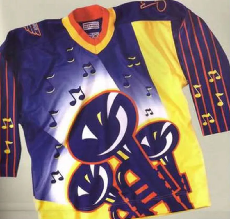
The " ville " is the reason I think the poster idea is bunk, its just something they came out with to try and explain why they had this weird " S " because they couldn't make it fit with a normal one. It appears to be the only letter that is actually a different style and font on the whole thing.
The numbers are different from each other ... Each S is different ... between the letters and crest the gold band in front has navy completely crossing it rather than keeping the letters within the band. So many small things that add up to leave this as a headscratcher. It will sell but I don't foresee it becoming a fan favorite.
Armourboy
Hey! You suck!
People will buy almost anything, I mean those Smash hats prove that.The numbers are different from each other ... Each S is different ... between the letters and crest the gold band in front has navy completely crossing it rather than keeping the letters within the band. So many small things that add up to leave this as a headscratcher. It will sell but I don't foresee it becoming a fan favorite.
101st_fan
I taught Yoda
People will buy almost anything, I mean those Smash hats prove that.
The "SMASHVILLE" branding alone doesn't bother me. The execution on this jersey does. Go with wordmark or crest, not both in such a small area. Make the font height fit totally within the gold band on the front, not stretching into the navy parts above and below the band which created a total navy blur from shoulder to hem. They aimed for edgy and missed that edge.
Kat Predator
Registered User
- Nov 28, 2019
- 3,885
- 3,897
Almost like the blade came off their skate in the middle of a turn. Oops.The "SMASHVILLE" branding alone doesn't bother me. The execution on this jersey does. Go with wordmark or crest, not both in such a small area. Make the font height fit totally within the gold band on the front, not stretching into the navy parts above and below the band which created a total navy blur from shoulder to hem. They aimed for edgy and missed that edge.
Legionnaire11
Registered User
You're welcome?.?.?I will never not see that now
Or not. Haha
darth5
No!
sorry this jersey design just sucks. I think my cat could do better. And she has zero experience
Breaking: This design is NOT. Repeat NOT growing on me. At all.
MrJoshua
Registered User
NOW I realize what it reminds me of. A box of Kraft Macaroni and Cheese. Ha ha ha ha ha... sigh. Well, we can always put it with the Isles' Gorton's jersey and make a comfort meal I guess.Definitely looks cheap and cheesy…
101st_fan
I taught Yoda
Is there a place to monitor sales and compare it to the Winter Classic?
There are within the front office and Adidas. Unless there is a sudden open reporting of sales it will come down to the eye test once these new sweaters start shipping.
- Aug 13, 2007
- 35,482
- 15,762
10 days later... it still looks like shit.
predwings
Registered User
I guess I’m in the minority who likes it. The font could be better but it’s a great color scheme and the logo is good. Better than winter classic ones for sure
sparkle twin
Registered User
It's growing on me, I'm starting to like it, too.I guess I’m in the minority who likes it. The font could be better but it’s a great color scheme and the logo is good. Better than winter classic ones for sure
But I disagree about it being better than the Winter Classic jersey, I love that one, it's beautiful!
BigFatCat999
First Fubu and now Pred303. !@#$! you cancer
Kat Predator
Registered User
- Nov 28, 2019
- 3,885
- 3,897
Kat Predator
Registered User
- Nov 28, 2019
- 3,885
- 3,897

Kat Predator
Registered User
- Nov 28, 2019
- 3,885
- 3,897
Is that a Dallas sweater? I don't remember seeing those.Personally, it's hard to top the uterus sweater
:format(webp):no_upscale()/cdn.vox-cdn.com/uploads/chorus_asset/file/19562892/53079942.jpg.jpg)
Kat Predator
Registered User
- Nov 28, 2019
- 3,885
- 3,897
Yes.Is that a Dallas sweater? I don't remember seeing those.
I'm sure they sold like hotcakes.

Ad
Upcoming events
-

-
-
 2024 NHL Draft Lottery Team that wins #1 pick - PICK ONLY ONE TEAMWagers: 9Staked: $11,200.00Event closes
- Updated: