
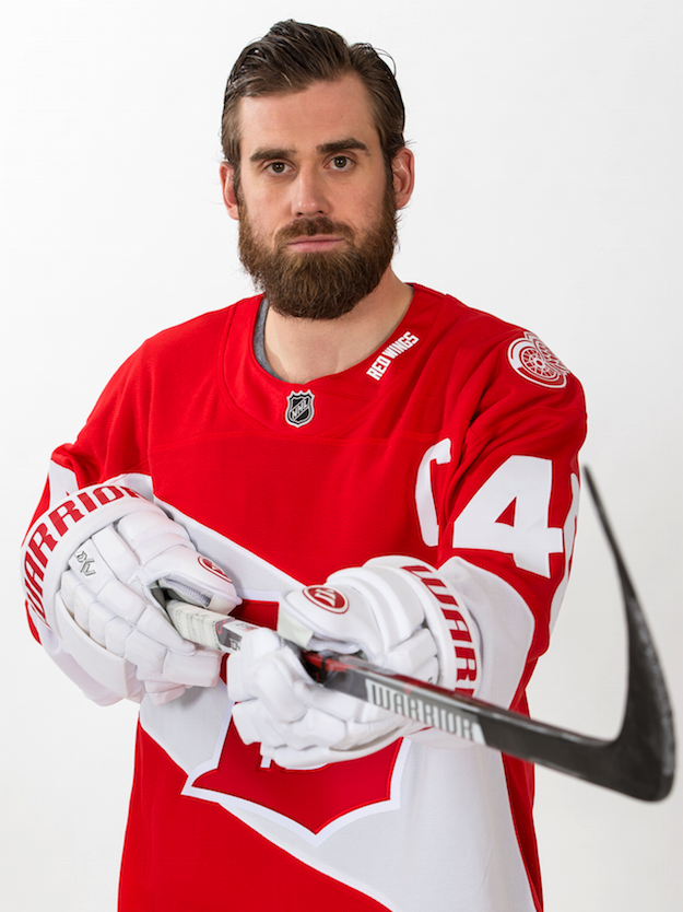
Our Stadium Series jerseys look like....
- Thread starter LeighDx59
- Start date
You are using an out of date browser. It may not display this or other websites correctly.
You should upgrade or use an alternative browser.
You should upgrade or use an alternative browser.
The Zetterberg Era
Ball Hockey Sucks
They aren't terrible except for the GIANT numbers.
Worst part being we can still expect Doc to call Larkin Tatar and DeKeyser Kronwall as apparently all he looks at is the number on the right when calling games.
Worst part being we can still expect Doc to call Larkin Tatar and DeKeyser Kronwall as apparently all he looks at is the number on the right when calling games.
To be fair I screw up DeKeyser and Kronwall still. They glide to the corner the same, I swear.
Cyborg Yzerberg
Registered User
The Wings have a bit more history and pedigree than the three California franchises. Really being compared to the artists formerly know as the Anaheim Mighty Ducks, the teal expansion craze era Sharks isn't great. Yes the Kings have had some nice jerseys over the year, but sorry not the standard I expect. This looks like a crappy late 80's indoor soccer jersey I wore as a kid...
While I admire our history, I don't think it's fair to diminish other teams at the expense of our storied success. All of the stadium series jerseys are universally terrible. By that metric, which is appropriate, as they are worn for the biggest cash grab sham that the league offers, the Coors Light Stadium Series. So by that metric, our kits are the least worst, I'd say, of the whole litter. It's why I don't feel that much outrage. Especially compared to the concept art we saw in August? Like I said, I feel relieved.
And for the record, all three California teams have had some nice jerseys over the years.
The Zetterberg Era
Ball Hockey Sucks
To be fair I screw up DeKeyser and Kronwall still. They glide to the corner the same, I swear.
They have a similar skating style in part because DK hunches over. Have kind of gotten past that one, in part because you can tell the guys apart by their head gear. DK has the long hair and Kronner has the goofy visor.
Have kind of gotten past that one, in part because you can tell the guys apart by their head gear. DK has the long hair and Kronner has the goofy visor.
Ah yes, the Kronwall "I'm flipping my visor so far up why the hell am I even bothering with the visor" look.
Pavels Dog
Registered User
RockemSockemProberts
Stevie's home!
Ah yes, the Kronwall "I'm flipping my visor so far up why the hell am I even bothering with the visor" look.
Kronner learned his league-mandated-visor management from Kenny Holland's cap/waiver/injured reserve techniques.

RayMoonDoh
Outta Waiver Stuff
I assume you are referring to this one? still meh to me
Nah, this'n:
Shaman464
No u
waltdetroit
Registered User
- Jul 20, 2010
- 2,649
- 526
TheOtherOne
Registered User
- Jan 2, 2010
- 8,274
- 5,272
They look like cheap knockoff's or like the store brand cereal you buy at Kroger/CVS.
Exactly what I wanted to say. They just look like something cheap. Like some kid got access to a design program and knocked this out in 5 minutes. Not very creative.
KJoe88
Forever Lost.

Everybody else.
It's not about change. Can't really be since it's only one game. It lacks imagination and creativity. The first WC jerseys were pretty cool. Even the second set was pretty nice.
This just looks cheaply done, like a template with that band on a solid existed somewhere, and you just plop the Detroit D on it.
Perfect Human
Registered User
- Dec 17, 2014
- 1,540
- 1,027
SpookyTsuki
Registered User
- Dec 3, 2014
- 15,916
- 671
It is not bad at all. I do not understand the hate. Some people just like to live in a fantasy world i guess. Expecting a one million dollar amazing jersey for one game. (people on facebook anyway)
white gloves look dope with it 2. I like it. Except the D. Looks like a 3D logo
Announcers lack emoton anymore. Doc is alright. But any other announcer besides Ken and Mickey are kind of lame. They are so monotone.
white gloves look dope with it 2. I like it. Except the D. Looks like a 3D logo
Worst part being we can still expect Doc to call Larkin Tatar and DeKeyser Kronwall as apparently all he looks at is the number on the right when calling games.
Announcers lack emoton anymore. Doc is alright. But any other announcer besides Ken and Mickey are kind of lame. They are so monotone.
GoAwayDanCleary
DRWCC
- Aug 6, 2012
- 10,752
- 5
Man these look fresh as hell! Was iffy after the reveal but seeing them on Kronner and Z changed things. The white gloves too... nice. It has its own own style and vibe, even if it is 80's roller-hockeyish, that I'm definitely digging.
Pavels Dog
Registered User
I agee. They are really growing on me. I actually think they're going to look amazing in action.Man these look fresh as hell! Was iffy after the reveal but seeing them on Kronner and Z changed things. The white gloves too... nice. It has its own own style and vibe, even if it is 80's roller-hockeyish, that I'm definitely digging.
Syckle78
Registered User
Big Poppa Puck
HF's Villain
They're awful.
White "sash" is dumb and the D logo looks like a poor fan concept.
And that's before you even get to the unnecessarily enormous numbers on the sleeve.
The 2 (3 if you count alumni game) Winter Classic jerseys were great. These are just bad.
White "sash" is dumb and the D logo looks like a poor fan concept.
And that's before you even get to the unnecessarily enormous numbers on the sleeve.
The 2 (3 if you count alumni game) Winter Classic jerseys were great. These are just bad.
ArGarBarGar
What do we want!? Unfair!
- Sep 8, 2008
- 44,042
- 11,737
They're awful.
White "sash" is dumb and the D logo looks like a poor fan concept.
And that's before you even get to the unnecessarily enormous numbers on the sleeve.
The 2 (3 if you count alumni game) Winter Classic jerseys were great. These are just bad.
They do that for the fans who wouldn't be able to tell who is who otherwise.
Even at the Winter Classic I had a hell of a time trying to figure out who was who. Basically had to rely on what I knew about their skating to try and figure it out.

Ad
Upcoming events
-

-
 GAME 7 - North Bay Battalion @ Oshawa Generals - Series tied 3-3Wagers: 2Staked: $850.00Event closes
- Updated:
-

-
 Series Winner Florida Panthers vs Boston BruinsWagers: 11Staked: $109,041.00Event closes
- Updated:
-