Oilers Darkening blue to navy for jerseys next year

Del Preston

Registered User
Mar 8, 2013
63,171
78,954
If they can darken it and move the numbers down it might be the best jersey ever.
tYMwb7R.jpg
 

Oil Gauge

5+14+6+1=97
Apr 9, 2009
5,649
242
honestly, he talks like he is unsure. I think its an optical illusion from darkening the blue. the guy who photoshopped theMcDavid jersey to give an estimate of the tone of the new jersey actually had a crossover effect minimally but noticeable to the orange as well (got darker).

wait until we see them I guess.

personally I think its a jinx to switch the colors...but they have a new supplier so changes might be made just for that (last I checked...ADIDAS owned RBK// and Bauer is NIKE...so not even changing companies as much as the actual sourcing factory/label)

I'm pretty sure Bauer is just Bauer now. Been apart from Nike for almost a decade now.
 

Jeff Lebowski

Registered User
Jan 12, 2008
1,537
135


Is this a darker blue on this jersey already or is it just the lighting?

Edit: Actually, it looks like it's still the Reebok jersey.
 

ujju2

Registered User
Apr 9, 2016
9,635
6,476
Edmonton, AB
Lighting. Already saw this on the forums on Chris Creamer's site. It still has the reebok logo and everything, so it's the old one, just dark lighting.
 

La Bamba

Tier 2 Fan
Aug 23, 2009
9,435
5,860
That's the point of a teaser. Its supposed to tease you, get you excited without giving it all away.

I don't like being teased :rant:

I did some amateur investigation work and I compared the Islanders blue to the Oilers blue in the teaser and the Oilers' is much darker in shade so that has to confirm a darker blue. I also compared Philly's orange to the Oilers' orange and it looks like the orange is darker too.
 

Diamondillium

DO YOU WANT ANTS!?
Aug 22, 2011
5,704
66
Edmonton, AB
Not sure I like the white letters

I always felt the blue letters with white outline on orange was a really awkard feel and actually hurt my eyes a bit. The lettering has always been actually one of my biggest dislikes about our oranges.

I think using blue as the 'separator' color works much better and makes it far more readable in my opinion.
 

40oz

..........
Jan 21, 2007
16,953
5
I wonder if the name plates will be easier to read now, some people seemed to complain about that last year.
 

scb23

Registered User
Jan 5, 2012
509
2
Edmonton


Interesting. White letters with what looks like a black outline... this could mean the number colouring is reversed too. Not sure I'm a big fan of that, especially if it's black (maybe it's just a dark navy, hard to tell). Also, the lettering looks like it's just screen printed like the crappy cheap crested jerseys you get in foot locker. I really hope you can still get a properly crested one similar to the ones you get at Rogers/Oilers store etc.
 

ujju2

Registered User
Apr 9, 2016
9,635
6,476
Edmonton, AB
This looks decent on second thought. Looks more professional. Still not a big fan though.

Edit:hoping for an orange collar, seems unlikely though
 

Alberta

Registered User
Jul 20, 2005
1,710
18
This looks decent on second thought. Looks more professional. Still not a big fan though.

Edit:hoping for an orange collar, seems unlikely though


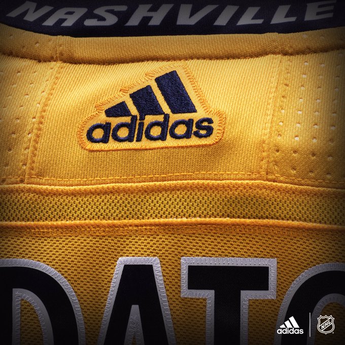
You can actually see the collar in the shot (it's blue). It just isn't obvious. Look at Nashville:

DCXt7REUQAITVdg.jpg:small


Bigger version of Edmonton:

19025091_10155395107552128_2882174699320411115_o.jpg
 

Ad

Upcoming events

Ad

Ad