Oilers Darkening blue to navy for jerseys next year

ujju2

Registered User
Apr 9, 2016
9,639
6,490
Edmonton, AB
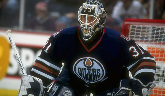
My idea of iconic as a 90's kid is dark blue , no yoke, badass oil rig worker. Rough, tough, blue collar badboy.

So pretty much the opposite of myself.

90s-edm-g-curtis-joseph.jpg

I wouldn't mind this look with red eliminated and orange in place of copper, but I prefer the 2016-17 set, which I think was perfect with the royal blue home and orange third. I was born in 2000, so really I'm not attached to one look too much because of how frequently the jerseys have been changed since then.
 

BamaOil

Registered User
Nov 18, 2018
549
407
Is it time to change jerseys again for next year? I don't hate the highlighter orange, but it's not great either. Plus, we play like garbage in them.

I propose we do a color swap. The primary would be navy, and the orange would be the trim. The whites can stay the way they are right now. Keep the royal blue throwbacks as the 3rd.

This is one of the best looking uniforms in college football:

auburn-tigers-football.jpg


auburn-tigers-football-flop-teams-hot-start.jpg

Would be similar to the 06 cup run, but I'm fine with keeping the template the same as it is now, just swap the colors.

And can we please wear the throwbacks more often? Wearing them against Calgary only and a random team here and that isn't enough. I think it's only 5 games a year right now? Bump that up to 10.
 
Last edited:

Soundwave

Registered User
Mar 1, 2007
72,159
27,860
I think orange is out for next year or will become the third jersey. They'll bring back blue to signify the post-Chiarelli era.
 

McFlash97

Registered User
Oct 10, 2017
7,469
6,505
If you become an embarrassment, its always good to change jersey colours so maybe they think your a different team !:D
 
  • Like
Reactions: RattsSSV

fuswald

I'd Be Fired
Dec 10, 2008
3,052
1,833
Edmonton
Could wear a sack if they would win.

One day a team will come up with a radical design. Right now its what 2 colours how many stripes and a logo.
 

ujju2

Registered User
Apr 9, 2016
9,639
6,490
Edmonton, AB
Is it time to change jerseys again for next year? I don't hate the highlighter orange, but it's not great either. Plus, we play like garbage in them.

I propose we do a color swap. The primary would be navy, and the orange would be the trim. The whites can stay the way they are right now. Keep the royal blue throwbacks as the 3rd.

This is one of the best looking uniforms in college football:


Would be similar to the 06 cup run, but I'm fine with keeping the template the same as it is now, just swap the colors.

And can we please wear the throwbacks more often? Wearing them against Calgary only and a random team here and that isn't enough. I think it's only 5 games a year right now? Bump that up to 10.

The Condors have a navy jersey this year that uses the same template as our highlighter orange. I wasn't originally a fan, but it's grown on me since. I still think returning to the royal blue home and WHA orange third like in 2016/17 is the way to go though.

50401013_10156948470423633_3646906123157504000_o.jpg
 
  • Like
Reactions: Supermassive

MettleMcOiler

5-14-6-1
Mar 9, 2011
4,235
5,227
Edmonton
Yeah, Bring back the blue. Orange was nice a change of pace but with new GM coming and possibly more changes. I think it is time for a comeback and I don't this year versions of it.
 

Supermassive

HISS, HISS
Feb 19, 2007
14,612
1,090
Sherwood Park
The Condors have a navy jersey this year that uses the same template as our highlighter orange. I wasn't originally a fan, but it's grown on me since. I still think returning to the royal blue home and WHA orange third like in 2016/17 is the way to go though.

50401013_10156948470423633_3646906123157504000_o.jpg

I agree. Gotta sell merch, though. This will be our scheme next season, 100%.
 
  • Like
Reactions: ujju2

BamaOil

Registered User
Nov 18, 2018
549
407
The Condors have a navy jersey this year that uses the same template as our highlighter orange. I wasn't originally a fan, but it's grown on me since. I still think returning to the royal blue home and WHA orange third like in 2016/17 is the way to go though.

50401013_10156948470423633_3646906123157504000_o.jpg

Looks a little off, I think get rid of the orange around the wrists and obviously we have a much cleaner crest logo, and I think that's an improvement over our current ones
 
  • Like
Reactions: ujju2

Del Preston

Registered User
Mar 8, 2013
63,171
78,954
The navy jersey would look nicer without the orange shoulder yokes and cuffs. Pretty much the dark jersey from 97-07, with orange replacing copper.
 

BamaOil

Registered User
Nov 18, 2018
549
407
The navy jersey would look nicer without the orange shoulder yokes and cuffs. Pretty much the dark jersey from 97-07, with orange replacing copper.

I'd be fine with that. Those jerseys would be beauts. Edmonton and shoulder yokes go hand in hand though...maybe do the yoke outline in Orange but keep the shoulders navy? Either way, I think this would look amazing on the ice:

0418-ryangordon-edm.png
 

Todd from Leduc

Connor “The Next Great One” McDavid
Nov 15, 2017
1,411
918
Leduc
I’d be curious to see a 2019 styled cooperall, if done right it could look sweet, no vertical stripes though.
 

Little Fury

Registered User
Jun 21, 2006
17,831
6,800
I'd be fine with that. Those jerseys would be beauts. Edmonton and shoulder yokes go hand in hand though...maybe do the yoke outline in Orange but keep the shoulders navy? Either way, I think this would look amazing on the ice:

0418-ryangordon-edm.png

Those are pretty sick, though I'd ditch the lacing and the shoulder numbers for a modern, clean and minimalist look. Keep the current road whites as they are.
 

Crude

Rafters 94
Jul 15, 2007
486
193
Edmonton
I'd be fine with that. Those jerseys would be beauts. Edmonton and shoulder yokes go hand in hand though...maybe do the yoke outline in Orange but keep the shoulders navy? Either way, I think this would look amazing on the ice:

The Islanders did something like this a when RBK Edge came out and it looked terrible:

ae76_58_grande.jpg


Ditch the shoulder numbers and I think the jersey you posted is perfect. A nice nod for the fans who grew up in the 90s/00s.
 

BamaOil

Registered User
Nov 18, 2018
549
407
The Islanders did something like this a when RBK Edge came out and it looked terrible:

ae76_58_grande.jpg


Ditch the shoulder numbers and I think the jersey you posted is perfect. A nice nod for the fans who grew up in the 90s/00s.

Yeah you're right that's pretty poopalicious, nevermind lol. Move the shoulder numbers to the sleeve though at least, you have to have TV numbers
 

Ad

Upcoming events

Ad

Ad