No doubt. I've mentioned it before, but I find it so funny how guys wear boring white pads to try and make it harder for the shooter to see the pads, and then put a bright outline on the pad, which just shows off exactly where the edge of the pad is
No doubt. I've mentioned it before, but I find it so funny how guys wear boring white pads to try and make it harder for the shooter to see the pads, and then put a bright outline on the pad, which just shows off exactly where the edge of the pad
If NHL professionals were actually fooled by pad colors then all goalies would be wearing white pads. There's no evidence having white pads can confuse an NHL shooter. Hell, most shooters barely shoot low nowadays anyway.
Homer vote as well, but I think Scrivens' works because he's not using a full logo. He's using an accent basically, which still looks good and screams "Oilers" when you only see half of it, which you will mostly see on pads. What Lack is doing is straight up splitting a full logo in half, which doesn't work as well.
"goaliecustomizr" on Instagram does a good job of this, and by the looks of things, since Scrivens thanks him in his tweet, likely had a hand in these. https://instagram.com/goaliecustomizer/
I always thought Lack's looked terrible. Most logo things on the pads do. But Scrivens' actually work because he chose a symmetrical Oil Drop that's really as much just a "design" as a logo, rather than the Oilers actual logo.
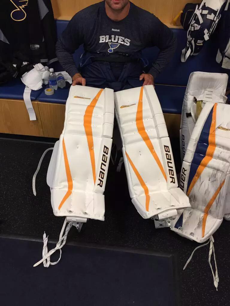
I really like it. You can see in the picture posted of Scrivens practicing, that the design actually still looks cool when the pads are apart (as they will be the majority of game action)...something that cannot be said of Lack's straight up logo split in half look.
This site uses cookies to help personalise content, tailor your experience and to keep you logged in if you register.
By continuing to use this site, you are consenting to our use of cookies.