
- Jun 10, 2014
- 57,431
- 29,291

I like that even better than the one above it.

a few reasons.Why?
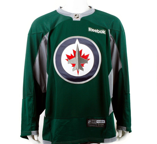
So the Flames people are seeing this as a "home" game for them, are they? Want Mosaic to become a C of Red? OK. All the Jets need to do is trot out a HC jersey in Rider Green and the House is theirs.Something like this practice jersey perhaps.

Fair enough.a few reasons.
the "reverse" logo wasn't used in the WHA. it was always dark on dark. i'm not a stickler for tradition. just stating the history.
the dark logo has a kitschy look that is back in style because of the vintage design and the colour scheme used. the inverse logo just looks awkward. doesn't have the colour blast ti give it the 21st century appeal.
toss the inverse logo on a dark jersey and it doesn't integrate well. it stands out, but not in a good way. similar reason why i don't love the dark logo on a dark jersey. it needs a VERY thin white outline on the outside to make it pop slightly. key word: slightly.
final reason: Winnipeg Jets. Current logo. Word logo on our third jersey. Heritage classic logo. now we want to introduce a 4th logo?
Hope it. Nothing redeeming about the 90s logoThey went with version 1 of the roundel logo on white for Heritage Classic 1.
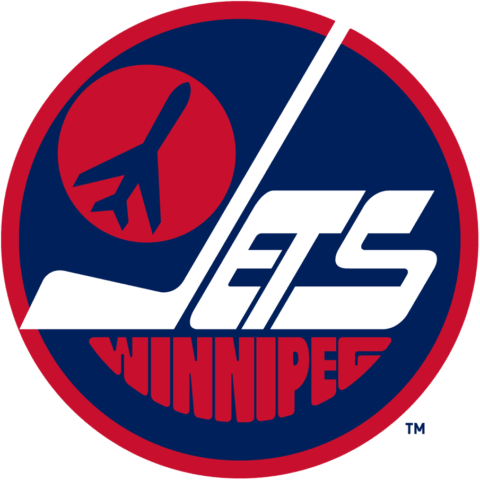
I think they'll go with version 2 of the roundel on dark for Heritage Classic 2.
Winnipeg has no WHA history with Calgary.
Calgary Cowboys. next to the Toronto Toros, New York Raiders, New York Golden Blades (lol)/Jersey Knights and Cleveland Crusaders (look them up), it was one of the worst hockey logos made in the golden age of hockey logos.The fuq is that?
Golden Blades...Golden Knights. You say tomato...Calgary Cowboys. next to the Toronto Toros, New York Raiders, New York Golden Blades (lol)/Jersey Knights and Cleveland Crusaders (look them up), it was one of the worst hockey logos made in the golden age of hockey logos.
the WHA gave birth to the following amazing logos:
Minnesota Fighting Saints
Wpg Jets
Edmonton Oilers
Indianapolis Racers
Quebec Nordiques
Phoenix Roadrunners
View attachment 201333
Just put some white around that logo and we're f'ing rocking. people agree?
@Guardian17 ,hope you don't mind
")
They went with version 1 of the roundel logo on white for Heritage Classic 1.
I think they'll go with version 2 of the roundel on dark for Heritage Classic 2.
I think it will be this to push the old rivalry.
It's hard to believe there were so many terrible fonts and clip art available back then!Calgary Cowboys. next to the Toronto Toros, New York Raiders, New York Golden Blades (lol)/Jersey Knights and Cleveland Crusaders (look them up), it was one of the worst hockey logos made in the golden age of hockey logos.
the WHA gave birth to the following amazing logos:
Minnesota Fighting Saints
Wpg Jets
Edmonton Oilers
Indianapolis Racers
Quebec Nordiques
Phoenix Roadrunners
There will be!has there been a fight at an outdoor game?
Did the jets actually announce that they’ll have a new jersey for the heritage classic? I just assumed they were going to use the same one that we already have.