Florida Panthers completely changing jersey (logo leaked post 661)

Status
Not open for further replies.

Rangediddy

The puck was in
Oct 28, 2011
3,710
809
AnthonyCalisto-FLA.png


I don't mind these
 

CanadienShark

Registered User
Dec 18, 2012
37,566
10,843
I should hope so. I think their jerseys are abysmal. Great young team and I have no ill will towards the franchise, but I hate their current jerseys.

They already tried this though, they weren't well received.


panthersnewjersey.jpg

Honestly, I didn't mind these.

confirmed new logo:

Florida_Panthers.png

What in the world... that reminds me of a team back in my hometown. The Peninsula Panthers.
 

drew5580

Registered User
Sponsor
Jan 6, 2007
681
47
Good. Logo is ok but for some reason the color scheme really irked me. I think it was the yellow
 

Mantha Poodoo

Playoff Beard
Jun 5, 2008
4,109
0
I'm okay with the Imagetchu cat.

A 'panther' logo could potentially be better.

I have a feeling they'll do it worse.
 

XX

Waiting for Ishbia
Dec 10, 2002
54,938
14,669
PHX
Not a big fan of the leaping panther logo. But they can and probably will manage to do worse.
 

Zaddy

Registered User
Feb 8, 2013
13,058
5,850
Hate the current jerseys. As silly as it might sound their jerseys alone turn me off to the Panthers franchise and I just never want to watch them play because of it. I'd probably prefer them to change the colors but if they insist on keeping them then at least go back to the older jerseys from the early 2000's, like the one with Pavel Bure. Those were fine. I feel like the current colors are just too dark and doesn't match well together at all.
 

Miri

Lavinengefahr!
Aug 13, 2013
1,947
769
Slovakia
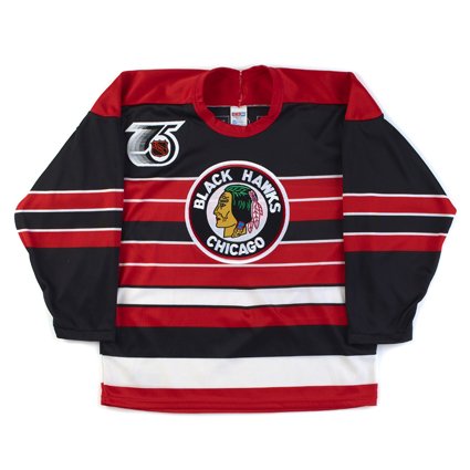
The "Original six" logos are 'classic'

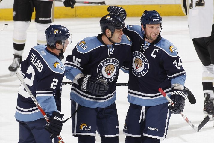
Panthers logo, like you said, is not.

Keep it around long enough and it will become classic too.

I was never a big fan of Panthers logo, way too busy to me with all the details - but i like how people tend to pretend that say NYR logo became classic, cause its a clear example of artistic mastery of yesteryear and thing of beauty...
 

WhalerTurnedBruin55

Fading out, thanks for the times.
Oct 31, 2008
11,346
6,708
Sooner or later, every teams logo is just going to be modified to be a circle with some semblance of their old logo inside of it. Until it becomes circles within circles.
 

South Florida Canuck

Biggest Canucks Superfan in South Florida
Jun 8, 2006
704
19
Jupiter, FL
The logo completely sucks! It's a dated 90's logo that should have been changed, probably at the turn of the century. I also hope they incorporate more blue, especially into the road whites. The plain white jerseys with red striping on the sleeves with plain blue pants just does not look right. I'm also hoping for some actual striping on the pants themselves
 
Status
Not open for further replies.

Ad

Upcoming events

Ad

Ad