
DeYarmond Edison
drinkingpinkrabbits
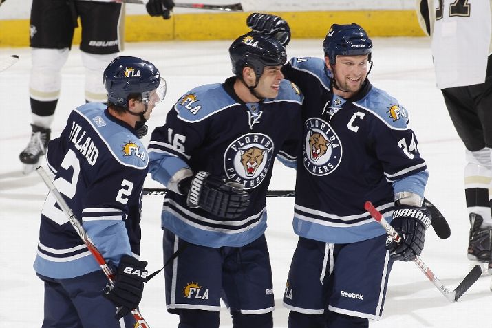
Their logo is one of my favorites in all of sports. It's the color scheme that I've never really loved.
Always love a jersey change. Hope they keep their logo though it's a classic.

People actually like that logo? It's terrible
"Classic" isn't a synonym for "thing I like a lot". Nothing about this logo is classic.
Never liked their existing logo that much, always thought it looked dated. I am interested to see what they come up with.
It's funny because most liked the logo not the color, and they're changing the logo and keeping the color
Always love a jersey change. Hope they keep their logo though it's a classic.

^beauty

Thing of beauty.
Good. They could use the head of the Panther, but they don't need the entire thing.

I can't put my finger on what it is exactly, but I always felt like there was something... off about the Panthers logo for me, so I'm all for them trying to take a crack at it again. For instance, I think that the Preds did a damn good job with cleaning their logo, albeit I would still change a couple things, so hopeful that the Panthers are able to do a good job, too. That being said, I'll withhold judgement on the very likely chance that they just screw the pooch and make a mess.

They already tried this though, they weren't well received.
I get that the body is supposed to be further away than the head but I always thought the body just looked smaller as opposed to further away. So it just wound up looking kind of goofy.
Like the legs in particular

