Speculation: 2020-21 News/Rumors/Roster Thread Part II

Status
Not open for further replies.

Raccoon Jesus

Todd McLellan is an inside agent
Oct 30, 2008
62,048
62,306
I.E.
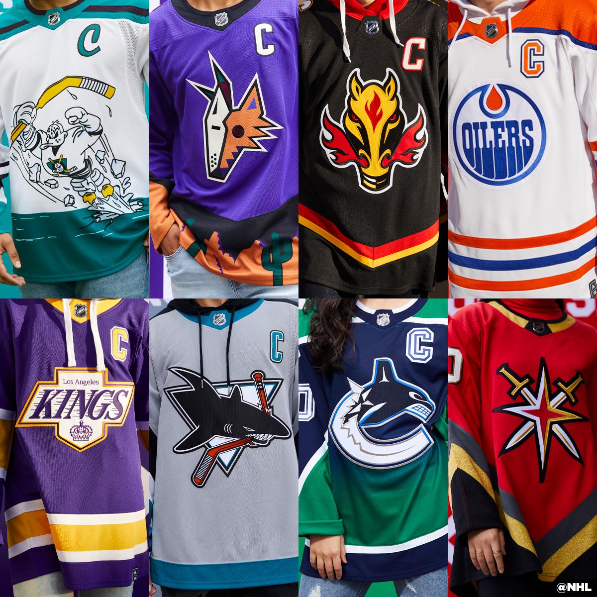
LA one should be permanent. There should be a White (yes white) and Yellow version and that should be the 3 jerseys LA uses.

I'm not a designer at all which is probably good for this exercise--but this is the best job the NHL has done at making their jerseys look modern for this decade. AND it references the past.
 
  • Like
Reactions: YP44

HeadInjury

Registered User
Jul 30, 2005
1,705
645
Well, the Ducks are the winners of the most hideous retro jersey. I won't even post it here. Avert your eyes if you happen to see it.
 

Reaper45

Registered User
Jul 14, 2003
37,254
5,374
Los Angeles
Well, the Ducks are the winners of the most hideous retro jersey. I won't even post it here. Avert your eyes if you happen to see it.
The Ducks, Stars, Canucks, Jets, Canadiens and Leafs are the ones I really don’t like. Ours is cool for the colors but the arm stripes and numbers seem oddly placed. And I despise the Chevy logo.
 

SufferingSelfCreated

Registered User
Apr 5, 2020
803
807
The Ducks, Stars, Canucks, Jets, Canadiens and Leafs are the ones I really don’t like. Ours is cool for the colors but the arm stripes and numbers seem oddly placed. And I despise the Chevy logo.
Having won a few Cups with a different logo, the chevy logo brings back mixed emotions .
 

kilowatt

the vibes are not immaculate
Jan 1, 2009
18,480
21,198
How did Dallas f*** up something so simple? Their old star was one of the best jerseys ever.

d117848ccc5be3d8.jpg
 
  • Like
Reactions: ru4reals

fivehole32

Kicking rebounds to the slot
Jan 11, 2015
440
552
I may buy that Whalers jersey and get Kay Whitmore lettering. Love the old Whalers Jersey and that was the first game I attended as a kid a 4-4 tie with Hrudey and Whitmore as the goalies of record.
 

Telos

In Gavrikov We Must Trust
Aug 16, 2008
32,726
7,405
Reno, NV
Not gonna lie, while it is not perfect, I am going to buy that jersey. The Chevy logo with the original purple and gold is irresistable.
 

KINGS17

Smartest in the Room
Apr 6, 2006
32,390
11,314
The Anaheim jersey is one of my favorites, because it is so ridiculous and it's fitting for the Ducks.

In terms of real sharp looking jerseys, I will go with the Colorado Nordique and Montreal jerseys.

New Jersey definitely got into the spirit of the reverse retro coloring scheme going with their old red, white and green colors.
 
Last edited:

Telos

In Gavrikov We Must Trust
Aug 16, 2008
32,726
7,405
Reno, NV
I kind of feel bad for Ducks fans to be honest. A lot of teams got some pretty solid throwbacks, and while it fits the spirit of the "fun" 90's throwback, obviously that design is almost laughable trash. I think if they were going to go back to the 90's then they should have just re-designed their original design:

Paul-Kariya-Ducks-2003.jpg
 
Status
Not open for further replies.

Ad

Upcoming events

Ad

Ad