
Svechhammer
THIS is hockey?
- Jun 8, 2017
- 23,825
- 87,723
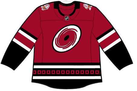
Ok gross the stormy jersey is straight up bad

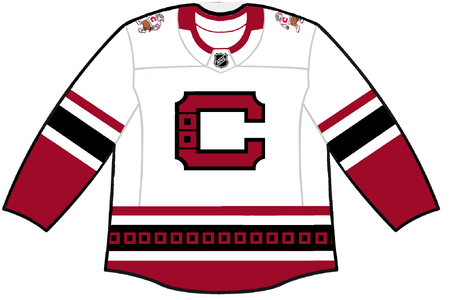
 carolinaproshop.com

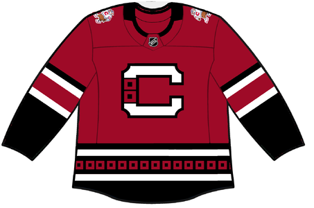
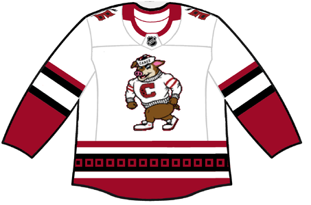
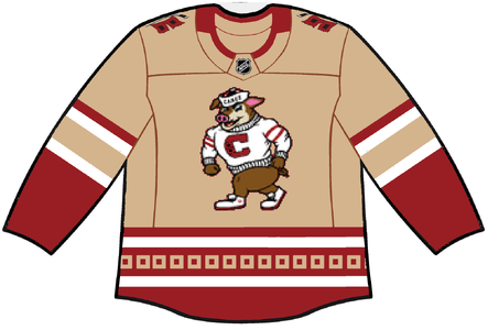
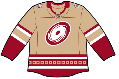
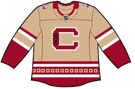
Adidas Vintage Canes Theme Jersey
-Made in Canada Custom Practice Jersey -Shoulders feature Vintage Stormy Patch and tonal primary Hurricanes Patch. -Portion of proceeds will go back to the Carolina Hurricanes Foundation.

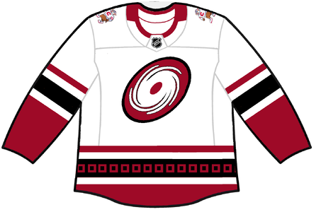
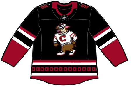
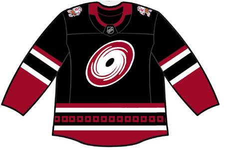
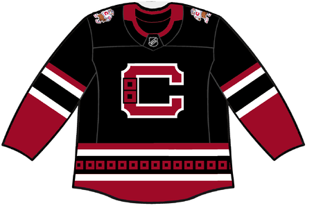
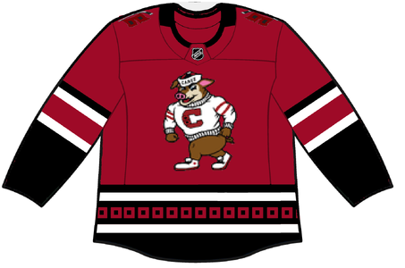
 . Ironically, I think the black jerseys I posted might look the best of the bunch.