
OttawaSenators11
#25 FTW
- Oct 10, 2010
- 6,089
- 1,088
Would have never known the difference without being told.From the link:
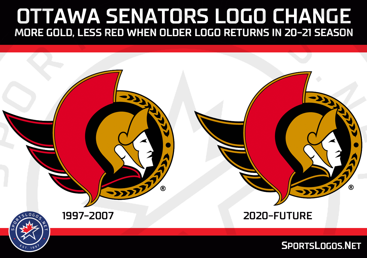
I'm happy we are going back to this old school logo.
Would have never known the difference without being told.From the link:
Yuck.
If they have to simplify for whatever reason, just go with the heritage O. Don't take a detailed design and whitewash it.
Apparently it shouldn’t look much different on the jerseyThey’re definitely using a different shade of gold judging by the leaked Merch and the twitter profile pic. Curious to how it’ll look on the jersey.
This is buttf***ing hideous. Agree to disagree...The new jerseys won't be complete until the accompanying scoreboard reads Sens 7 Leafs 0.
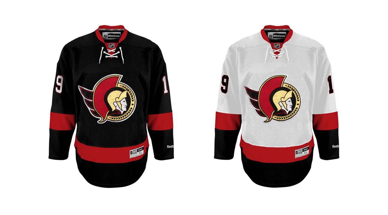
In seriousness, I like the gold trim over the wings. I still think they should go for a solid red arm bar as opposed to two red stripes on the sleeves.
THis but in Sens colours.
This is buttf***ing hideous. Agree to disagree...
This is what I was refering to. Buttfu%$#@g hideous? Okay.
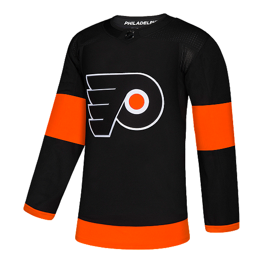
Sorry, I take it back. I'm a huge fan of these... just the Flyers version is awful. And I normally love Flyers stuff.
This is what I was refering to. Buttfu%$#@g hideous? Okay.
They aren’t the same. One is Reebok one is adidas. The Sens ones have laces, and the bottom striping is not the same. They look a lot classier. The flyers looks like a third jersey.They are exactly the same jerseys. The Flyers jersey is orange and black and the Sens is red and black. What are you guys looking at?
Ah ok. I don’t mind either one.Okay fair enough. My original point was that I liked the solid red arm bar better than two thinner red stripes on the sleeves. That was the only point I was trying to make.
They aren’t the same. One is Reebok one is adidas. The Sens ones have laces, and the bottom striping is not the same. They look a lot classier. The flyers looks like a third jersey.
look at the black Sens jersey. To match the flyers jersey you would have to take away the bottom black stripe.
That and the fact the Senators logo adds colour and style compared to that boring and unattractive Flyers logo.
I like the O.I prefer the red outline over the gold but I'll take it any day if the week over the awful cartoon version, the 3D version or the O.
If it wasn't for Covid we would have them. They were planning on unveiling them at the draft.Just want to look at pictures of the new jerseys all day. Can we get those now
If it wasn't for Covid we would have them. They were planning on unveiling them at the draft.
