Seattle Eagles, Seattle Rainiers, and Seattle Whales just sound awkward. Each of them has a weird cadence for one reason or another, and would be annoying to say on a regular basis. Seattle Eagles and Seattle Whales in particular do not trip off the tongue smoothly.
As Brodie says above, Renegades sounds VERY minor league.
The Richmond Renegades really DID have that Solo Jazz look, and I see no reason that an NHL team would want to evoke that kind of vibe.
While it's not a terrible name, Cougars is a bit generic, and there's already a Cougars in league history. Likewise, Seals would co-opt another team's history in a way that I would find kind of distasteful.
“Totems” is a nice reference to Native American culture and local hockey history, but it would be awful as an NHL team name.
Kraken is a bit too stuck in an era for me. I associate it with Pirates of the Caribbean and Game of Thrones, both of which are soon to be franchises we remember from a bygone era. And singular names have always been too clever by half. I'm sure "Wild" sounded really clever at one point, but it didn't age well and I don't think Kraken would either.
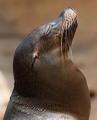
Sea Lions wouldn't be totally unacceptable, but honestly that's kind of a lame name for a hockey team. It's an upgrade from Seals but not much of one.
Firebirds has potential if they can really tie it to Native American culture with a design similar to the old Coyotes picasso dogs. And it has a certain retro-70s vibe that actually does fit well with the Seattle aesthetic. It would make sense in a city that has a visual identity defined largely by the Space Needle, vinyl albums, and 70s-influenced Sonics/Mariners merchandise. But I worry that they'd miss that opportunity and just end up with something only slightly less generic than Cougars.
Emeralds and Evergreens are both interesting concepts, and could potentially make really incredible logos
if they do it right. The absence of an obvious hockey-playing-animal type logo leaves a lot of room for creativity, so you have the potential for the NHL's answer to the Trailblazers logo. Or you could end up with a tree inside a circle with crossed hockey sticks. The downside is scary here.
Of the three, I think Sockeye has the most upside to be something different and fun. It gives the franchise room to define themselves as young and creative, while also calling back to local identity and an old-school hockey feel, with the added bonus of being aggressive or edgy if they want it to be. If they can hit the sweet spot in between "aww cute" and "wow cool", they could have another Pittsburgh Penguins level of marketing hit on their hands. So Seattle Sockeye would be my choice.