101st_fan
I taught Yoda
Over the past decade we've seen Preds fans complain about the transition to the Reebok Edge jerseys ... bemoan the black and blue checker pattern on the navy aclternates before the jersey ever saw the ice ... cry that the logo looked like it had snot coming from the nose with one change ... the gold made people express fears of how it would look washed out and pale on TV ... there is still the love it / hate it dichotomy over the mustards .... basically, no jersey that a player will wear in a game gets a good initial reception from our fan base.
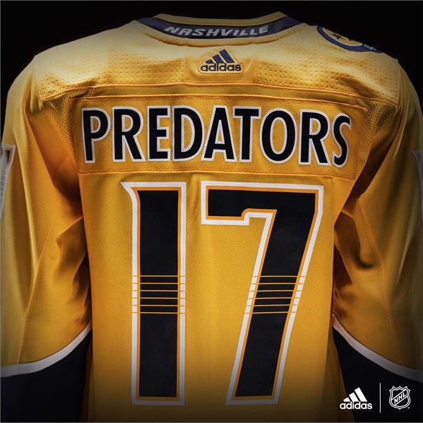
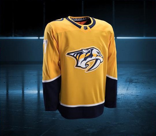
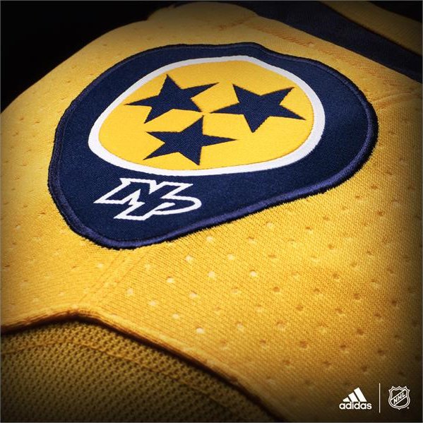
This jersey really has only minor changes from the last one. Removal of some piping, change of the collar shape, removal of the blue blocks at the top of the chest and back shoulder areas.
This jersey really has only minor changes from the last one. Removal of some piping, change of the collar shape, removal of the blue blocks at the top of the chest and back shoulder areas.

")