Post-Game Talk: Welcome to 1984

Drivesaitl

Finding Hyman
Oct 8, 2017
45,904
55,997
Canuck hunting
The idea is that a positive Corsi for the rags is a negative Corsi for us, and vice versa.

So ultimately, if you total one for one team it creates the negative total for the other team.

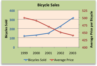
They just add another axis label for the other team so they don't have to make two graphs because it's the same information. It is kind of confusing though.

Yeah, thanks. The entire time I took postsecondary Science or stats I never encountered such a graph with different labels on each side.

I would require remedial work to comprehend these graphs.

Probably some of the confusion is if mathematically the two variables are one and the same, just inversely identical, then putting both is redundant in the first place. In other words all they have to graph is either how the Oilers, or the Rangers did, and the other team is the mathematical inverse. So these are not two data points representing any spot in the line. Its one data point, thus one line..

typing out loud here..;)
 

TameYew

Registered User
Oct 24, 2016
205
212
To me its perfectly indecipherable and I don't comprehend this nature of two label graph. I could if the Oilers and Rangers were two separate color coded lines..

meant to respond to both replies with one post but didn't work out.

Thanks for the help. I'm analytics impaired..

You are measuring shot differential so there is only one line needed. Anything below the zero line means that Oilers are generating more shots/attempts vs Rangers. This fancy graph is showing that after the initial push by the Rangers in the first period, the Oilers generated more shots for the remainder of the game. I think a very useful overlay would be who was on the ice during these shots/attempts. We would see which lines caused a swing in momentum from periods where Rangers were generating a lot of shots to when things turned around.
 

iCanada

Registered User
Feb 6, 2010
18,942
18,363
Edmonton
Yeah, thanks. The entire time I took postsecondary Science or stats I never encountered such a graph with different labels on each side.

I would require remedial work to comprehend these graphs.

Probably some of the confusion is if mathematically the two variables are one and the same, just inversely identical, then putting both is redundant in the first place. In other words all they have to graph is either how the Oilers, or the Rangers did, and the other team is the mathematical inverse. So these are not two data points representing any spot in the line. Its one data point, thus one line..

typing out loud here..;)

Yes exactly; one shot from the Oilers on the rags is one data point. One shot from the rags on the Oilers is one data point.

The line is the same, only difference is the reference of whats up and what's down; the Oilers think their shots are up and the rags shots are down while the rags think the opposite.
 

TameYew

Registered User
Oct 24, 2016
205
212
Time moves left to right. The Rangers shot attempts are above the zero line, the Oilers shot attempts are below the zero. The blue, orange highlights are powerplays, the period markers and goals scored are also displayed. The more that the line is on the Oilers side of the equator the better. The parts of the line where it falls drastically towards the bottom of the graph means there was a heavy push by the Oilers and vice versa.

There is only one puck and one game being played, so a single graph illustrates the nature of the game in terms of shots.
 
  • Like
Reactions: TB12

Drivesaitl

Finding Hyman
Oct 8, 2017
45,904
55,997
Canuck hunting
You are measuring shot differential so there is only one line needed. Anything below the zero line means that Oilers are generating more shots/attempts vs Rangers. This fancy graph is showing that after the initial push by the Rangers in the first period, the Oilers generated more shots for the remainder of the game. I think a very useful overlay would be who was on the ice during these shots/attempts. We would see which lines caused a swing in momentum from periods where Rangers were generating a lot of shots to when things turned around.

Yeah, but like I said above if the data is just perfect inverse then its only one data set and only one line, and one axis label is required. Whichever team has higher corsi should be displayed. The other doesn't need to be displayed as obviously its the perfect inverse redundant data.

Take a look at your bolded and see how unnecessarily confusing this depiction of information is. The team with the higher corsi should be ABOVE not BELOW. People learn to read left to right, people learn to look at graphs with negative numbers on the bottom, positive numbers on the top. The graph is whacked.

The only scenarios in which it makes actual sense to have two vertical labels would be graphing something like below, in which case the data sets differ, and are demarked by two different colored lines. Two vertical axes should only be used if there are two separate lines of data. Heres an example of a sensible two variable, two vertical label access, with two labels..

0c1a14c8-2dd2-4572-9367-5ebfd905970a.gif
 

McDNicks17

Moderator
Jul 1, 2010
41,673
30,111
Ontario
To me its perfectly indecipherable and I don't comprehend this nature of two label graph. I could if the Oilers and Rangers were two separate color coded lines..

meant to respond to both replies with one post but didn't work out.

Thanks for the help. I'm analytics impaired..

The halves are labelled by the logo behind them. There's only one line because +/- is zero sum. A + for the Oilers is a - for the Rangers and vice versa.

It's basically just a rough illustration of game flow.
 
  • Like
Reactions: TB12

TameYew

Registered User
Oct 24, 2016
205
212
Yeah, but like I said above if the data is just perfect inverse then its only one data set and only one line, and one axis label is required. Whichever team has higher corsi should be displayed. The other doesn't need to be displayed as obviously its the perfect inverse redundant data.

Take a look at your bolded and see how unnecessarily confusing this depiction of information is. The team with the higher corsi should be ABOVE not BELOW. People learn to read left to right, people learn to look at graphs with negative numbers on the bottom, positive numbers on the top. The graph is whacked.

The only scenarios in which it makes actual sense to have two vertical labels would be graphing something like below, in which case the data sets differ, and are demarked by two different colored lines. Two vertical axes should only be used if there are two separate lines of data. Heres an example of a sensible two variable, two vertical label access, with two labels..

0c1a14c8-2dd2-4572-9367-5ebfd905970a.gif

You would use this graph to measure shots/attempts instead of shot differential.
 

Drivesaitl

Finding Hyman
Oct 8, 2017
45,904
55,997
Canuck hunting
Yes exactly; one shot from the Oilers on the rags is one data point. One shot from the rags on the Oilers is one data point.

The line is the same, only difference is the reference of whats up and what's down; the Oilers think their shots are up and the rags shots are down while the rags think the opposite.

The team with the higher corsi should be the only one graphed, the other is inverse inferred and redundant display. Why this is significant is that the up and down seems reversed on the graph, from that which would sensibly occur. For instance higher values on graphs are up, not down... In a sensible depiction.
 

McDNicks17

Moderator
Jul 1, 2010
41,673
30,111
Ontario
The team with the higher corsi should be the only one graphed, the other is inverse inferred and redundant display. Why this is significant is that the up and down seems reversed on the graph, from that which would sensibly occur. For instance higher values on graphs are up, not down... In a sensible depiction.

You can't just graph a single team since both the Rangers and Oilers had the higher Corsi at one point.
 

Drivesaitl

Finding Hyman
Oct 8, 2017
45,904
55,997
Canuck hunting
The halves are labelled by the logo behind them. There's only one line because +/- is zero sum. A + for the Oilers is a - for the Rangers and vice versa.

It's basically just a rough illustration of game flow.

Yep, I follow that its zero sum data. Its thus one line, one axis, one data point for each line on the graph. Pick either team, but a sensible one would graph the winning corsi team.

To wit the Oilers had increased Corsi as the game went on, and yet the line is going DOWN because the Oilers axis is labeled opposite to how people read graphs.

Imagine if stock markets displayed increased valuations as lines going down. That would make for even more interesting and inexplicable Wall Street trading. ;)
 

Drivesaitl

Finding Hyman
Oct 8, 2017
45,904
55,997
Canuck hunting
You can't just graph a single team since both the Rangers and Oilers had the higher Corsi at one point.

Of course you could graph it with just the Oilers vertical axix. The axis would be on the left, start at -1 for first few minutes and then the line goes UP, as the oilers upped their Corsi share coefficient. That would be a line going up, which would make more sense. That would be intuitive.

heh fun discussion.
 
Last edited:

McDNicks17

Moderator
Jul 1, 2010
41,673
30,111
Ontario
Yep, I follow that its zero sum data. Its thus one line, one axis, one data point for each line on the graph. Pick either team, but a sensible one would graph the winning corsi team.

To wit the Oilers had increased Corsi as the game went on, and yet the line is going DOWN because the Oilers axis is labeled opposite to how people read graphs.

Imagine if stock markets displayed increased valuations as lines going down. That would make for even more interesting and inexplicable Wall Street trading. ;)

It's just simpler to do that than have two separate charts for each team's PoV.
 

JordanGalhanth

Registered User
Apr 21, 2012
4,079
4,537
Meh...call me crazy, but I really don't care a whole ton about Corsi and these other "nerdier-than-thou" analytics.

If analytics are such a big deal, why is it that the stats-darling Coyotes have never won a cup in the analytics era? Same thing with the Leafs to an extent.
 

TameYew

Registered User
Oct 24, 2016
205
212
Meh...call me crazy, but I really don't care a whole ton about Corsi and these other "nerdier-than-thou" analytics.

If analytics are such a big deal, why is it that the stats-darling Coyotes have never won a cup in the analytics era? Same thing with the Leafs to an extent.

I don't think Corsi does anything to explain if a team can win a cup or not. It speaks to on-ice performance of your team vs the team you are playing. I also don't think that corsi should reflect any long-term evaluation of a player. I think that sample size is never high enough to measure a player using corsi, but if you look at the parts I highlighted on this graph.


Whoever was on the ice during the red boxes played well. Does that mean those players will win you a cup? Not unless you had a very large sample size.
 

LaGu

Registered User
Jan 4, 2011
7,500
3,823
Italy
So you trade him as early as possible, right? What am I missing. Its 2019.

If the scenario is the Oilers do not resign him, and I'm not sure why a new GM would, then we just lose him for nothing if we don't deal him soon.

Again why not just get an asset?

Are the Oilers worried in the optics of the ultimate deal breakdown being Taylor Hall for 2nd or 3rd pick?

Is it better to not do that and get nothing?
Right for you probably, wrong for me.

I didn't say the Oilers would not sign him, I said that he would not need protection in the expansion draft because his contract expires that year. He can be signed after the draft.

If you think he can be a valuable player contributing to the team's success you don't trade him, if you don't think that of course you would be open to trading him and as you say then it is logical to do it sooner rather than later. I think that leaving the right side with 2 rookies + Benning would be a mistake, no matter how good things look after 5 GP
I am willing to give Larsson this season to show he can fit into the new system and group (I actually did not think he had a bad game before getting injured). Preseason is what it is and I don't put much stock into that. After this season I would think more carefully about it, definitely not now.
 

Fourier

Registered User
Dec 29, 2006
25,612
19,903
Waterloo Ontario
To me its perfectly indecipherable and I don't comprehend this nature of two label graph. I could if the Oilers and Rangers were two separate color coded lines..

meant to respond to both replies with one post but didn't work out.

Thanks for the help. I'm analytics impaired..

In this case one line suffices because every plus one team gets is a negative for the other. It's actually fairly common to do this sort of thing. You see it on financial graphs quite oten to show correlation.
 

Fourier

Registered User
Dec 29, 2006
25,612
19,903
Waterloo Ontario
I don't think Corsi does anything to explain if a team can win a cup or not. It speaks to on-ice performance of your team vs the team you are playing. I also don't think that corsi should reflect any long-term evaluation of a player. I think that sample size is never high enough to measure a player using corsi, but if you look at the parts I highlighted on this graph.


Whoever was on the ice during the red boxes played well. Does that mean those players will win you a cup? Not unless you had a very large sample size.
Corsi has its uses especially for units. It's far less effective in isolating individual characteristics.

Its primary intention is to be a proxy for possession. It can do a fair job in that respect. The problem is when people read more into the stats than they can actually reveal.
 

dssource

5-14-6-1=97
Jun 29, 2012
4,908
6,926
Just finished the game as I was out of town this weekend. We'll played for a road game against what seems will be a pretty good team in nyr. Oilers were the better team and deserved that win. The 5 on 3 killed the rangers. Another game where we won the specialty teams battle. We haven't lost one this year.

Do all these New York based teams play on this poor ice all year long? Terrible.

Can someone explain the no commercial situation in the first? We put it on Lund from before centre, so they can't go to commercial? Why?

5-0 baby!
 

WhyYouHaveToBeMad

Registered User
Aug 26, 2018
523
589
So you'd leave Larsson unprotected in an expansion draft rather than trying to get some asset for him prior to that? Why?
Of course I would like to trade him for assets but if there is no trade to be made, I would not be protecting him. Let Seattle pick him and free up 4 million to be used elsewhere.
 

WhyYouHaveToBeMad

Registered User
Aug 26, 2018
523
589
It's kind of a moot point since his contract expires in 2021. He won't need to be protected because he won't be signed.
Depends on what dollar value he's asking for. If hes willing to resign for 2 mill, I am all for it. He would be an excellent bottom pairing d
 

harpoon

Registered User
Dec 23, 2005
14,274
11,528
Depends on what dollar value he's asking for. If hes willing to resign for 2 mill, I am all for it. He would be an excellent bottom pairing d
For a guy that many on the board expected to be a solid #2 for the next five to seven seasons that is incredibly disappointing.
Are the Oilers worried in the optics of the ultimate deal breakdown being Taylor Hall for 2nd or 3rd pick
You better believe they are worried about that.
 
Last edited:

Ad

Upcoming events

Ad

Ad