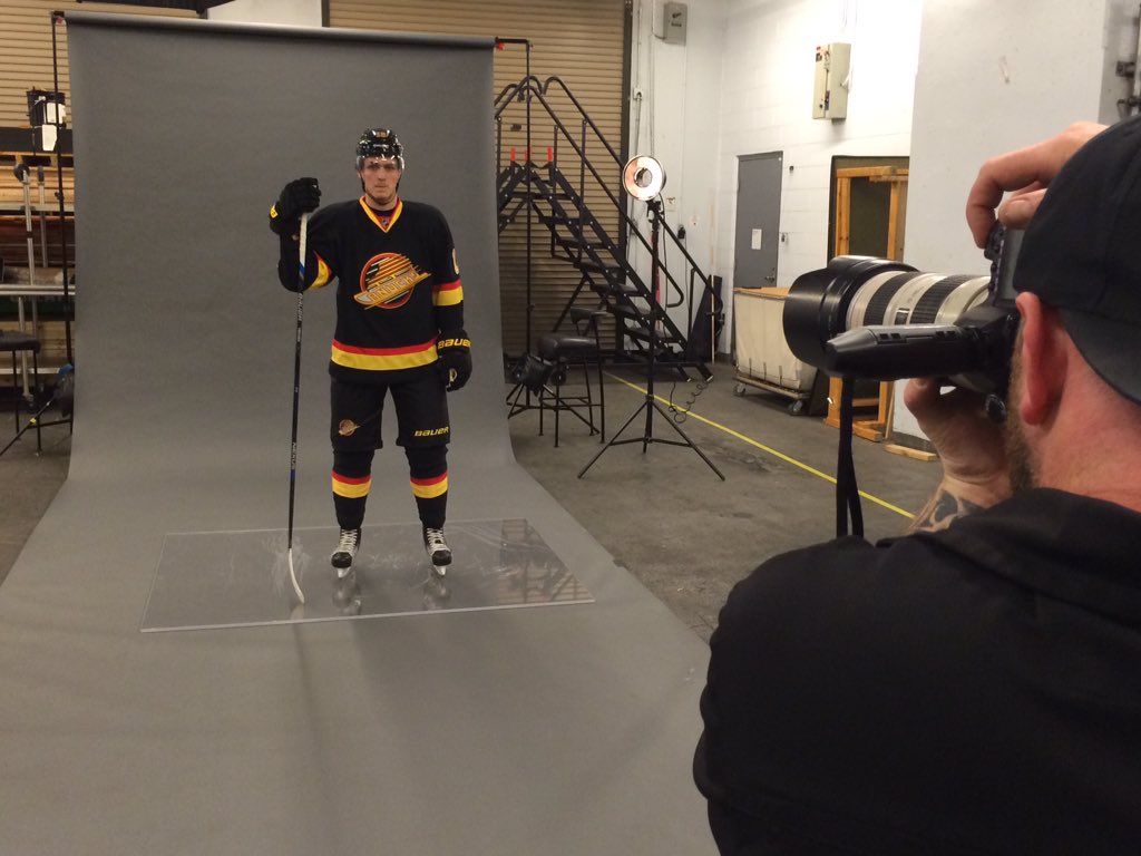
Time to bring back the "Flying Skate"?

David Bruce Banner

Nude Cabdriver Ban
Mar 25, 2008
7,965
3,242
Streets Ahead
Stick and rink... it's clean and simple.

I have no problem, though, with any or all of the old jersey's making the occasional appearance. Including the flying V and the Millionaires.
 

Solidius

#TankLivesMatter
Jul 7, 2006
1,052
3
Vancouver, B.C.
Keep the current colours, drop the orca and pretty much use a hybrid of the 40th anniversary jerseys/current thirds. I'm thinking the thirds as the are right now, no shoulder patch, with a V in the arm striping. Have a version for home and away (obviously).

Move the Flying Skate to a rare third for special occasions. Same with the Millionaires jersey. (I actually don't hate it; it's just tied to bad memories here.)
 

TARS

Registered User
May 3, 2009
2,129
68
Vancouver
the only change we need is to get rid of that stupid 'Vancouver' wordmark over the orca. the Canucks are in Vancouver? really? when did they move there?

don't mind spaghetti skate per se, but it's still 3rd to the stick'n'rink and orca

I hated the wordmark at first. It seemed like an obvious cashgrab attempt at making a Canucks jersey the souvenir for tourists to bring home from the 2010 Olympics. Now I actually like it.

Regardless of that, I don't want to change jerseys because history is what makes a classic jersey. It takes a long time to build that. If you change it every 10 years, it will always feel like it needs to be changed.

The current jerseys are good enough to keep. 30 years from now with any amount of success attached to them, people will call the idea of changing jerseys blasphemy.

Pick something and stick with it.
 

Tobi Wan Kenobi

Registered User
May 25, 2011
5,284
94
Vancouver
imo they should do a new one that hasn't been done before. It should be a V on the crest with something in it and not the Johnny Canuck. Something else. The V is an attractive letter and no other team has it.
 

Seattle Totems

Registered User
Apr 14, 2010
3,894
1,138
Oh are we talking buses?

BC-Hydro-Bus.jpg
 

deckercky

Registered User
Oct 27, 2010
9,379
2,452
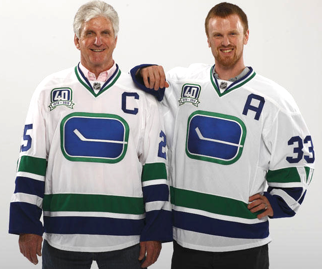
I'd be ok with adopting the 40 anniversary stick and rink as our 1st and using the flying skate as our third. However, I really dislike the current jersey's. They just are so dull and blah. They look like we are trying to be the seahawks or something.

Stick and rink ain't bad though

KurtenbachSedin.jpg

I think that regardless of what they do with the logo, it makes sense to use the V on the sleeves from these.

I love the flying skate, but I don't see them switching over fully, and it's such a contrast that I can't see them as a regular third jersey.
 

Seattle Totems

Registered User
Apr 14, 2010
3,894
1,138
It's actually been nice the last few years to finally have reasonable looking uniforms and to not see a rainbow of vomit in the stands at Canucks games. No longer were the Canucks the laughing stock of the league for that sea of ugly uniforms and that ever changing colour scheme. Finally a little stability. So much for that!

It's a little ironic that they are honouring this franchise by wearing these uniforms just as the franchise is being run into the ground by new management. The skate logo after all is attached to the greatest losing streak in pro sports history. I guess nothing ever changes.
 

groov2

Registered User
Apr 11, 2014
1,140
275
Vancouver
As much as I would love to, I really don't think the team can. We have a mascot who was developed a relationship with the community. It is Orca who goes to all the events for Children and they get excited to see him. I understand that you can change the jerseys and logo and keep Orca, but suddenly it really doesn't fit the brand and you lose the continuity we have now.
 

D0ctorCool

Registered User
Dec 3, 2008
4,637
535
Vancouver
As a city Vancouver is changing rapidly. However, unfortunately, we are forgetting are past. From the 60s-90s we were thought of as a kind of rough, rugged and wild Pac-NW.

Red, yellow and black contrast nicely to our natural surroundings.

CZlPJKwUsAAtkhm.jpg


Remember these beautiful trains and buses:

SkytrainExpoLine-SH.jpg


0590-801vancouver3409.jpg

ticket_scans-1.jpg


Bring back all the old things!!!
 

biturbo19

Registered User
Jul 13, 2010
25,795
10,843
As stoked as i am for the "Retro" throwback jerseys as a special occasions thing for the nostalgia and as something different and exciting...I really wouldn't want it back as a regular jersey. First off, it's some extremely ugly colours...striking, and kind of a fun change up, but really...they're ugly colours and it's a pretty ugly logo as well. :laugh: Secondly...they need to stop changing things. Just stick with something for a length of time and let it build. Vancouver has to be one of the most fickle sports markets out there...right down to people constantly getting "bored" of any particular jersey iteration the Canucks have ever had. :laugh:
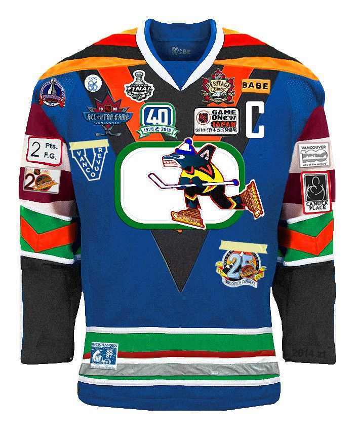

I had a good laugh at the initial post's idea of Vancouver as anything resembling "rough, rugged, wild pacific NW". So thanks for that. :laugh:
 

JA

Guest
As a city Vancouver is changing rapidly. However, unfortunately, we are forgetting are past. From the 60s-90s we were thought of as a kind of rough, rugged and wild Pac-NW.

There's some great footage on YouTube of this city throughout the years.


[yT]-SxXXbtGl-E[/MEDIA]
 
Last edited by a moderator:

mathonwy

Positively #toxic
Jan 21, 2008
19,120
10,069
It's actually been nice the last few years to finally have reasonable looking uniforms and to not see a rainbow of vomit in the stands at Canucks games. No longer were the Canucks the laughing stock of the league for that sea of ugly uniforms and that ever changing colour scheme. Finally a little stability. So much for that!

It's a little ironic that they are honouring this franchise by wearing these uniforms just as the franchise is being run into the ground by new management. The skate logo after all is attached to the greatest losing streak in pro sports history. I guess nothing ever changes.

Hah...

Exactly my thoughts.

Farewell sea of blue. I hardly knew thee.

Lessee... the last time the Canucks did something like this was.... hiring Trevor Linden as president.

So what are they doing? Well, they're using nostalgia marketing to combat the cloud of negativity that has surrounded this team all season long.

Or ..

Putting lipstick on a pig.

There's absolutely nothing special about the relationship of the year 2016 to 1994.
 

BloatedGuppy

Registered User
Jun 29, 2007
4,307
232
Vancouver
Why do Nucks fans like the 'stick in rink logo? It's lame and too simple. They just like whales logos? :) It looks like a cartoonish whale almost. :)

Simple is GOOD in a sports logo. The classic logos are, virtually without exception, clean and simple. Simple color schemes, simple uniform designs, simple logo. Fancy/busy logos are abominations.

I'm nostalgic for the old skate going rapidly downhill, but I wouldn't want to see it back except as a special occasions jersey. Stick in rink regular, and you can rotate in the skate, the Millionaires jersey and the Orca for special jersey nights. Lose the wordmark entirely, I'm sure everyone is aware the team plays in Vancouver.
 

VanillaCoke

Registered User
Oct 30, 2013
25,400
11,830
Simple is GOOD in a sports logo. The classic logos are, virtually without exception, clean and simple. Simple color schemes, simple uniform designs, simple logo. Fancy/busy logos are abominations.

I'm nostalgic for the old skate going rapidly downhill, but I wouldn't want to see it back except as a special occasions jersey. Stick in rink regular, and you can rotate in the skate, the Millionaires jersey and the Orca for special jersey nights. Lose the wordmark entirely, I'm sure everyone is aware the team plays in Vancouver.
Nailed it..

A new logo would be stupid. The orca is ugly and stupid. The wordmark is really stupid.

Stink rink is nice and simple and already classic. Just go with it.
 

FOurteenS inCisOr

FOS COrp CEO
May 4, 2012
3,896
1,675
Republic of VI
Liked it when it was current, but as soon as I got used to the change, I found it too busy.

The best jerseys/logos are simple—the stick-in-rink is awesome.

Plus, I like the blue/green combo much better than black/yellow/red.

Sure, bring it back for a game or two, but let the cluster-f**** of a design die.
 

Josepho

i want the bartkowski thread back
Jan 1, 2015
14,797
8,336
British Columbia
Full time please. A Brock Boeser jersey would be filthy.

I've already committed to my next jersey being a Boeser one and I was highly considering this one. Does anyone know what number Boeser might be here since 16 is retired? IK he wore 42 in camp.
 

Knight53

#6 #9 #17 #35 #40 #43
Jun 23, 2015
9,302
5,584
Vancouver
I've already committed to my next jersey being a Boeser one and I was highly considering this one. Does anyone know what number Boeser might be here since 16 is retired? IK he wore 42 in camp.

Hoping he chooses something like 73 or 77, his name on all black would be nasty.

Him and Demko are the next jerseys I'm most likely gonna buy.
 

Ad

Upcoming events

Ad

Ad