
discordant concord
Registered User
I find our post 2007 colour scheme is the least intimidating look in the league. The colours work really well and represent our city and province. However, I think it's time for a change.


Nope. How about the team just starts to build some identity instead rather than constantly changing it.
get rid of the orca. it's garbage.
and bring these as 3rd.
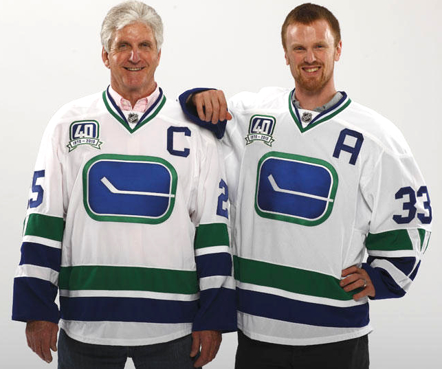
I'm okay going back to an old logo, either stick-in-rink or spaghetti plate. Just no new logo.
Green and blue version of the skate. Easy.
Interesting idea. On paper I prefer it to the current jerseys.


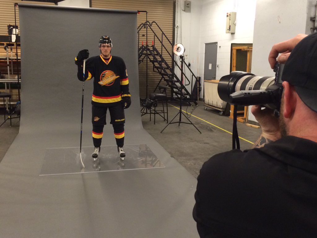
Black yellow red is deadly color combo
This is the thinking that created the flying V...
Am I the only one who thinks this looks really tacky?
That is how it should be done, rarity of use is a good way to make the old ones special and it sell tons more jerseys by getting people to double and triple up.Nah. We've finally had the same colors for almost a decade....stick with em. THAT being said...I am all for having throwback jerseys throughout the year. NFL does it. NBA does it. Just have a few throwbacks throughout the season. Fans will like it.
") It looks like a cartoonish whale almost.
It looks like a cartoonish whale almost.