
BelovedIsles
Registered User
- Oct 22, 2005
- 20,378
- 5,612
I suspect that they will look much better on the players, at least I hope so. I think the white will be more on top of the shoulders are opposed to draping down the front which is how it looks when they are laying flat.Just wish they had done the shoulders differently...I cannot stand the way they look. My impression is subject to change based on how it looks with someone wearing it though, that could make a difference.
I really hope your right, because right now it just looks laughable to me. Even the back makes it look like they come down too far.I suspect that they will look much better on the players, at least I hope so. I think the white will be more on top of the shoulders are opposed to draping down the front which is how it looks when they are laying flat.
You constantly fixate on the absolute weirdest sh*t...They Look ok, but when I go to my five games a year, I purposely check to see if they are wearing real islanders jerseys or 3rd jerseys and I don't go if it's not islanders jerseys. I know I'm in the minority on it being a big deal, but for me, the only benefit of being a islanders fan is seeing those jerseys and thinking off the very old days...I get nothing else out of the team.
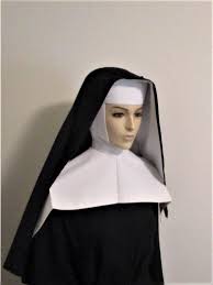
Just came to this thread and when I first saw it I hated it. Honestly, the white shoulders kill me. They are too wide and shaped weirdly. Almost looks like a nun's habit. Really don't like them at all and they kill the jersey for me.
Then, I see that they will have orange numbers and the white name with orange outline. That looks killer and kind of brings the jersey back to tolerable range for me. Just wish they had done the shoulders differently...I cannot stand the way they look. My impression is subject to change based on how it looks with someone wearing it though, that could make a difference.

Sign me up for this one:
I would actually put the Isles near the top of the list. Most of those don't do much for me either, and the author somehow put Anaheim's abomination at #5. I like St Louis' the best.Not sure if I agree with this guys assessment, but I do agree the Coyotes is the best and I really like the Sharks jersey as well. None of the others thrill me.
Ranking the NHL's 2018-19 alternate jerseys from worst to first
I would actually put the Isles near the top of the list. Most of those don't do much for me either, and the author somehow put Anaheim's abomination at #5. I like St Louis' the best.
Sign me up for this one:

