
The Official Caps Uni Thread
- Thread starter txpd
- Start date
You are using an out of date browser. It may not display this or other websites correctly.
You should upgrade or use an alternative browser.
You should upgrade or use an alternative browser.

I love those uni's
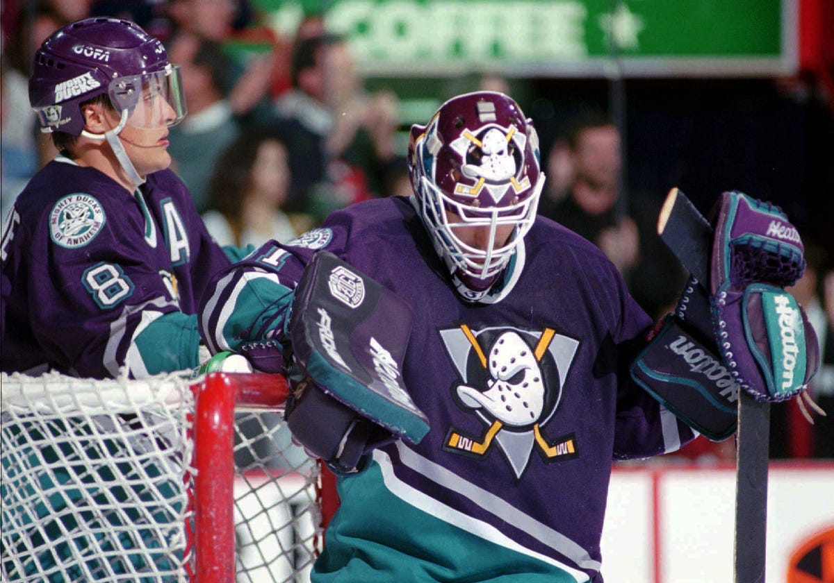
It's a f***ing travesty we don't wear those. They'd be arguably the nicest kits in the league. The ones they currently wear suck through and through. The Flames, Kings, Caps, Coyotes, and Ducks all need to go back to their older jerseys because all of their current ones are trash.


Hivemind
We're Touched
Disagreed 100% about the jerseys. Caps alternates are super boring. Mediocre throwbacks to an era of Capitals hockey where the team did nothing noteworthy. I'd much rather the team have an actual alternate jersey. And in no world should those alternates replace the main sweaters.
Calicaps
NFA
Disagreed 100% about the jerseys. Caps alternates are super boring. Mediocre throwbacks to an era of Capitals hockey where the team did nothing noteworthy. I'd much rather the team have an actual alternate jersey. And in no world should those alternates replace the main sweaters.

Hivemind
We're Touched
The stars everywhere are among the worst elements of 70s designs. Just tacky.
ArmadilloThumb
Registered User
- Apr 20, 2018
- 517
- 386
It's a ****ing travesty we don't wear those. They'd be arguably the nicest kits in the league. The ones they currently wear suck through and through. The Flames, Kings, Caps, Coyotes, and Ducks all need to go back to their older jerseys
Strongly agree!! It doesn't matter a whiff the Caps had rough years (that's on the NHL for setting them up to fail with the poor Expansion Draft) - in fact the simple reality the Caps survived means that original design should be embraced with the highest level of pride (are you listening Ted?).
Many Original Six teams had very bad years and never abandoned their heritage for some focused-grouped design.
Tradition is very important in hockey (here in London, Ontario and also in DC)- wearing the classics like many teams do keeps that lineage (Flyers and Islanders get that very well, and Blues are close - Kings and Canucks need to get it and go back to their originals too).
We can have the thirds for the creative ones (rotate the Stadium Series, the current, the screaming eagle, and even new designs!). You do realize that the original home white "with too many stars" is based off Montreal's classic white? Very close, and the red is the inverse.
I will also add, in case Ted is listening, they need to do the throwbacks correctly - they should have the logo letters individual larger and sewn on directly. Also, they need to tweak the yoke on the Adidas template - its too wide. The Adidas template was altered for the Flyers shoulder/arm stripe, which is properly narrow. Can be done with the Caps - don't cheap out - do it right!!
The League or Adidas wanted the Blackhawks to use a twill crest instead of the more costly and labour intensive chain-stiched classic with the change to Adidas to save cost. The Hawks said no, do it right. Caps should too.
Silky mitts
It’s yours boys and girls and babes let’s go!
- Mar 9, 2004
- 4,685
- 3,701
ArmadilloThumb
Registered User
- Apr 20, 2018
- 517
- 386
The nice thing about rotating a bunch of 3rds is you can make everyone who likes the later designs happy too. They could make a killing selling proper original-spec throwbacks and then a range of 3rd's always available. I, of course, would only buy the Made In Canada on-ice-quality ones, not the fake "Authentics" from Indonesia.
Disagreed 100% about the jerseys. Caps alternates are super boring. Mediocre throwbacks to an era of Capitals hockey where the team did nothing noteworthy. I'd much rather the team have an actual alternate jersey. And in no world should those alternates replace the main sweaters.
What in the world do you like about the current jerseys over the alternate jerseys? The ones they have now are dreadful.
Corby78
65 - 10 - 20
The throw back red sweaters are awesome and the best look we have ever had. What we have now are much better than those awful flying eagle things. Although the home whites could use an adjustment, I don’t want to see an overall change.
capsdom86
Registered User
- May 28, 2015
- 42
- 34
Agree, the 3rd jerseys are the best (I have two , ovechkin and oshie) but the regulars will forever be associated with winning the cup so don't ever want to change those either!
And may the gold (or copper) and black stay banished forever
And may the gold (or copper) and black stay banished forever
Hivemind
We're Touched
The Weagle is awesome. The current jerseys aren't loaded with a bunch of random stars down the sleeves (or more importantly the pants legs). The shade of blue doesn't clash as obnoxiously (two primary colors!?! hard thumbs down). The piping looks great. And the current road whites are the best in the league.What in the world do you like about the current jerseys over the alternate jerseys? The ones they have now are dreadful.
The 70s jerseys look like awful 70s jerseys. The current jerseys took that general aesthetic and updated it to not be filled with terrible 70s jersey features.
That being said, I would like the retro jerseys more if they got rid of the pants. The pants are f***ing hideous.
twabby
Registered User
- Mar 9, 2010
- 13,728
- 14,647
The Weagle is awesome. The current jerseys aren't loaded with a bunch of random stars down the sleeves (or more importantly the pants legs). The shade of blue doesn't clash as obnoxiously (two primary colors!?! hard thumbs down). The piping looks great. And the current road whites are the best in the league.
The 70s jerseys look like awful 70s jerseys. The current jerseys took that general aesthetic and updated it to not be filled with terrible 70s jersey features.
That being said, I would like the retro jerseys more if they got rid of the pants. The pants are ****ing hideous.
Finally someone else points out how great their current road whites are! 100% prefer them to any other jersey in team history.
Hivemind
We're Touched
Even if I didn't genuinely prefer the look of the road whites, this image of the road whites will be forever etched in my memory.Finally someone else points out how great their current road whites are! 100% prefer them to any other jersey in team history.

ArmadilloThumb
Registered User
- Apr 20, 2018
- 517
- 386
The stars everywhere are among the worst elements of 70s designs. Just tacky.
Hivemind, you are portraying yourself as not well informed of the history NHL jersey aesthetics. "Stars everywhere" and word logos are as deep in original jersey history as the Habs "C" logo, the Leaf and others. To say its from the 70's is just wrong. Sit tight a moment...
ArmadilloThumb
Registered User
- Apr 20, 2018
- 517
- 386
ArmadilloThumb
Registered User
- Apr 20, 2018
- 517
- 386
Hivemind
We're Touched
I don't care if that's part of NHL history (nor did I say it wasn't). Stars everywhere is ugly. It's like something a 6 year old would draw for a jersey.
ArmadilloThumb
Registered User
- Apr 20, 2018
- 517
- 386
So, in actually, the Caps original "70s" aesthetic is more accurately a combination of the 1940s Habs whites and 1920s Americans (and don't dis the Americans, as they were an important part of the NHL).
Caps original jersey is as classic as it gets, IMO.
Caps original jersey is as classic as it gets, IMO.
ArmadilloThumb
Registered User
- Apr 20, 2018
- 517
- 386
I don't care if that's part of NHL history (nor did I say it wasn't). Stars everywhere is ugly. It's like something a 6 year old would draw for a jersey.
You are entitled to not like them, but please don't make false proclamations about their aesthetic origin, and respect that lots of people like them.
Hivemind
We're Touched
??You are entitled to not like them, but please don't make false proclamations about their aesthetic origin, and respect that lots of people like them.
It's a 70's jersey. It originates in the 70s. Just because there are other jerseys that have stars on them or use the colors of the US flag doesn't mean those aesthetics are generally from an earlier time. Calling it a 70s aesthetic isn't a "false proclamation," because (well) the jersey was made in the 1970s and generally fit with the style of jerseys being worn across all sports in the 1970s. Bold primary colors and horizontal stripes were to the 70s as gradient jerseys were to the 90s and black jerseys were to the early 2000s.
And it's a conversation. People can have differing views. Talking about how I think the jerseys are ugly is no different than others talking about how they dislike the current jerseys.
ArmadilloThumb
Registered User
- Apr 20, 2018
- 517
- 386
Even if I didn't genuinely prefer the look of the road whites, this image of the road whites will be forever etched in my memory.
Also etched in my mind forever (we agree there!). I now own this Made In Canada Adidas, worn in pre-season last year (as a #3), which was then converted perfectly to Cup Hoisting specs! My pride and joy!!
ArmadilloThumb
Registered User
- Apr 20, 2018
- 517
- 386
??
It's a 70's jersey. It originates in the 70s.
And it's a conversation. People can have differing views. Talking about how I think the jerseys are ugly is no different than others talking about how they dislike the current jerseys.
Yes, its is a good discussion. I get your point that it comes out of a period with some pretty tacky aesthetics and on some level seems share some of that (I would suggest the font is the most 70s part), but I'm hoping everyone sees the connection to designs that are are older and generally considered classic.
And everyone is free to like whichever ones they prefer. Go Caps!!
Dr John Carlson
Registered User
Hivemind
We're Touched
As much as I love our road whites, it does amaze me that in the era of color TVs we've stuck with the color/white convention for as long as we have. Sweden has the right idea with Yellow & Blue jerseys (just wear whichever doesn't match your opponent). Surprised we haven't seen more push for allowing colored road jerseys yet.
edit; Although I suppose you have to avoid the issues with color blindness that the NFL's color rush game had. LOOK: Bills-Jets game is complete torture for color-blind people
edit; Although I suppose you have to avoid the issues with color blindness that the NFL's color rush game had. LOOK: Bills-Jets game is complete torture for color-blind people
Ad
Latest posts
-
GDT: WCQF- Game 3 Vancouver Canuck @ Nashville Predators 4/26 6:30PM CT
- Latest: Boss Man Hughes
-

-

Upcoming events
-

-
 Game 3 Edmonton Oilers @ Los Angeles Kings - Series tied 1-1Wagers: 13Staked: $17,782.00Event closes
- Updated:
-
Series Winner Edmonton Oilers vs Los Angeles Kings - Series tied 1-1Wagers: 6Staked: $3,487.00Event closes
- Updated:
-
-