The Official Caps Uni Thread

Vote for your favorite


  • Total voters
    37

txpd

Registered User
Jan 25, 2003
69,649
14,131
New Bern, NC
I don't care if that's part of NHL history (nor did I say it wasn't). Stars everywhere is ugly. It's like something a 6 year old would draw for a jersey.

The way I remember it there were people that rated the Caps uniforms the best in the league back than and then other would say the worst. They were the most expensive to make at the time. I know that much. Each letter was individually stitched on. They also originally came with white pants which lasted about 3 games. I cant agree with the 6 year old comment. That is over the top hate.
 

txpd

Registered User
Jan 25, 2003
69,649
14,131
New Bern, NC
I really don't like the road whites. Needs more colour. The red homes are excellent IMO.

I liked the winter classic season where the Caps wore the throwback whites on the road and the current reds at home. My hope is that they will swap the reds out for the whites as the 3rd after a couple years.
 

txpd

Registered User
Jan 25, 2003
69,649
14,131
New Bern, NC
GettyImages-147860659_article.jpg
 
  • Like
Reactions: VaCaps Fan

AlexBrovechkin8

At least there was 2018.
Sponsor
Feb 18, 2012
26,854
25,317
District of Champions
The Weagle is awesome. The current jerseys aren't loaded with a bunch of random stars down the sleeves (or more importantly the pants legs). The shade of blue doesn't clash as obnoxiously (two primary colors!?! hard thumbs down). The piping looks great. And the current road whites are the best in the league.

The 70s jerseys look like awful 70s jerseys. The current jerseys took that general aesthetic and updated it to not be filled with terrible 70s jersey features.

That being said, I would like the retro jerseys more if they got rid of the pants. The pants are ****ing hideous.

We couldn't disagree more. The piping is the worst part. And the pants are amazing on the retros. There's nothing aesthetic about the current kits. Awful piping for the sake of piping. A random strip of red on the inside of the sleeve to make it less boring which has no place or rhyme or reason and looks like it was thrown in as an afterward because someone looked at them and said, "yikes, a lot of white... maybe add some color to it somewhere?" Just gross.
 

ArmadilloThumb

Registered User
Apr 20, 2018
514
384
Piping belongs undeground!

Also would love to see whites worn at home again like when I was a kid (and can have maybe 5 flexible games where its not to allow something special worn by the visitors).

This would allow for the most variety - right now its always home red against white.
 
  • Like
Reactions: VaCaps Fan

ArmadilloThumb

Registered User
Apr 20, 2018
514
384
IIRC, the white pants lasted 18 games. They were odd and awful. It was both gratifying and somehow ironic to see the Leafs wear the white pants as part of the Annapolis game.
 
  • Like
Reactions: VaCaps Fan

Hivemind

We're Touched
Oct 8, 2010
37,058
13,508
Philadelphia
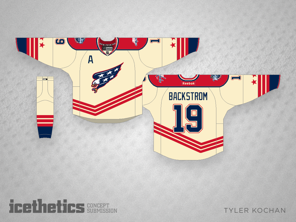
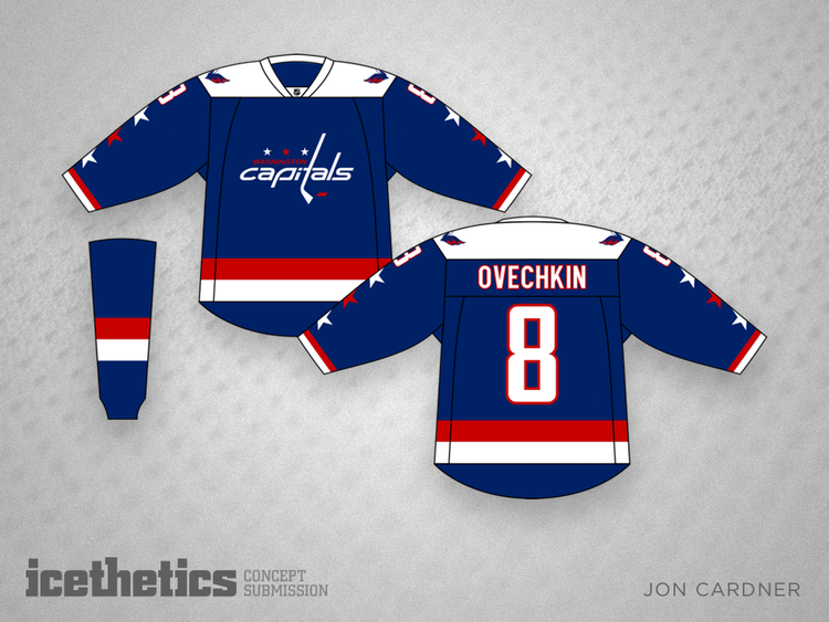
First off, let's just all agree that we dodged a bullet on this one (prototype jersey from when they were re-designing in the mid-2000s)
capitals-weagle-prototype-jersey.jpg


Jerseys I'd prefer as alternates:

Caps-SS.jpg

(With full Capitals nameplate rather than "Caps")

1476578988578


0505-joncardner-wsh3.png


38080903_538121713278698_8411186183513571328_n-1024x1024.jpg

(Probably not full season, but say there was an outdoor game at FedEx or something and they wanted a crossover)
 

Ridley Simon

HFBoards Sponsor
Sponsor
Feb 27, 2002
18,267
9,253
Marin County — SF Bay Area, CA
Disagreed 100% about the jerseys. Caps alternates are super boring. Mediocre throwbacks to an era of Capitals hockey where the team did nothing noteworthy. I'd much rather the team have an actual alternate jersey. And in no world should those alternates replace the main sweaters.

Worst take I’ve seen in a long time. Yikes.

Good thing he had me on ignore.
 

Ridley Simon

HFBoards Sponsor
Sponsor
Feb 27, 2002
18,267
9,253
Marin County — SF Bay Area, CA
The way I remember it there were people that rated the Caps uniforms the best in the league back than and then other would say the worst. They were the most expensive to make at the time. I know that much. Each letter was individually stitched on. They also originally came with white pants which lasted about 3 games. I cant agree with the 6 year old comment. That is over the top hate.

It’s funny that someone mocked the use of 2 primary colours (Red and Blue). Right. Let’s just totally ignore where the color scheme comes from.

Total shake my head moment.
 
  • Like
Reactions: VaCaps Fan and txpd

twabby

Registered User
Mar 9, 2010
13,719
14,632
Gross. Their current whites are atrocious. The piping is hideous.

Other people always mention piping when they are analyzing jerseys and I guess I just don’t care? I like the main logo quite a bit, the weagle is a perfect arm logo, and I just think the white looks cleaner than the red.

Also the advanced stats support my opinion so please close the thread now thanks. :laugh:
 

Devil Dancer

Registered User
Jan 21, 2006
18,458
5,445
Disagreed 100% about the jerseys. Caps alternates are super boring. Mediocre throwbacks to an era of Capitals hockey where the team did nothing noteworthy. I'd much rather the team have an actual alternate jersey. And in no world should those alternates replace the main sweaters.
100% agree, they're a throwback to an era of ugly jerseys. I don't mind them wearing them occasionally for nostalgia, but it's not a great jersey.

Voted current road whites, though the current home reds are fine too.

My favorite all time might be the white flying Eagle.

Wish they would do a Weagle logo jersey in blue.
 
  • Like
Reactions: Hivemind

AlexBrovechkin8

At least there was 2018.
Sponsor
Feb 18, 2012
26,854
25,317
District of Champions
First off, let's just all agree that we dodged a bullet on this one (prototype jersey from when they were re-designing in the mid-2000s)
capitals-weagle-prototype-jersey.jpg


Jerseys I'd prefer as alternates:

Caps-SS.jpg

(With full Capitals nameplate rather than "Caps")

1476578988578


0505-joncardner-wsh3.png


38080903_538121713278698_8411186183513571328_n-1024x1024.jpg

(Probably not full season, but say there was an outdoor game at FedEx or something and they wanted a crossover)

Love the Stadium Series jersey and the other mock-ups you posted are great, but I thought jerseys with stars on them look like they've been designed by 6-year olds? :sarcasm:
 
  • Like
Reactions: Ridley Simon

Ovechkins Wodka

Registered User
Dec 1, 2007
17,554
7,265
DC
First off, let's just all agree that we dodged a bullet on this one (prototype jersey from when they were re-designing in the mid-2000s)
capitals-weagle-prototype-jersey.jpg


Jerseys I'd prefer as alternates:

Caps-SS.jpg

(With full Capitals nameplate rather than "Caps")

1476578988578


0505-joncardner-wsh3.png


38080903_538121713278698_8411186183513571328_n-1024x1024.jpg

(Probably not full season, but say there was an outdoor game at FedEx or something and they wanted a crossover)
I would so buy the retro blue
 

Ad

Upcoming events

Ad

Ad