Stadium Series Jersey

Waffle Fries

Registered User
Mar 7, 2013
18,086
2
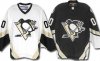
I never knew people hated the blue jerseys so much. I thought for sure the darker blue one would have been liked better compared to the lighter, but this was unexpected. I love both, with my preference going to the '08 jersey (even though I have a Malkin jersey from '11).

I was never a fan of the blue jerseys, but I think the curse they seemed to carry really solidified the hatred.
 

Fire Shero*

Guest
I loved both blue jerseys, but I'm nervous about this one. Could be islanders bad...
 

Shrimper

Trick or ruddy treat
Feb 20, 2010
104,198
5,275
Essex
I liked the light blue, had the dark blue not had so many stripes it would've been nice.

I'm actually quite excited for this now.
 

bathroomSTAAL

The halcyon days
Mar 15, 2007
16,325
5,186
Pittsburgh
Couldn't disagree more. Patterns and what not were fine, but the light blue itself... well, they looked like one half of a powder puff game. I have yet to see a uniform that looks good in that color.
Eh, **** masculinity. Just because a color is bright doesn't make it feminine.
 

The Tang

I like gooooollllddd
Sep 19, 2002
7,394
1
Pittsburgh. PA
Visit site
Eh, **** masculinity. Just because a color is bright doesn't make it feminine.

It's not about masculinity, the color in general is just bad. If they used the darker blue from the late 70's or hell, even the darker blue from the second winter classics, it would be much better. The masculinity is more of a side effect.
 

Big McLargehuge

Fragile Traveler
May 9, 2002
72,188
7,742
S. Pasadena, CA
because seats arent replaceable

Which is why I said decade instead of 35 years. They didn't put vegas gold all over that arena to replace it a couple years down the line. Seats are re-upholstered every 10-15 years, so I wouldn't bet on a color change being considered until Consol gets it's first round of renovations in a dozen or so years (see: Lightning, Tampa Bay).

Couldn't disagree more. Patterns and what not were fine, but the light blue itself... well, they looked like one half of a powder puff game. I have yet to see a uniform that looks good in that color.

Vehemently disagree. That powder blue was gorgeous, especially when paired with white. It's probably my favorite shade of blue for a hockey team, but there's examples of that shade looking glorious in all other sports as well in my eyes (Chargers, Nuggets, Royals, etc.). It should never be a primary color for a team called the Pittsburgh Penguins, but my ideal jersey set would have dark and light 1980-92 jerseys as the primaries and the powder blues as alternate.
 

Finesse

nostromo
Dec 9, 2013
4,632
426
Have to admit, I always hated the blue jerseys. Even the originals. And I don't have much hope for liking these new "chrome" sweaters. Sounds fairly cheesy. I just wish they'd bring back real "Black and Gold" (ie Yellow, not vegas gold).
 

BlindWillyMcHurt

ti kallisti
May 31, 2004
34,459
28,621
I actually really liked the powder blues... at first.

Then came the troubles.

As for the new ones... we all know they are gonna be double-ugly, right?
 

BlindWillyMcHurt

ti kallisti
May 31, 2004
34,459
28,621
To be fair, people still sporting acid washed jeans and rat-tails tend to be pretty excitable about most things, from my experience. But, in particular, the dulcet tones of Ronnie James Dio and the absolute necessity of making certain your Trans Am is equipped with a t-top.

Just like the Bandit.
 

The Tang

I like gooooollllddd
Sep 19, 2002
7,394
1
Pittsburgh. PA
Visit site
Vehemently disagree. That powder blue was gorgeous, especially when paired with white. It's probably my favorite shade of blue for a hockey team, but there's examples of that shade looking glorious in all other sports as well in my eyes (Chargers, Nuggets, Royals, etc.). It should never be a primary color for a team called the Pittsburgh Penguins, but my ideal jersey set would have dark and light 1980-92 jerseys as the primaries and the powder blues as alternate.

Yeah, I think all of those teams look like jokes in those uniforms. I honestly can't take a team seriously when they have it on. I know its all a matter of taste, but light blue to me, it's never looked good on any uniform.
 

PensBandwagonerNo272*

Forgot About Sid
Sep 10, 2012
12,530
9
light blues are a classic imo

best jersey color

chargers powder blues --> best jersey in sports

ladainian-tomlinson-powder-blue-jersey.jpg
 

CraigAdamsnumber1fan*

Guest
I really doubt they're going to go with blue.

I hope for the early 90's throwback pls.
 

doob

Registered User
Jan 9, 2011
91
1
Maybe in the pics they aren't right side up and they are just teasing us. Maybe they will look like these. My favorite.
 

Attachments

  • pensjersey.jpg
    pensjersey.jpg
    20.5 KB · Views: 14

BrunoPuntzJones

Biscuit Scorer
Apr 17, 2012
4,901
28
Washington, DC
I think I'm the only person in the world who likes the Islanders' Stadium Series uniform. The chrome logo is a little goofy but everything else was pretty spiffy.
 

Ad

Upcoming events

Ad

Ad