
Stadium Series Jersey
- Thread starter Stad
- Start date
You are using an out of date browser. It may not display this or other websites correctly.
You should upgrade or use an alternative browser.
You should upgrade or use an alternative browser.
Shockmaster
Registered User
- Sep 11, 2012
- 16,013
- 3,382
I don't think the flying pigeon will be apart of it since it's the traditional skating penguin logo they have on NHL.com, plus that logo is probably the least liked of them all.
Modern day interpretations of the 80's/ early 90's would be nice but I doubt it happens.
The logo is going to be the current Penguins logo in chrome.

The Tang
I like gooooollllddd
The logo is going to be the current Penguins logo in chrome.
The only doubt I have (and it's quite small mind you) is because I'm pretty sure they didn't reveal the different Isles logo until the unveiling.
MetalheadPenguinsFan
Registered User
I wonder if these will just be worn once or if they'll become our new alternates?
If we didn't have that stupid chrome logo nonsense like how other participating Stadium Series teams do as well then I could maybe see us using them afterwards as third jerseys like how we used our '08 and then 2011 Winter Classic jerseys as our alternates after each of those Winter Classics.
But who knows....
SUBdrewgANS
Let's Go Pens!
The logo is going to be the current Penguins logo in chrome.
the chrome idea is stupid.
I understand them wanting to modernize jerseys.. I mean I get it.. I don't agree with it.. but chrome is not modern.. it is pretty outdated.. it's not the early 2000's anymore.
I mean look at this flyers logo for example.. it was a product of the times, but it is horrible

and the predators original logo compared to the redesign

bathroomSTAAL
The halcyon days
Nah, that was released along with the other ones before the unveiling too.The only doubt I have (and it's quite small mind you) is because I'm pretty sure they didn't reveal the different Isles logo until the unveiling.
These jerseys are going to be the worst ones ever.
I'm not giving up hope completely, but yeah, chances are, this will be the reaction when they are unveiled.

The Tang
I like gooooollllddd
These jerseys are going to be the worst ones ever.
I have a hard time fathoming them coming up with something worse than the last winter classic. Even chrome is better than that garbage
MrBurghundy
I may be older but I'm never forgetting #47 & #41
I have a hard time fathoming them coming up with something worse than the last winter classic. Even chrome is better than that garbage
I wouldn't test them.
412 Others
5Cups beats 2Cups
with the recent obsession with blue and the ongoing obsession with "family atmosphere", this jersey could've been blue on blue with a care bear shoulder patch. guess i'll settle for this chrome thing. not going to (pittsburgh) black and yellow is highly disappointing though.
wgknestrick
Registered User
- Aug 14, 2012
- 5,966
- 2,889
I wouldn't test them.
Fox sports robot shooting a Foxtrax puck as our logo?
Where do I sign?
Shockmaster
Registered User
- Sep 11, 2012
- 16,013
- 3,382
The only doubt I have (and it's quite small mind you) is because I'm pretty sure they didn't reveal the different Isles logo until the unveiling.
All Stadium Series logos are chrome. The NHL revealed them a while back.
#66
Registered User
I'm hoping for the 90's jersey with the vegas gold. Keep it simple and don't make anything stupid... like the Isles.
Big McLargehuge
Fragile Traveler
Ugh, I hate these sneak peak things teams have started to do.
It's going to be hideous, I don't need to see a different swath of fabric once a week to know that.
It's going to be hideous, I don't need to see a different swath of fabric once a week to know that.
Guins71
Registered User
- Mar 22, 2004
- 1,043
- 15
Ugh, I hate these sneak peak things teams have started to do.
It's going to be hideous, I don't need to see a different swath of fabric once a week to know that.
It's well on it's way to being ridiculously ugly. Hate everything about the Vegas gold. It was cool the first year. It shows very poorly on television.
Big McLargehuge
Fragile Traveler
I still like the vegas gold in theory, but it doesn't work with RBK's fabric at all...it just washes out into a bland, uninteresting beige without having that sheen that the pre-Edge jerseys had.
Still pisses me off that they built those vegas gold seats into Consol, that meant we were doomed to another decade (at least) of the color sticking around.
Still pisses me off that they built those vegas gold seats into Consol, that meant we were doomed to another decade (at least) of the color sticking around.
#66
Registered User
SUBdrewgANS
Let's Go Pens!
I still like the vegas gold in theory, but it doesn't work with RBK's fabric at all...it just washes out into a bland, uninteresting beige without having that sheen that the pre-Edge jerseys had.
Still pisses me off that they built those vegas gold seats into Consol, that meant we were doomed to another decade (at least) of the color sticking around.
because seats arent replaceable
wgknestrick
Registered User
- Aug 14, 2012
- 5,966
- 2,889
The Tang
I like gooooollllddd
All Stadium Series logos are chrome. The NHL revealed them a while back.
I know, that wasn't what I had a doubt about.
I still like the vegas gold in theory, but it doesn't work with RBK's fabric at all...it just washes out into a bland, uninteresting beige without having that sheen that the pre-Edge jerseys had.
Fully agree. It's not really gold at all now just a crappy, dull beige.
I never knew people hated the blue jerseys so much. I thought for sure the darker blue one would have been liked better compared to the lighter, but this was unexpected. I love both, with my preference going to the '08 jersey (even though I have a Malkin jersey from '11).
The Tang
I like gooooollllddd
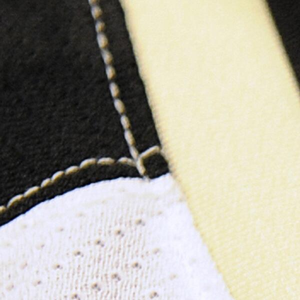
So black shoulder section (and yellow stitching) with a gold bar down the sleeve? Does not sound promising if that's what we're looking at.
Ad
Latest posts
-
 Your Wildly Outrageous (History of) Hockey Opinions...
- Latest: BigBadBruins7708
-
 Name a move that you want your GM to make this offseason
- Latest: GeeoffBrown
-

-
 GDT: ECF: Game 1 - New York Rangers vs Florida Panthers, 8pm ET, ESPN
- Latest: mandiblesofdoom
Upcoming events
-

-
-
 BET ON ONLY ONE HORSE WATCH LIVE - FINGER LAKES RACE 1 - Farmington, NYWagers: 4Staked: $815.00Event closes
- Updated:
-
-