Confirmed with Link: RIP Wordmark: Vancouver's uniforms have been modified for 2019-20 (leaked, then confirmed)

What do you think the Canucks should do with their jerseys?


  • Total voters
    113
Status
Not open for further replies.

Mr. Canucklehead

Kitimat Canuck
Dec 14, 2002
40,506
31,321
Kitimat, BC

GetFocht

Indestructible
Jun 11, 2013
9,077
4,373
One thing that has always bugged me about the current logo is that the Orca is trimmed in silver, for some inexplicable reason. It would seem far more fitting with the rest of the jersey to trim it in the same green that garnishes other spots on the jersey.

That said, that's a very nice rendering.

I think why they did this is because they wanted to simplify the logo to accomodate the wordmark otherwise it would have looked too busy. I think they will add green to the logo if they remove the word mark
 
  • Like
Reactions: Mr. Canucklehead

WHISTLERNATE

Registered User
Nov 14, 2017
849
505
OK, so what I have got out of this thread:
- Black Skate jersey coming back for a handful of games
- Wordmark likely gone from home and away jersey
- Orca likely updated to include green
- Seats at GM Place to be replaced in team colors
- New 3rd on the way, not much info on that as of yet
 
  • Like
Reactions: Boeser Fan

Bettman Returnz

Why so serious?
Jul 28, 2003
4,788
2,675
BC
Visit site
One thing that has always bugged me about the current logo is that the Orca is trimmed in silver, for some inexplicable reason. It would seem far more fitting with the rest of the jersey to trim it in the same green that garnishes other spots on the jersey.

That said, that's a very nice rendering.
I agree !!! Hate the silver and still don’t get the dark blue orca either. My ocd doesn’t understand it. I mean this concept looks better but the orca is still such a lame logo. Still holding on to hopes that Johnny Canuck logo takes over soon.
 
  • Like
Reactions: MikeK

MikeK

Registered User
Nov 10, 2008
10,728
4,273
Earth
I agree !!! Hate the silver and still don’t get the dark blue orca either. My ocd doesn’t understand it. I mean this concept looks better but the orca is still such a lame logo. Still holding on to hopes that Johnny Canuck logo takes over soon.

Yep. Never been a fan of the Orca and can go as far as to say I hate it. Almost anything would please me more than it.
 

polarbearcub

Registered User
May 7, 2011
13,845
1,903
Vancouver
Just noticed how there is a hockey stick built in to the Canucks 50th season logo in the 5.

I wonder if that’s a hint at the new main jerseys ? Or just a nod to the original logo
 

Attachments

  • 0E777A28-1B06-4404-827A-EEA7CC6E963A.jpeg
    0E777A28-1B06-4404-827A-EEA7CC6E963A.jpeg
    86.6 KB · Views: 3

82Ninety42011

Registered User
Jul 2, 2011
7,659
5,650
Abbotsford BC
Go back to the original design for the primary and the black skate jersey for alternate 3rd. Anytime there is a poll I believe this is the consensus anyway why they don't listen is beyond me.
 

Mr. Canucklehead

Kitimat Canuck
Dec 14, 2002
40,506
31,321
Kitimat, BC
I don't even care if they leave the wordmark or not. Just stick with something and build some history, no more flip flopping.

Put a 50 on it and be done with it.

This. I was surprised to note the other day that the current set of jerseys is the longest set that has been employed by the franchise - but we’ve still had an embarrassing amount of “complete overhauls” to our look.

1970-1978 - Rink and Stick
1979-1984 - Flying V
1985-1997 - Skate (major change to looks from 89-97, but logo stayed same)
1998-2007 - Orca
2007-Present - Current Getups
 
  • Like
Reactions: ayoshi

me2

Go ahead foot
Jun 28, 2002
37,903
5,595
Make my day.
This. I was surprised to note the other day that the current set of jerseys is the longest set that has been employed by the franchise - but we’ve still had an embarrassing amount of “complete overhauls” to our look.

1970-1978 - Rink and Stick
1979-1984 - Flying V
1985-1997 - Skate (major change to looks from 89-97, but logo stayed same)
1998-2007 - Orca
2007-Present - Current Getups

I was looking at nhluniforms.com and you can see how long some of the originals teams have their identity. Tweeks and such to patterns and logos but they are identifiably redwings or Chicago or Boston.
 

brokenhole

Registered User
Aug 12, 2015
1,135
408
Knowing Benning it will be an abomination of Johnnie Canuck with a wordmark undeneath saying...
He can walk the line.
 

Kryten

slightly regarded
Sponsor
Sep 29, 2011
15,423
12,737
Kootenays
We the Aquilinis have listened to our fanbase and are pleased to announce our new team logo. Vancouver. Just the word, nothing else
 
  • Like
Reactions: Josepho

Seattle Totems

Registered User
Apr 14, 2010
3,894
1,138
Because hockey ops is responsible for the uniforms...

True but, it would surely be a heck of a lot better than our clueless former owner paying a "colour psychologist" $100,000 in the 70s to redesign our uniforms. The next clueless owner then decided that an orca would best represent a Canuck and dressed the team in yet another colour scheme tangent that will never be pined for or brought back.

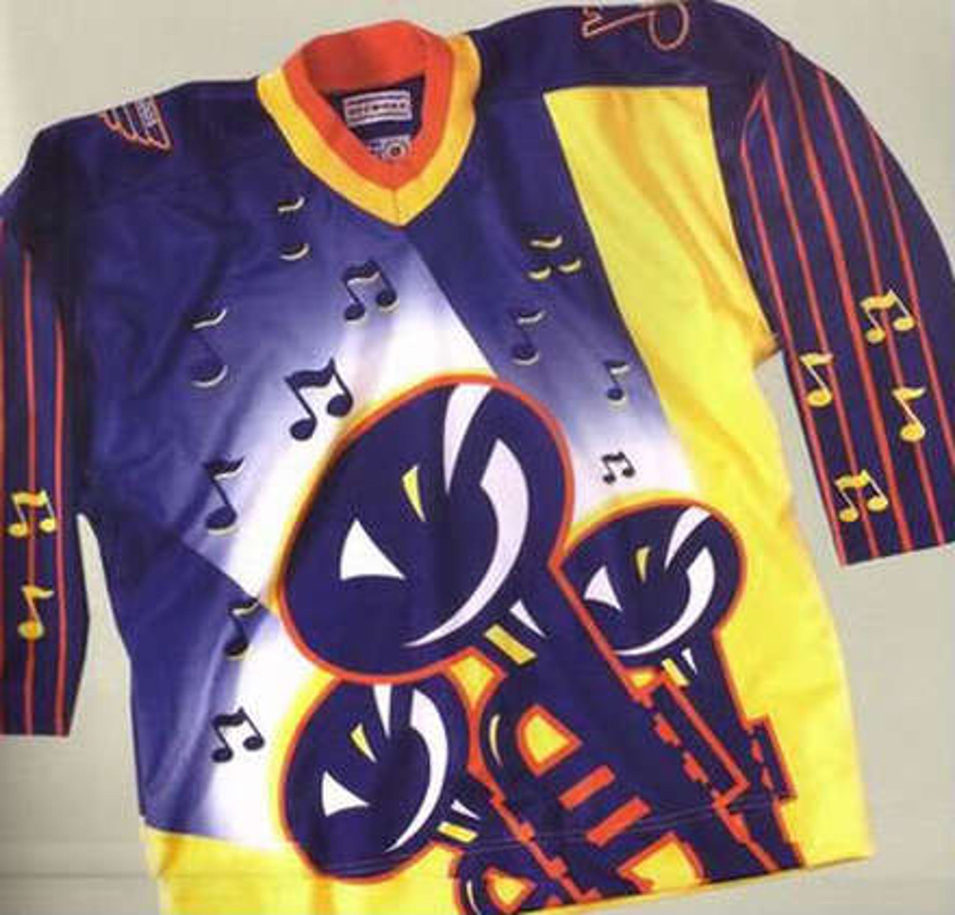
Someone also mentioned Mike Keenan in this thread. I wish we were so lucky to have him around making uniform decisions. People forget that he vetoed the St Louis Blues "cool cat" uniforms after they were put into production. That would've been almost as bad as the Flying V.

18j4tzg1jx4j4jpg.jpg
 

Mr. Canucklehead

Kitimat Canuck
Dec 14, 2002
40,506
31,321
Kitimat, BC
True but, it would surely be a heck of a lot better than our clueless former owner paying a "colour psychologist" $100,000 in the 70s to redesign our uniforms. The next clueless owner then decided that an orca would best represent a Canuck and dressed the team in yet another colour scheme tangent that will never be pined for or brought back.

Someone also mentioned Mike Keenan in this thread. I wish we were so lucky to have him around making uniform decisions. People forget that he vetoed the St Louis Blues "cool cat" uniforms after they were put into production. That would've been almost as bad as the Flying V.

18j4tzg1jx4j4jpg.jpg

That atrocity would have made the Flying V look like the best uniform in the history of professional sports. Holy God.
 

Kryten

slightly regarded
Sponsor
Sep 29, 2011
15,423
12,737
Kootenays
True but, it would surely be a heck of a lot better than our clueless former owner paying a "colour psychologist" $100,000 in the 70s to redesign our uniforms. The next clueless owner then decided that an orca would best represent a Canuck and dressed the team in yet another colour scheme tangent that will never be pined for or brought back.

Someone also mentioned Mike Keenan in this thread. I wish we were so lucky to have him around making uniform decisions. People forget that he vetoed the St Louis Blues "cool cat" uniforms after they were put into production. That would've been almost as bad as the Flying V.

18j4tzg1jx4j4jpg.jpg
Lets not forget our current clueless owner who dished out 2 million dollars to a designer to change the uniform to the original colours, add a wordmark, and change the letter/number font.
 

sting101

Registered User
Feb 8, 2012
15,929
14,836
Get rid of the stupid free willy orca bay that has nothing to do with Canucks. Go to the V and adjust the jersey and pants accordingly
 
Status
Not open for further replies.

Ad

Upcoming events

Ad

Ad