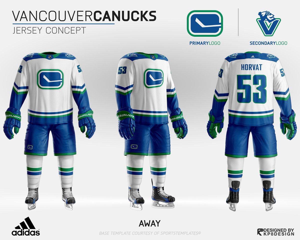
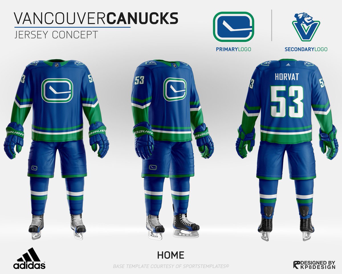
Confirmed with Link: RIP Wordmark: Vancouver's uniforms have been modified for 2019-20 (leaked, then confirmed)

What do you think the Canucks should do with their jerseys?


  • Total voters
    113
Status
Not open for further replies.

JT Milker

Registered User
Mar 24, 2018
1,276
1,265
I’m not even a huge fan of these but I like them better than what we’re getting. There’s actually green In the jerseys
DELd9xDUMAArtfb.jpg
DELd8guUMAA2tH2.jpg

Shoulder patch (and Johnny Canuck no less) combined with the blocked shoulders and the striping are horrid, but I'd take them given they have the stick in rink.

Also, you guys really shouldn't wear team apparel unless you're going to a game lol, the orca may be a bit childish but wearing a jersey/shirsey casually is much more so.
 

Bettman Returnz

Why so serious?
Jul 28, 2003
4,788
2,675
BC
Visit site
Should the canucks tweak the jersey they have ie getting rid of the lettering or go for an entirely new design? They have history of identity issues with the wide and disparate jerseys they've had. What do you guys think?


--------

MOD INSERT:

Chris Creamer confirms an alleged leak of a new uniform posted to r/hockeyjerseys and Twitter on May 28th is legitimate. The "VANCOUVER" wordmark is gone, and the shoulder patches are now white.

Leaked: Canucks New Uniforms for 2019-20 | Chris Creamer's SportsLogos.Net News and Blog : New Logos and New Uniforms news, photos, and rumours


Thanks for nothing, wordmark. You will not be missed.

And the exact same logo, just blown up! No green added!? Yawn...
 

The Drop

Rain Drop, Drop Top
Jul 12, 2015
14,873
4,060
Vancouver
Shoulder patch (and Johnny Canuck no less) combined with the blocked shoulders and the striping are horrid, but I'd take them given they have the stick in rink.

Also, you guys really shouldn't wear team apparel unless you're going to a game lol, the orca may be a bit childish but wearing a jersey/shirsey casually is much more so.
Agreed. Let’s all grow beards, man buns, buy flannel and buy a pair of steel toe Blundstones and pretend we work hard for a living.
 
  • Like
Reactions: Green Blank Stare

Green Blank Stare

Drance approved coach
May 16, 2019
1,317
1,612
The skate logo looks great on fan gear but the overall uniform itself isn't as good as the current ones or the stick in rink.
 

JT Milker

Registered User
Mar 24, 2018
1,276
1,265
Agreed. Let’s all grow beards, man buns, buy flannel and buy a pair of steel toe Blundstones and pretend we work hard for a living.

Why would that be the only (and equally silly) alternative to wearing a Canucks jersey and snap back anywhere but at a game?
 

lawrence

Registered User
May 19, 2012
15,964
6,740
speaking of jerseys I thought their would be "sweeping changes" according to icetheltics or something. Removing the Vancouver words keeping the orca, is not "sweeping" at all.
 

JT Milker

Registered User
Mar 24, 2018
1,276
1,265
I just think it’s silly to judge or tell people what to wear. I’d never wear a Canucks jersey around but far be it for me to discourage someone who may enjoy wearing it. All the power to them.

If someone wants to wear it, so be it, but don’t complain about the logo being childish. I wouldn’t eat baby food and complain that the flavour profile was childish.
 

Seattle Totems

Registered User
Apr 14, 2010
3,891
1,131
speaking of jerseys I thought their would be "sweeping changes" according to icetheltics or something. Removing the Vancouver words keeping the orca, is not "sweeping" at all.

No its not a sweeping change to the primary uniforms. Icethetics occasionally puts out misleading information to generate interest and get traffic. Its kind of silly considering that hes seen every new uniform ahead of time, but if he didnt "speculate" he'd have little to write about.
 

The Stig

Your hero.
Feb 14, 2013
15,620
3,794
Maple Ridge B.C.
True on all accounts except ONE thing...a Canuck is not an animal. The Orca was inspired by the former Orca Bay Sports & Entertainment ownership. Johnny Canuck inspired the Canucks name. His lumberjack profession is a tribute to BC's longstanding lumber industry which helped build the City of Vancouver.

The classic Stick in Rink C and Johnny Canuck are the true co-identities of the Canucks.View attachment 231943

Actually the team was named to honor Canadian soldiers, who were called Canucks by ally soldiers. The soldiers nickname came from the comic about Johnny Canuck.
 
  • Like
Reactions: VanCity15

crazychimp

Registered User
Jun 24, 2014
2,784
706
Vancouver
Personally I like the original 1970 jerseys, I like the old school look, that's what the original Canucks wore to me that has historical value, 1970 was a long ass time ago. As an alternate I'd go with the skate jersey, I feel like it has that nostalgia feeling, people loved the 94 Canucks and they associate those jersey's with that time and with that great run that they had. The modernized stick logo is pretty lame and as is the Orca.
 
  • Like
Reactions: VanCity15

Bettman Returnz

Why so serious?
Jul 28, 2003
4,788
2,675
BC
Visit site
As much as I don’t care for the orca logo, I could live with it if there was some green on it (at very least outlined). Since we have green stripes on our jersey it should be incorporated into the logo. Otherwise, what’s the point?! To me that seems very “rec” (let’s find a jersey we like and slap on our random beer league logo for sh*%$ and giggles).
 
  • Like
Reactions: Jyrki21

Jyrki21

2021-12-05
Sponsor
As much as I don’t care for the orca logo, I could live with it if there was some green on it (at very least outlined). Since we have green stripes on our jersey it should be incorporated into the logo. Otherwise, what’s the point?! To me that seems very “rec” (let’s find a jersey we like and slap on our random beer league logo for sh*%$ and giggles).
It absolutely ruins non-jersey merchandise, which often doesn’t have a shred of green on it (especially with plain white numbers) and looks like Leafs/Lightning gear.

Like, what is this?

9E873F98-16A3-4762-92BF-534521B100C1_zpseusifvwg.jpg


It’s such a basic design principle, it’s mind-boggling to me that no one with the team finds this weird. All it takes is a dab – the Seahawks figured it out.
 
Last edited:

CascadiaPuck

Proud Canucks investor.
Jan 13, 2010
1,767
2,270
Vancouver
speaking of jerseys I thought their would be "sweeping changes" according to icetheltics or something. Removing the Vancouver words keeping the orca, is not "sweeping" at all.

Icethetics was probably just making a separate reference to the custodial staff getting new brooms.

I’m not even a huge fan of these but I like them better than what we’re getting. There’s actually green In the jerseys
DELd9xDUMAArtfb.jpg
DELd8guUMAA2tH2.jpg

These are quite nice. I'd prefer it if the Millionaire V (in blue) was the secondary logo and used for the shoulder patches instead though.
 
Status
Not open for further replies.

Ad

Upcoming events

Ad

Ad