Confirmed with Link: RIP Wordmark: Vancouver's uniforms have been modified for 2019-20 (leaked, then confirmed)

What do you think the Canucks should do with their jerseys?


  • Total voters
    113
Status
Not open for further replies.

CJZizzari

Registered User
Feb 24, 2019
50
72
Should the canucks tweak the jersey they have ie getting rid of the lettering or go for an entirely new design? They have history of identity issues with the wide and disparate jerseys they've had. What do you guys think?


--------

MOD INSERT:

Chris Creamer confirms an alleged leak of a new uniform posted to r/hockeyjerseys and Twitter on May 28th is legitimate. The "VANCOUVER" wordmark is gone, and the shoulder patches are now white.

Leaked: Canucks New Uniforms for 2019-20 | Chris Creamer's SportsLogos.Net News and Blog : New Logos and New Uniforms news, photos, and rumours


Thanks for nothing, wordmark. You will not be missed.
 
Last edited by a moderator:

The Vasili Jerry

Serenity now!
Jun 11, 2011
5,309
7,318
Orange County
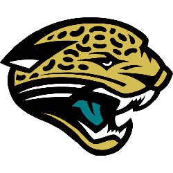
I think the current theme works well but I'd like to see some tweaks. The current color scheme is fine and the idea behind the logo is great (Haida style) but updating it would be nice. Something like how the Jacksonville Jaguars tweaked their logo a few years back.

From this:
jacksonville_jaguars_1995-2012.png

To this:
jacksonville_jaguars_2013-pres.png

Adding some kind of new style black jersey would be sweet too. Black jerseys are always awesome.
 

Kryten

slightly regarded
Sponsor
Sep 29, 2011
15,130
12,405
Kootenays
Minor tweeks. Just delete the wordmark and change the goofy-ass lettering and numbers back to a hockey font
 

member 290103

Guest
I think the current theme works well but I'd like to see some tweaks. The current color scheme is fine and the idea behind the logo is great (Haida style) but updating it would be nice. Something like how the Jacksonville Jaguars tweaked their logo a few years back.

From this:
jacksonville_jaguars_1995-2012.png

To this:
jacksonville_jaguars_2013-pres.png

Adding some kind of new style black jersey would be sweet too. Black jerseys are always awesome.

Weird, why would the Jags do such a minor overhaul? I guess the revised version is better.
 

The Vasili Jerry

Serenity now!
Jun 11, 2011
5,309
7,318
Orange County
Weird, why would the Jags do such a minor overhaul? I guess the revised version is better.
Its basically updating it to keep in line with their history but making it more contemporary. Would love the Canucks to use a firm like the one who did the Jags’ update. Seems like they maybe use a cut-price in-house team?
 

polarbearcub

Registered User
May 7, 2011
13,845
1,903
Vancouver
There’s rumblings from icethletics that there will be a new primary jersey. That could mean just removing the word mark.

What we do know : for next year

Brand new third jersey
Black skate logo to be worn multiple times

Icethletics says new primary.

What I think happens?

Tweaks to the current jersey. Hopefully the word mark. I refuse to buy a New Jersey until that horrendous amateur looking wordmark is gone. Listening aqua?

My wish? Updated stick and rink ( Similar to the recent third jersey) for home and away. Put an orca patch on the shoulder.

Done

If they went back full road and home to stick I would buy both.
 

sabremike

Friend To All Giraffes
Aug 30, 2010
22,762
34,179
Brewster, NY
My question: do you think the league will have enough common sense to have us and you guys open up the season against each other because of the 50th anniversaries?
 

polarbearcub

Registered User
May 7, 2011
13,845
1,903
Vancouver
My question: do you think the league will have enough common sense to have us and you guys open up the season against each other because of the 50th anniversaries?
Probably not. I say this because we usually open vs a division team. Usually Calgary or Edmonton
 

The Vasili Jerry

Serenity now!
Jun 11, 2011
5,309
7,318
Orange County
There’s rumblings from icethletics that there will be a new primary jersey. That could mean just removing the word mark.

What we do know : for next year

Brand new third jersey
Black skate logo to be worn multiple times

Icethletics says new primary.

What I think happens?

Tweaks to the current jersey. Hopefully the word mark. I refuse to buy a New Jersey until that horrendous amateur looking wordmark is gone. Listening aqua?

My wish? Updated stick and rink ( Similar to the recent third jersey) for home and away. Put an orca patch on the shoulder.

Done

If they went back full road and home to stick I would buy both.
I'm probably in the minority, but to me there's nothing about a stick in a rink that signifies Vancouver, or even BC. It's a generic idea for a generic hockey team. I'm probably in the minority again in thinking the current branding is the right direction (it just needs to be more aesthetically pleasing). It signifies the team's location and its identity.
Blue and green = forests meeting the Pacific Ocean
First Nations Art = historical nod to the area's first inhabitants/totems in Stanley Park/Bill Reid's sculpture in YVR/Museum of Anthropology
Orca = fierce, incredibly intelligent, always stick together with a core group that's particularly strong/native to the area
 

TruKnyte

On the wagon
Jan 1, 2012
5,938
3,332
Vancouver, BC
I'm probably in the minority, but to me there's nothing about a stick in a rink that signifies Vancouver, or even BC. It's a generic idea for a generic hockey team. I'm probably in the minority again in thinking the current branding is the right direction (it just needs to be more aesthetically pleasing). It signifies the team's location and its identity.
Blue and green = forests meeting the Pacific Ocean
First Nations Art = historical nod to the area's first inhabitants/totems in Stanley Park/Bill Reid's sculpture in YVR/Museum of Anthropology
Orca = fierce, incredibly intelligent, always stick together with a core group that's particularly strong/native to the area

I like the Orca as well. Just get rid of the wordmark and keep the same colour scheme.
 

Cupless44

Registered User
Jun 25, 2014
7,154
3,298
The wordmark has to go no question. We are the only team that has it and it looks stupid.

I would settle for that but wouldn’t mind seeing what a cool looking Johnny Canuck would be like.

Same colours.
 
  • Like
Reactions: Bettman Returnz
Status
Not open for further replies.

Ad

Upcoming events

Ad

Ad