Right, I like the jersey, the colors remind me of the late 70's Penguins jerseys before they switched to black/gold. But the logo is pure minor-league.
The wolf is not a bad jersey/design. Colours scheme is dated but that's fixed easy enough. I'd say it wasn't NHL caliber, but after looking at what the NHL does and has had for jersey design that wouldn't quite be true.
It's just that the Nordiques ones are that much better.
At one time the Nordiques in their final years were my favourite version, but now my top Nordiques uniform choice is this WHA one.
I am almost thankful the Nordiques moved instead of wearing those horrid wolf jerseys. Actually, I think there would have been enough backlash that they would scrap the idea or switch back after a year or two so bring hockey back to QC.
I am almost thankful the Nordiques moved instead of wearing those horrid wolf jerseys. Actually, I think there would have been enough backlash that they would scrap the idea or switch back after a year or two so bring hockey back to QC.
Shoutout to the 8-year-old post dropping a Web Warriors reference. I’d trade the next few NHL seasons for another chance to see Heavy Metal ramp it up.
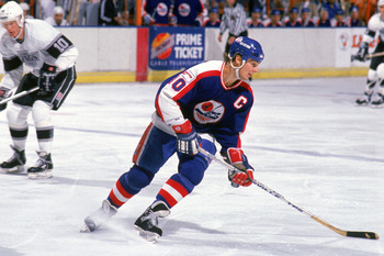
These jerseys illustrated the management issues within the organisation. Not on-ice issues, like when they got 3 straight 1st overall picks, but things were in a bad place and this picture is one more proof of it.
The wolf is not a bad jersey/design. Colours scheme is dated but that's fixed easy enough. I'd say it wasn't NHL caliber, but after looking at what the NHL does and has had for jersey design that wouldn't quite be true.
It's just that the Nordiques ones are that much better.
At one time the Nordiques in their final years were my favourite version, but now my top Nordiques uniform choice is this WHA one.
I actually don't think these Nords jerseys are that bad, it's just radically different than what we were used to, sort of "fixing what's not broken.
It would be in line with Sabres & Capitals re-design in the 90s, fine uniforms but people just like the old ones. The difference being the colours were more daring in the Nordiques case, but I think it walks the line without being ridiculous. A colour combination like that would be welcome in the NHL- just not at the expense of the fine uniform Quebec already had.
This site uses cookies to help personalise content, tailor your experience and to keep you logged in if you register.
By continuing to use this site, you are consenting to our use of cookies.