
SenatorArmy*
Guest
Yes. This should be our official logo. Any variation of it really. I was a big fan of the uniforms the team wore during the cup run year. The Heritage jerseys should be the permanent alternates
For those who hadn't seen this duo I did a little while ago

4th dimension is time, so the logo would be an old man or skeletonI'm looking forward to a 4d logo as the next step in our logo progression.

For those who hadn't seen this duo I did a little while ago
I know I'm in the minority here but always feel like those are missing something (besides shoulder patches). Feel like for example the black should have a white stripe worked in...
Speaking of shoulder patches - I want to see a return to using the peace tower logo on one side.
I always hated the first logo. It actually made it really hard for me to like the team for the first few years. Still think it's horrid. 3d was a huge improvement.
There was a news article I read a while back from the early 90's before the first season with a bunch of fans ******** on the "Trojan condom" logo. They were upset since they all ordered the Peace Tower logo jerseys during the Bring Back The Sens campaign, and then the Senators for what ever reason (possibly one out of their control) used a different logo.
Follow the Buffalo way of doing things (logo-wise... not their alternates). They came out with the gold slug after their love affair with the 3D wooly grey buffalo, realized it was terrible, and changed back to their original buffalo with the crossed sabres. They listened to majority opinion. I can't understand why the Senators refuse to do the same. All I can think of is that they want to keep the home jersey red, and the 2D looks terrible on a red jersey. Seems like their futile marketing and partnerships with Canadian Tire etc. are keeping them from listening to what their fans actually want.
Their unwillingness to listen the fans about what logo we want to be represented by is probably the single biggest thing that irks me about this team. We had the best jerseys in the league and they ruined it for no reason. It's time to right the mistake.
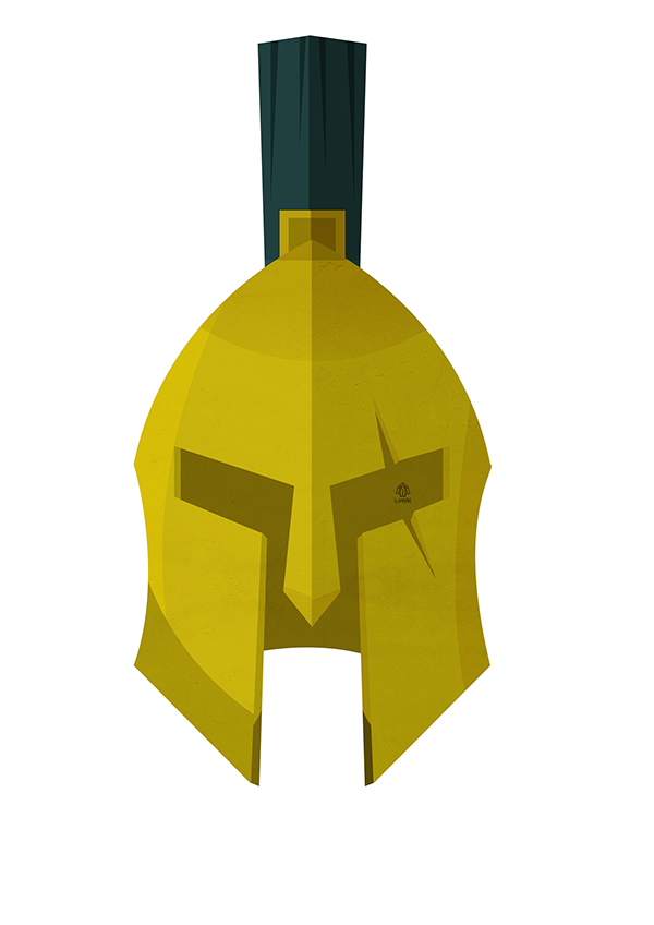
i wouldn't mind seeing something new. something real simple and badass. maybe something similar to this with the eyes as hockey sticks, and an 'O' and 'S' worked in? something the players can really feel good about (and tougher) pulling over their heads. imagine 6 of these on the ice together
The Peace Tower logo was garbage; hopefully that's why it was changed. They had a good concept in incorporating the Peace Tower into the design, but the execution was atrocious and looked like something a Junior A team would wear. The centurion logo, by comparison, can be placed alongside the logos of the O6 franchises, and it'll look like it's supposed to be there.
The Peace Tower logo was garbage; hopefully that's why it was changed. They had a good concept in incorporating the Peace Tower into the design, but the execution was atrocious and looked like something a Junior A team would wear. The centurion logo, by comparison, can be placed alongside the logos of the O6 franchises, and it'll look like it's supposed to be there.


Is the problem that Senators fans are too passive? Are our voices not loud enough? Are they seeking to attract new demographics? Well I say NO! enough is enough! Bring back the old logos or I will not contribute another dollar to this wishy-washy organization! What do we want? THE OLD LOGOS! When do we want them? NOW!!
What do we want? THE OLD LOGOS! When do we want them? NOW!!
Call me crazy but I've always liked this one:

