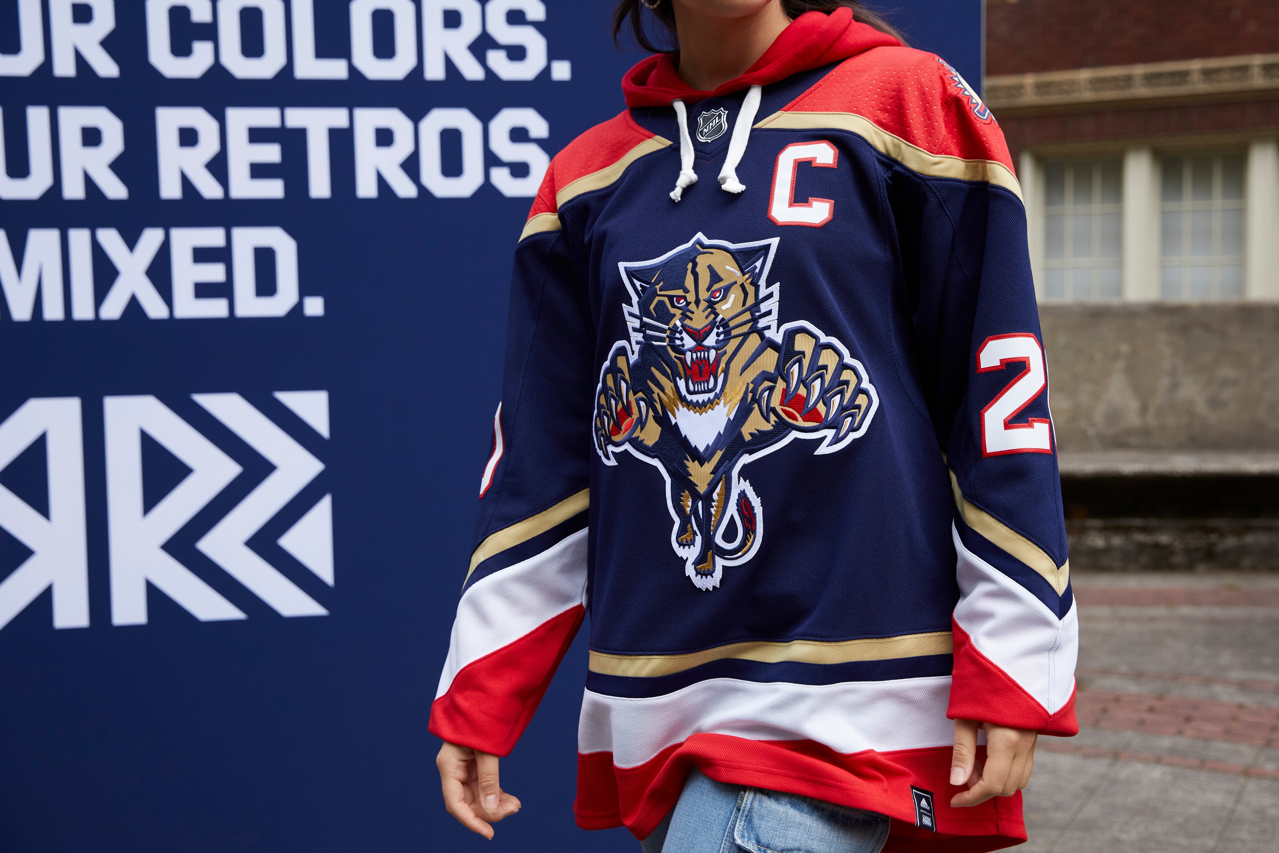
As a Panthers jersey collector, I'm in of course.
Glad they went with the OG Panther instead of the new minimalistic one. Only thing that bothers me here is the "96" on the neck cause we didn't have the blue until 98-99. Those details is what make jersey collecting fun, HUGE missed opportunity to make this the leaping Panther with the broken stick and the 98 on the collar, more accurate for my picky ass taste.
Also, funny if they would have dropped a Reverse Retro of the JetBlue to piss everyone off haha. (I own one and love it, don't really care about the hate on that thing)