Replacement*
Checked out
has anybody seen the oilers coke zero cans?
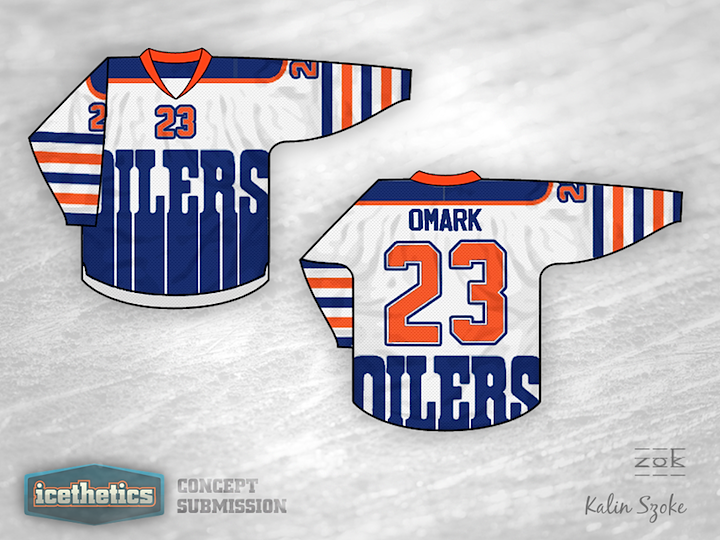
I thought that would be a sick jersey.

I like the fact that it actually looks like Oil.
Plus these sick cans are zeros as well so really apt.
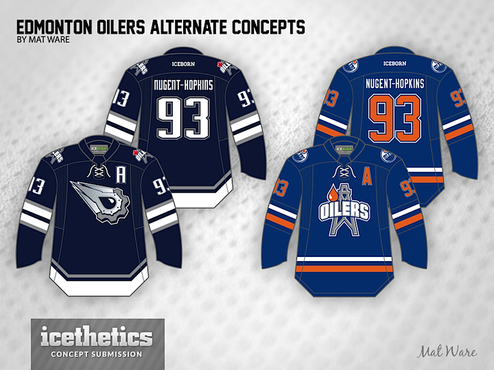
The "Smell the Glove" black is pretty rocking too.
Turn this up to 11..