New Flames Alternate Confirmed

Volica

Papa Shango
May 15, 2012
21,447
11,117
Ugly lol.
Wish if they had changed it, they'd have gone for something to mirror the team; I.e a new beginning, these things look like they were designed somewhere between 1984 and 1996... so ugly lol.
 

MC Ride

Feels bad man
Feb 4, 2009
2,544
0
I was secretly hoping the Flames were playing a joke and that the real alternate was the mustard heritage classic ones :(
 

Lunatik

Registered User
Oct 12, 2012
56,252
8,384
BXm9l3rCQAASsD0.jpg:large
not taken from a cell phone I actually don't mind them.

Not what I wanted but they aren't bad either. I LOVE the shoulder patch though, I hope those get on the main unis next year.
 

tmurfin

That’s the joke
May 8, 2010
11,243
1,280
If any of you guys watch the jersey video, just pause on the idea board they showed, and be thankful we came up with this one, some of the designs were insanely bad
 

Taranis

Registered User
Jul 9, 2013
5,975
27
Nova Scotia
The only problems I have are not having the Flaming C as the C in Calgary and the yellow strip looks out of place imo.

I completely agree with your comments. It's not that I feel the jersey is bad, rather just that its very average, and copying the written city name just speaks to the "meh" vibe for me.
 

TheHudlinator

Registered User
Nov 21, 2011
28,824
7,602
Victoria,BC
I completely agree with your comments. It's not that I feel the jersey is bad, rather just that its very average, and copying the written city name just speaks to the "meh" vibe for me.

Yea I feel like the colors chosen and the jersey outside of the logo are very well done but the logo seems like they just kind of threw it together.

Also I forgot to mentions I hate the spacing between the A on Glencross's and Cammy's jersey from the logo. Why did they cram such a big A in when the C is smaller and fits fine.

Ugh my OCD is kicking in :laugh:
 

InfinityIggy

Zagidulin's Dad
Jan 30, 2011
36,087
12,866
59.6097709,16.5425901
Yea I feel like the colors chosen and the jersey outside of the logo are very well done but the logo seems like they just kind of threw it together.

Also I forgot to mentions I hate the spacing between the A on Glencross's and Cammy's jersey from the logo. Why did they cram such a big A in when the C is smaller and fits fine.

Ugh my OCD is kicking in :laugh:

Exactly my feeling about them.
 

Lunatik

Registered User
Oct 12, 2012
56,252
8,384
Yea I feel like the colors chosen and the jersey outside of the logo are very well done but the logo seems like they just kind of threw it together.

Also I forgot to mentions I hate the spacing between the A on Glencross's and Cammy's jersey from the logo. Why did they cram such a big A in when the C is smaller and fits fine.

Ugh my OCD is kicking in :laugh:
I think the C and A should be on the right side on these jerseys, like Detroit. I think Abbotsford should do it too.
 

MC Ride

Feels bad man
Feb 4, 2009
2,544
0
I don't know how to link NHL.com videos but if anyone wants, there's A LOT of content about the new jersey on the Flames website
 

Kranix

Deranged Homer
Jun 27, 2012
18,287
16,359
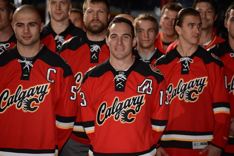
zellers kiddy bargain bin pajama jerseys. Why do the Flames keep dicking around with their uniforms?
The Flames have a classic uniform collecting dust. Are they not aware that the original 1980s uniform looks amazing? Home and away, the vintage one is great. No one has to agree with me-the Flames currently have the dumbest looking uniforms in the league. 30th out of 30.
I was hoping Burke would have an opinion and force King to change to the classic.
Also this reminds me of Anaheim's dumb purple and black baseball wordmark one, which seemed to be a transitional jersey to what they have now, so maybe when the Flames have got their fill of gouge money off of these ones, they'll tear it all down and go back to a professional looking uniform all around.

Gaaaahhh
*SHUDDER!*
 

Ad

Upcoming events

Ad

Ad