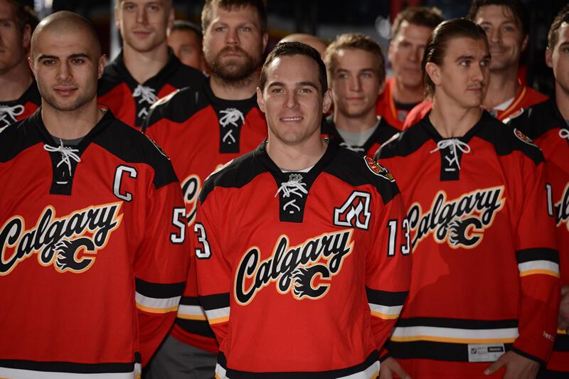
New Flames Alternate Confirmed

Nordberg

Registered User
Sep 22, 2009
1,591
0
Landskrona
NSH have great jerseys. The Minny aways are amazing, but their home jerseys have an awful color combination. Their alternates are great in every way except the trashy baseball wordmark.

Man can teams stop with the baseball wordmark garbage already. :shakehead
 

tmurfin

That’s the joke
May 8, 2010
11,243
1,280
Flames twitter just posted another tease, anyone wanna throw it up? I'm on mobile
 

TheHudlinator

Registered User
Nov 21, 2011
28,824
7,602
Victoria,BC
Flames twitter just posted another tease, anyone wanna throw it up? I'm on mobile

BXh6f2OCIAEDELk.jpg
 

Sean Monahan

JIMMIES ARE RUSTLED
Nov 25, 2011
4,298
1
Murrica
that's really disappointing if it's actually like the EA leak

more disappointing to learn that we're not going with our "old" alternates as our regulars.

Oilers kinda looked more revalent after their switch a few years ago
 

Lunatik

Registered User
Oct 12, 2012
56,252
8,384
that's really disappointing if it's actually like the EA leak

more disappointing to learn that we're not going with our "old" alternates as our regulars.

Oilers kinda looked more revalent after their switch a few years ago
With the exception of the wordmark the leaked 3rds are actually quite nice and the new shoulder patch is a thing of beauty. I am not a fan of the wordmark personally but it could lay the groundwork for some nice jerseys in the future if the change the logo on it. Quite honestly if they put a white C (with yellow and black outlines) and it's a thing of beauty.
 

1989

Registered User
Aug 3, 2010
10,409
3,961
I feel the standalone sweater is underwhelming, but like the Heritage Classic Ronald McDonald throwbacks, I want to see what they'll look like as a set on the ice. The throwbacks looked pretty good on the ice IMO, but are a pretty big eyesore just by themselves.

Edit - the best part of the sweater is definitely the shoulder patches.
 
Last edited:

Nordberg

Registered User
Sep 22, 2009
1,591
0
Landskrona
I feel the standalone sweater is underwhelming, but like the Heritage Classic Ronald McDonald throwbacks, I want to see what they'll look like as a set on the ice. The throwbacks looked pretty good on the ice IMO, but are a pretty big eyesore just by themselves.
You're right, but there's no getting around the fact that the logo with the wordmark is just utter manure. What were they thinking with that one?
 

1989

Registered User
Aug 3, 2010
10,409
3,961
BXm9l3rCQAASsD0.jpg:large


MacGrattan is one freaky hobo-looking dude while Backlund has his best Orlando Bloom impression going on.

Orlando_Bloom_at_Venice_Festival.jpg
 

Anglesmith

Setting up the play?
Sep 17, 2012
46,481
14,795
Victoria
I feel the standalone sweater is underwhelming, but like the Heritage Classic Ronald McDonald throwbacks, I want to see what they'll look like as a set on the ice. The throwbacks looked pretty good on the ice IMO, but are a pretty big eyesore just by themselves.

Yeah, when the jerseys were first leaked, my biggest issue with them was that they clashed horribly with the shorts and socks. I thought that they probably only had the jerseys at that point. I'm interested to see how the full ensemble looks.
 

Ad

Upcoming events

Ad

Ad