
Killion
Registered User
- Feb 19, 2010
- 36,763
- 3,217
Looking for a legit, customized Scouts jersey - this place has them (and all defunct teams).
Wow. They do indeed & then some. Nice find.
Looking for a legit, customized Scouts jersey - this place has them (and all defunct teams).
Wow. They do indeed & then some. Nice find.
I also adore the Devils red & Green, much more than the black. It was visually popping and gave them their own look rather than yet another team that wears black for no other reason than to wear black. People don't get that the green was in reference to both the garden State and the pine barrens where the Jersey Devil is said to live. It made sense more than random black.


I am a big collector, have ordered from these guys for about 10 years. They have every team and do great work - pro-quality stitching and not the knockoffs from Asia. Legit CCM Vintage series.
My next one is a toss up between...
Atlanta Flames, Dan Bouchard #30
Hartford Whalers, Mark Howe #5
St. Louis Blues, Doug Harvey #2 (without HARVEY on back)
Toronto Toros, Frank Mahovlick #27
Torn!
Thats awesome that they also feature a photo of the player, action or card shot, publicity photo or what have you so you know your getting the real deal. Authentic right down to the period collar, details, logo's, fonts & materials etc. I dont collect but if I did, that'd be where I'd shop for sure, tie down #4 Habs with the C, Chicago Blackhawks 9 & 21 etc.... oh, and I'd definitely go with the #2 Doug Harvey, St. Louis.... Who else / what else have you got?
Holy Cow @Boxscore!.... that is unreal... sticks, photos, ticket collector, seats (Forum, Garden?)
etc etc etcetc.... masks, Bobbleheads... and ya, thanks for pulling those 2 jerseys out. Beautiful.
You're welcome, thought you would enjoy some of the nostalgia. Seats... Montreal Forum (blue), Maple Leaf Gardens (red), Philly Spectrum pair (maroon), Boston Garden (yellow) and Chicago Stadium (Red). They are among my favorite things that I've collected. They just ooze nostalgia... as if those chairs could share tons of stories. Dinged up, nicked, ripped, dented, scratched. Never refurbished and never will.
.... awesome & good for you... what a wonderful collection & hobby..... great job in fixing up
& displaying them in what appears to be your basement. Nice & warm, contemporary, clean lines...
Last summer I was driving across the country and went through KC. While exploring the city I came across this statue and instantly recognized it thanks to the hockey teamYou're probably right about that SealsFan. It was an interesting looking logo and was pretty good at the time though.

Killion,
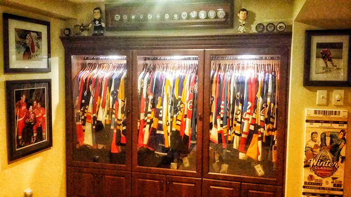
I have a ton. Been collecting for years! Just snapped a few photos for your enjoyment...
Much of my collection hanging...
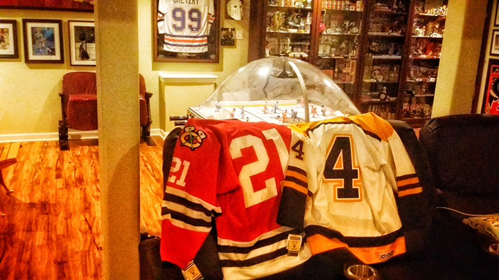
Two that you would like - from that place I posted. #4 Bobby and #21 Mikita. Perfect fonts, material, stitching, weight, etc. (still have tags on them!)
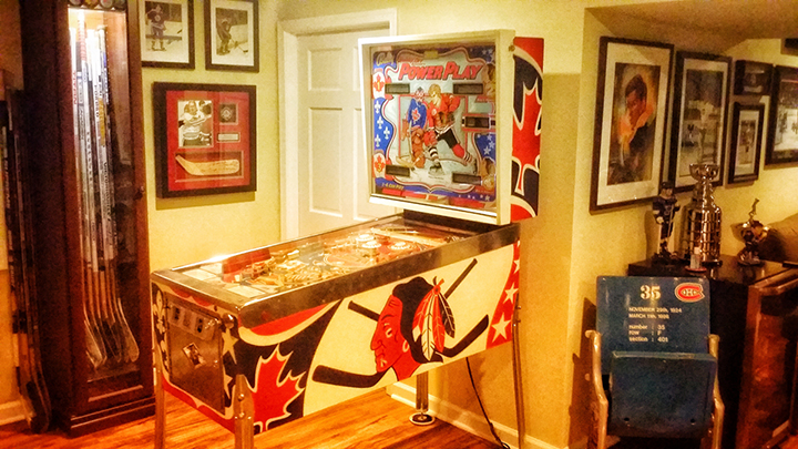
And, just because I know you'll dig. Original Bobby Orr Bally's from 78. Works perfectly. Untouched other than LED light upgrade on lighting board. Original parts everyplace else...
For the record, my favorite jerseys are probably my Houston Aeros "GORDIE HOWE" #9, my custom-made "FETISOV" #2 Red Army with the "K", my early-70s, gold and purple Kings "VACHON" #30, and my "4" Bruins that is in the pic above.
Last summer I was driving across the country and went through KC. While exploring the city I came across this statue and instantly recognized it thanks to the hockey team
The Scout (Kansas City, Missouri statue) - Wikipedia
Concerning Boxscore's collection, I wonder if he has one of few the team plaques that hung in the Leafs' dressing room that were miraculously saved from kindly Harold's purge of them back in about the mid 1970s (he said he wanted a hockey team, not a museum when he had them all taken out despite the fact that Conn and Stafford Smythe had kept them there all of the years they were the main owners of the team).

Hi, the above photo is what I was referring to in my comment. Conn and Stafford kept these plaques in the Leafs' dressing room all of the years that they both ran the club, but apparently kindly Harold had them trashed (save for a few) by about the mid 1970s. I've read stories involving how Ballard destroyed or had removed things that symbolized the team's successes under the Smythes. Foster's gondola was removed to make way for corporate boxes and then broken up to be incinerated despite requests to keep it for the Hockey Hall of Fame. Apparently, this took place following a dispute with Foster's radio network that had Ballard cut ties with it after the franchise had been with that network since 1923. In about 1971, Ballard ordered Gardens workers to clean out a storage room filled with game films that the Smythes had kept for many years. Some dear person overheard Ballard ordering the trashing of these films, so he took it upon himself to to the job on his own and filled up his station wagon with the films and took them home to store in his basement for many years. Leafs TV many years later took the films and they became an important vintage game archive for the network. The championship banners that hung in the Gardens for many years until the early to mid 1970s period were taken down supposedly because they blocked the sight lines in the Gardens. A few were discovered during a clean up of the Gardens following Ballard's death in 1990 in a storage room where they had apparently been used as protective mats by painters years earlier. Undoubtedly, there are many others stories concerning Gardens items and treasures lost or trashed or (thankfully) preserved and/or rediscovered.Oh? What plaques would those be ICM?.... I used to wonder if there werent dark hole in the wall storage rooms scattered throughout Maple Leaf Gardens, or perhaps just one or two crammed full of old equipment & memorabilia, everything from Leaf to Marlboro to you name it treasures however.... I dont believe anything was ever found when the place was finally thoroughly cleaned up & out, gutted & renovated. Ballard & or one of the many working there through the 60's, 70's & 80's quickly monetized whatever they could, be it used equipment or banners, wall hangings or photographs that were no longer being used.
I recall watching the 1972 Summit Series game at MLG and there is a post game interview with Harry Sinden in which you can briefly see these plaques while Harry is being interviewed. Probably not long after, Ballard had them removed along with the other work he ordered done in the Gardens at the time.Oh ok, so thats interesting. Cant quite make them out but they appear to be typset prints of each years rosters with their records from each season..... Agree?... And sure, those would be nice to have provided you had the full set (and plenty of wall space).
I recall watching the 1972 Summit Series game at MLG and there is a post game interview with Harry Sinden in which you can briefly see these plaques while Harry is being interviewed. Probably not long after, Ballard had them removed along with the other work he ordered done in the Gardens at the time.
Killion,
I have a ton. Been collecting for years! Just snapped a few photos for your enjoyment...
Much of my collection hanging...
Two that you would like - from that place I posted. #4 Bobby and #21 Mikita. Perfect fonts, material, stitching, weight, etc. (still have tags on them!)
And, just because I know you'll dig. Original Bobby Orr Bally's from 78. Works perfectly. Untouched other than LED light upgrade on lighting board. Original parts everyplace else...
For the record, my favorite jerseys are probably my Houston Aeros "GORDIE HOWE" #9, my custom-made "FETISOV" #2 Red Army with the "K", my early-70s, gold and purple Kings "VACHON" #30, and my "4" Bruins that is in the pic above.
My goodness that looks like a fun room. I love it!!! And the dome hockey game. What a room. All those jerseys ------ hockey heaven!!


The Kansas City Scouts definitely had one of the more unique uniforms. I really liked the color scheme they used and when the franchise transferred to Colorado they kept the same colors even though the overall design changed. I guess when the franchise relocated once again to New Jersey to become the Devils, the color selection was limited given the name chosen. I suppose the color change from the original red, green and white when the team arrived in New Jersey to that of red, black and white made sense to better reflect the team name. I do wonder if the fans in New Jersey would have preferred a name other than Devils so they could have kept the colors used in Kansas City and Colorado.


I just can't get on board with that color scheme, especially the blues.
I just can't get on board with that color scheme, especially the blues.
Colorado's was a little better because they at least simplified the striping a bit. But there's precious little difference between this:
and this:

That was criminal, what the Blues did there with that version. Unbelievable..... Now, do you remember the Winston-Salem Polar Twins of the SPHL tarheel? NC's 1st pro hockey team, colors were black, white & silver (or really steel grey) much like the LA Kings and a very Edward Gorey like logo featuring 2 Polar Bears out for a skate with sticks & sweaters. They eventually changed that logo to something far less interesting though more colorful but the original which can be found about 2/3rd's of the way down on this page under "Hockey in the South" ... a nice, clean look... www.theboltons.net/JerseysHockey.htm ... bottom row in the middle....
")


