Hurricanes Logo

Lempo

Recovering Future Considerations Truther
Sponsor
Feb 23, 2014
26,890
83,863
I'm a good fight actor insisting proper accuracy and correctness.

You do not take an established symbol and say that you use it to mean something else.

What if someone bets some booze on a single storm warning flag meaning "hurricane" basing his stance on our wrongful logo and ends up losing?

“Yeah I don't care about Carolina Hurricanes, that's not what single storm warning flag means." That guy not caring about Carolina Hurricanes doesn't deserve the booze!
 

Svechhammer

THIS is hockey?
Jun 8, 2017
23,940
88,095
I initially hated the double flag logo, but it grew on me over time. I think it better fills out the front of the jersey than most right now. Just something aesthetically has bothered me since the league moved to Reebok and then Adidas. Primarily that we've moves away from the baggy sweaters to a style that is far more form fitting than we've seen in a while. The sightless eye works well on the older jerseys because we weren't afraid to make it f***ing huge on the front. Like seriously look at it in 2006, its f***ing enormous...

01Canes01.jpg


But with the shift over to the new Adidas cut, they made it smaller. Its really obvious on the old New Storm set...

faulk-hanifin.jpg


And while they did lower it back to being on the middle with the new set, it still had to stay smaller to balance it out. (and maybe its just me, but it also looks like they tilted the angle of the logo down a bit to make it flatter)

But I have just not thought the eye logo worked with the current cut. This new Adidas trim emphasizes a slender, more form fit which I have found most league logos to be at odds with. Enter the new flag logo....

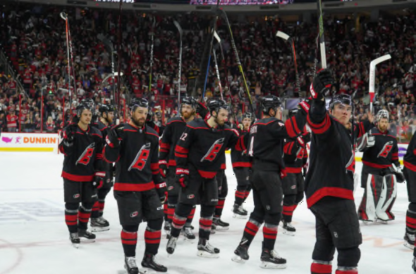
https%3A%2F%2Fcardiaccane.com%2Fwp-content%2Fuploads%2Fgetty-images%2F2019%2F05%2F1144111977-850x560.jpeg


It just looks balanced with the new cut. Centered nicely, doesn't appear to be going too low, doesn't look like it interferes too high. Leaves plenty of room for the C or A without making it cluttered. It just looks good. (though, would have been interested to see where the Finals patch would have gone had we beaten Boston last year).

So... I guess my thought here is that, with the new trim of jerseys the league is making nowadays, maybe it wouldn't be a bad idea to go with a more vertical crest going forward than a horizontal, aesthetically speaking. Also, I wouldn't necessarily change up the eye logo, but if they were going to tweak it, I do like the two tone logos they have used on both iterations of the black jersey as something to go toward.
 

GIN ANTONIC

Registered User
Aug 19, 2007
18,915
14,996
Toronto, ON
I initially hated the double flag logo, but it grew on me over time. I think it better fills out the front of the jersey than most right now. Just something aesthetically has bothered me since the league moved to Reebok and then Adidas. Primarily that we've moves away from the baggy sweaters to a style that is far more form fitting than we've seen in a while. The sightless eye works well on the older jerseys because we weren't afraid to make it f***ing huge on the front. Like seriously look at it in 2006, its f***ing enormous...

01Canes01.jpg


But with the shift over to the new Adidas cut, they made it smaller. Its really obvious on the old New Storm set...

faulk-hanifin.jpg


And while they did lower it back to being on the middle with the new set, it still had to stay smaller to balance it out. (and maybe its just me, but it also looks like they tilted the angle of the logo down a bit to make it flatter)

But I have just not thought the eye logo worked with the current cut. This new Adidas trim emphasizes a slender, more form fit which I have found most league logos to be at odds with. Enter the new flag logo....

https%3A%2F%2Fcardiaccane.com%2Fwp-content%2Fuploads%2Fgetty-images%2F2019%2F05%2F1144111977-850x560.jpeg


It just looks balanced with the new cut. Centered nicely, doesn't appear to be going too low, doesn't look like it interferes too high. Leaves plenty of room for the C or A without making it cluttered. It just looks good. (though, would have been interested to see where the Finals patch would have gone had we beaten Boston last year).

So... I guess my thought here is that, with the new trim of jerseys the league is making nowadays, maybe it wouldn't be a bad idea to go with a more vertical crest going forward than a horizontal, aesthetically speaking. Also, I wouldn't necessarily change up the eye logo, but if they were going to tweak it, I do like the two tone logos they have used on both iterations of the black jersey as something to go toward.

You're absolutely right that the eye logo circa 2006 looked much much better than the version you posted with Faulk and what's his face wearing it.

I also agree that the double flag logo on the slimmer jerseys is much more in balance... it's just that the two of the same flag still looks dumb to me (and many others) and it always will. The concept is good, but it's a boring flag so just doubling up on it with a stick as the pole leaves a lot to be desired.

Since we are all in quarantine lockdown maybe I will try my terrible hand at photoshopping something together. I'm sure it will still look bad but I think taking the flag theme and expanding on it there is a lot of potential there.
 

Svechhammer

THIS is hockey?
Jun 8, 2017
23,940
88,095
You're absolutely right that the eye logo circa 2006 looked much much better than the version you posted with Faulk and what's his face wearing it.

I also agree that the double flag logo on the slimmer jerseys is much more in balance... it's just that the two of the same flag still looks dumb to me (and many others) and it always will. The concept is good, but it's a boring flag so just doubling up on it with a stick as the pole leaves a lot to be desired.

Since we are all in quarantine lockdown maybe I will try my terrible hand at photoshopping something together. I'm sure it will still look bad but I think taking the flag theme and expanding on it there is a lot of potential there.
I had toyed around with a thought to create something with two flags, and this was the best I could do (which I used as my avatar on here for a while). What I liked about it is that it had both flags, has the obvious C, but the white space in the middle created an H as an homage to the same kind of treatment in Hartford. Didn't think it would look too badly. Unfortunately, with the introduction of the new wordmark and the C with 2 flags they already introduced, kind of makes this not really possible.
UniConcept.png
 

GIN ANTONIC

Registered User
Aug 19, 2007
18,915
14,996
Toronto, ON
I had toyed around with a thought to create something with two flags, and this was the best I could do (which I used as my avatar on here for a while). What I liked about it is that it had both flags, has the obvious C, but the white space in the middle created an H as an homage to the same kind of treatment in Hartford. Didn't think it would look too badly. Unfortunately, with the introduction of the new wordmark and the C with 2 flags they already introduced, kind of makes this not really possible.
View attachment 342949

It's kind of giving me a Blackhawks vibe (which is a good thing). It's simple but it pops and has a timeless look to it. Only thing going against it is maybe it's a bit too boring or basic but over I like it a lot and maybe some more catchy shoulder patches or piping or something could give it a good balance.

Overall I think it's a great template though.
 

Lempo

Recovering Future Considerations Truther
Sponsor
Feb 23, 2014
26,890
83,863
I had toyed around with a thought to create something with two flags, and this was the best I could do (which I used as my avatar on here for a while). What I liked about it is that it had both flags, has the obvious C, but the white space in the middle created an H as an homage to the same kind of treatment in Hartford. Didn't think it would look too badly. Unfortunately, with the introduction of the new wordmark and the C with 2 flags they already introduced, kind of makes this not really possible.
View attachment 342949

Is it not enough that we stole Aho from them?

:habs
 

Svechhammer

THIS is hockey?
Jun 8, 2017
23,940
88,095
Is it not enough that we stole Aho from them?

:habs
Completely different. See, their logo is an oval shaped C. Ours would be a circle shaped C. Their H is by design. Ours would be in the white space. Completely and utterly different, can't see how they would have any fault.

Plus,

1493500627418.gif


And if they don't like it, maybe they can beat the Hurricanes in the playoffs for once. (don't care about the Whale history)
 

Svechhammer

THIS is hockey?
Jun 8, 2017
23,940
88,095
Lol, didn't even connect the CH Habs vibe going on.

What's the best way to make these mockups? Is it a on a website or is there a program you download?
I found a bpg file a while ago, blanked it out and saved it and run these through MS Paint to create them.

If you would like the template, send me a message with your email and I'll send it on over to you.
 
Last edited:

Lempo

Recovering Future Considerations Truther
Sponsor
Feb 23, 2014
26,890
83,863
Completely different. See, their logo is an oval shaped C. Ours would be a circle shaped C. Their H is by design. Ours would be in the white space. Completely and utterly different, can't see how they would have any fault.

Plus,

1493500627418.gif


And if they don't like it, maybe they can beat the Hurricanes in the playoffs for once. (don't care about the Whale history)
ForkedFelineFowl-size_restricted.gif
 

My Special Purpose

Registered User
Apr 8, 2008
8,151
21,787
I've got a long history of hating every logo the Hurricanes have ever produced, and it has nothing to do with Original 6 bias. I'm a Whalers fan.

What makes it more fun is that, when I was the web guy, I was technically in the Marketing department under the marketing manager who also had the graphic design team. I've worked with several graphic design teams in my digital career, and this group was significantly better than any group I've ever worked with. Our photography and other creative stuff was *very* well done. But even they couldn't do anything with the logos. We introduced the secondary when I was there and nobody was really crazy about it.

At the end of the day, I think we're permanently hamstrung by the name: Carolina Hurricanes. As long as that's our name, our graphic department will never be able to make up for the inherent limitations of the name. Even when talented freelancers take a shot at our logo, the results are uninspiring. That can't be coincidence.

The University of Miami Hurricanes have the same issue. Their logo is a stylized "U" and their mascot is an ibus, for heaven's sake. It's not like we shouldn't have seen this coming.

IMO, the current set is very middling around the league, which is kind of amazing given the limitations. It's also a testament to solid work being done over there, because there is literally nothing to work with. Let me put it this way, I've seen nothing better than what we have.
 

AD Skinner

Registered User
Mar 18, 2009
12,930
39,158
bubble bath
I think the size of the chest logo is a huge factor. The OGs looked great with that giant hurricane crest and is it my imagination or was it a little less oval and more circular back then? Either way I get the decision to take up more of the y axis on the new blacks but stand by the statement that taking up more x would be a positive. I still don't think they've topped that first set of jerseys though the current reds are nice. There are so many bad jerseys in the league I think the Canes are in the top half pretty easily, though there will always be people who dislike the look based more on geography/history than aesthetic.
 

Chrispy

Salakuljettaja's Blues
Feb 25, 2009
8,326
26,805
Cary, NC
I think the size of the chest logo is a huge factor. The OGs looked great with that giant hurricane crest and is it my imagination or was it a little less oval and more circular back then? Either way I get the decision to take up more of the y axis on the new blacks but stand by the statement that taking up more x would be a positive. I still don't think they've topped that first set of jerseys though the current reds are nice. There are so many bad jerseys in the league I think the Canes are in the top half pretty easily, though there will always be people who dislike the look based more on geography/history than aesthetic.

I'm not sure if it's more circular, or if it's that the OG logo was larger and tilted up on the right. Look closely at the angle of the eye or where the red meets the black on the outer bands. You can see they are in different positions on RBA than on Faulk. That tilt up gave it a little concept of vertical on a very large horizontal logo.

I agree there are aspects of the jerseys that will always keep them pretty high up. The hurricane flag trim was always a unique themed touch and one of the mind-boggling omissions of the Red Wing jerseys Faulk and Hanifin(I think?) are wearing in the bottom picture above.
 

Svechhammer

THIS is hockey?
Jun 8, 2017
23,940
88,095
I'm not sure if it's more circular, or if it's that the OG logo was larger and tilted up on the right. Look closely at the angle of the eye or where the red meets the black on the outer bands. You can see they are in different positions on RBA than on Faulk. That tilt up gave it a little concept of vertical on a very large horizontal logo.

I agree there are aspects of the jerseys that will always keep them pretty high up. The hurricane flag trim was always a unique themed touch and one of the mind-boggling omissions of the Red Wing jerseys Faulk and Hanifin(I think?) are wearing in the bottom picture above.
You are dead on correct about the angle of the logo. With the Reebok Edge uniform we got soon after we won the Cup, they actually shrank the logo a little and flattened the angle.

Compare
s-l300.png


To what we wore in 2009:

images


In 2014 they actually kept the same positioning and angle on the jersey but shrank the logo 20% when they went with the New Storm Set. The elimination of the flag pattern and design from the bottom of the jersey as well as the shrinking of the logo caused it to look like a top heavy boring mess.

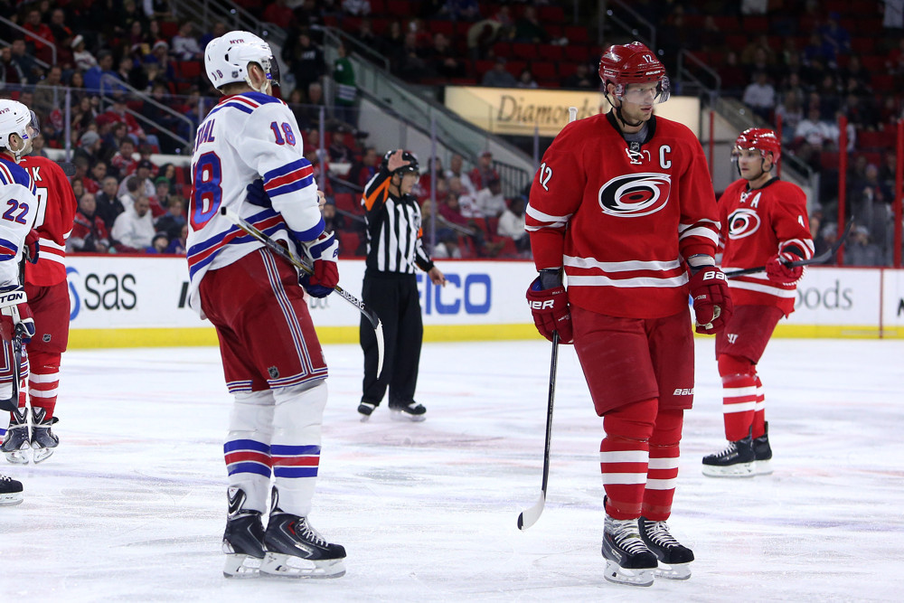
918m141220035_CAR_NYR.jpg


in 2018, with the red jersey redesign, while the flags and black did come back, they were effectively just inserted into the empty space between the white stripes as well as turning the hem black. They lowered the logo to be centered within the new space, and that is what we have now.

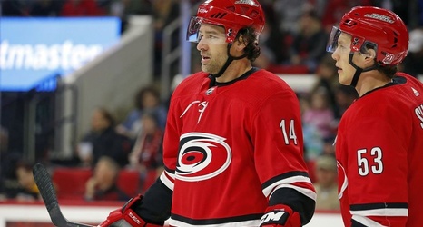
fef75e2d18f63cbdce6afb486312cc5e-original.jpg


So you are correct, the crest in 2006 absolutely did fill out the front of the jersey better because it was more diagonal, which allowed it to be a bit bigger without it taking up as much horizontal space. When they flattened that angle, they intentionally created a very horizontal crest that does little to fill out vertical space, which is something we've been struggling to compensate for since.
 

AD Skinner

Registered User
Mar 18, 2009
12,930
39,158
bubble bath
Maybe I'm conflating logo and jersey here but like I said I'd put the canes looks top half maybe top 3rd of the league. Going on their current sets, not counting alternates or throwbacks I'd tier them something like this

Bad:
Flames
Caps
Senators
Bjs
Ducks
Kings

Ok:
Sabres
Avs
Coyotes
Wild
Panthers
Knights
Blues
Jets
Oilers
Preds
Sharks

Good:
Flyers
Devils
Canucks
Lightning
Stars
Canes

Really good:
Islanders
Penguins
Original 6

I'm sure everyone has different rankings but I don't see how the canes aren't firmly in the ok to good category
 

WreckingCrew

Registered User
Feb 4, 2015
12,338
38,028
You are dead on correct about the angle of the logo. With the Reebok Edge uniform we got soon after we won the Cup, they actually shrank the logo a little and flattened the angle.

Compare
s-l300.png


To what we wore in 2009:

images
I know you're referencing the jersey/logo...but I'm totally comparing the victory high to Mr. Pouty Staal who then "led" the team for about a decade... :sarcasm:
 

djboos22

Aho (insert pun)
Jan 17, 2011
2,661
506
Palm Bay, FL
I've got a long history of hating every logo the Hurricanes have ever produced, and it has nothing to do with Original 6 bias. I'm a Whalers fan.

What makes it more fun is that, when I was the web guy, I was technically in the Marketing department under the marketing manager who also had the graphic design team. I've worked with several graphic design teams in my digital career, and this group was significantly better than any group I've ever worked with. Our photography and other creative stuff was *very* well done. But even they couldn't do anything with the logos. We introduced the secondary when I was there and nobody was really crazy about it.

At the end of the day, I think we're permanently hamstrung by the name: Carolina Hurricanes. As long as that's our name, our graphic department will never be able to make up for the inherent limitations of the name. Even when talented freelancers take a shot at our logo, the results are uninspiring. That can't be coincidence.

The University of Miami Hurricanes have the same issue. Their logo is a stylized "U" and their mascot is an ibus, for heaven's sake. It's not like we shouldn't have seen this coming.

IMO, the current set is very middling around the league, which is kind of amazing given the limitations. It's also a testament to solid work being done over there, because there is literally nothing to work with. Let me put it this way, I've seen nothing better than what we have.

Thanks for all that insight. That was cool to read and I agree. There is only so much we can do with a Hurricane unless we move towards something different like the state of North Carolina as a general logo.
 

djboos22

Aho (insert pun)
Jan 17, 2011
2,661
506
Palm Bay, FL
Here is how I rank our jerseys:

Home:

1. 2006
2. Current
3. Reebok / 2009
4. New Storm

Away:

1. Last year's adidas
2. 2006
3. Reebok / 2009
4. Current
 
  • Like
Reactions: AD Skinner

GIN ANTONIC

Registered User
Aug 19, 2007
18,915
14,996
Toronto, ON
I've got a long history of hating every logo the Hurricanes have ever produced, and it has nothing to do with Original 6 bias. I'm a Whalers fan.

What makes it more fun is that, when I was the web guy, I was technically in the Marketing department under the marketing manager who also had the graphic design team. I've worked with several graphic design teams in my digital career, and this group was significantly better than any group I've ever worked with. Our photography and other creative stuff was *very* well done. But even they couldn't do anything with the logos. We introduced the secondary when I was there and nobody was really crazy about it.

At the end of the day, I think we're permanently hamstrung by the name: Carolina Hurricanes. As long as that's our name, our graphic department will never be able to make up for the inherent limitations of the name. Even when talented freelancers take a shot at our logo, the results are uninspiring. That can't be coincidence.

The University of Miami Hurricanes have the same issue. Their logo is a stylized "U" and their mascot is an ibus, for heaven's sake. It's not like we shouldn't have seen this coming.

IMO, the current set is very middling around the league, which is kind of amazing given the limitations. It's also a testament to solid work being done over there, because there is literally nothing to work with. Let me put it this way, I've seen nothing better than what we have.

Thanks for the insight on this. I agree with you that Hurricanes is a very difficult concept to visualize. Kind of like the Avs and Wild. It's a force of nature, or in the Wild's case, just nature itself, but it's difficult to personify it in a logo.

However, I think the eye of the hurricane is great though and have no qualms with it as the primary logo.

I do feel that the best way to move forward though is to embrace the NC state outline or incorporate the state flag somehow. There are options out there but it will take some creativity and finesse in making it a cohesive design.
 

Ad

Upcoming events

Ad

Ad