Florida Panthers 25th Anniversary Logo

greasysnapper

Registered User
Apr 6, 2018
2,588
1,694
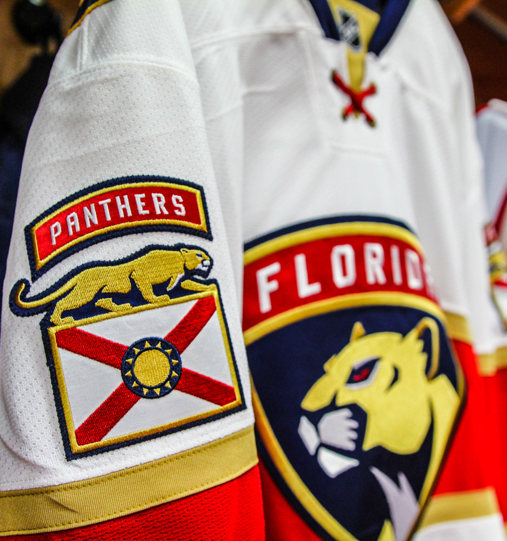
Has anyone read the Florida Panthers 25th Anniversary Logo infographic on the Panthers site?! It's amazing. Pure design bs. It's the funniest thing.

cut.jpg


Florida Panthers Unveil 25th Anniversary Season Logo


Guys, I don't know if you are aware but the inlaid circles, yes just the dots you see in this logo, those are from the 2009-2012 season design. I know you were thinking those might be the dots you see from microsoft word when you make bullet points, but no. Those are exclusively dots from the 2009-12 season design you pleb.

I really hope someone does some photoshop csi to confirm these are the same dots.
 
Last edited:

greasysnapper

Registered User
Apr 6, 2018
2,588
1,694
It is a plain old boring safe conservative logo much like their main jersey. A CSI investigation? Relax.

Are you sure? How can anyone be sure that this is the circle from the 2009-2012 season logo? We need to dig deeper. This is the greatest conspiracy theory of our generation and you're telling me to relax bud?!

cut.jpg


MH5DLYX.jpg
 

These Are The Days

Oh no! We suck again!!
May 17, 2014
34,493
20,296
Tampa Bay
Dear Panthers, stop desacrating the Florida State flag by using it as a fashion statement on your jerseys and logos.

Sincerely, a life long Floridian
 

Disclose

WE GET THAT RENT MONEY
Aug 22, 2007
12,691
5,968
Montreal
i mean, it is what its suposed to be. the number should be the biggest thing to be noticed on it for tv.

the history aspects adds fun.
hard to make this things too cool.
 

kerrabria

Registered User
May 3, 2018
3,883
4,753
At first I thought it was whatever.

Then I realized that this patch will probably replace the current shoulder patches they have on their jerseys, and that pisses me off. I love the full body panther profile on the shoulders. f*** this noise.

florida_panthers_uniform_detail.jpg
 

talkinaway

Registered User
Mar 19, 2014
6,973
4,126
On the couch
I don't think it's a simple design at all: It's got at least 6 or 7 things going on, with a wordmark on the outside, established 1993, the ring, the triangles pointing out, the palm-hockey thing on the inside, the large 25, and the red cross.

I once read something about flags: A good flag should be easily reproducible by memory by a kid. Same for a good logo...and I don't think this fits that. Compare to the Bruins 90th anniversary logo...yes, it's a bit bland, but it gets the point across quickly.

s-l1600.jpg


But the biggest sin in the Florida logo? When I glanced at it the first time, and saw the thing in the middle...I honestly thought it was a basketball. Anyone else get that? Yes, obviously looking at it for more than second, I can tell exactly what it is. But if this is something on a jersey that's going to be seen by someone in the top rows of the balcony at BB&T Center...is it the right logo from a distance like that?
 

Ad

Upcoming events

  • Finland vs Norway
    Finland vs Norway
    Wagers: 1
    Staked: $300.00
    Event closes
    • Updated:
  • Slovakia vs USA
    Slovakia vs USA
    Wagers: 2
    Staked: $150.00
    Event closes
    • Updated:
  • Lecce vs Udinese
    Lecce vs Udinese
    Wagers: 1
    Staked: $50.00
    Event closes
    • Updated:
  • Czechia vs Switzerland
    Czechia vs Switzerland
    Wagers: 4
    Staked: $875.00
    Event closes
    • Updated:
  • Sweden vs Germany
    Sweden vs Germany
    Event closes
    • Updated:

Ad

Ad