
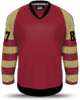
Have a look at Acadia Bathurst jerseys from Memorial Cup. I liked the colour scheme.
Confirmed with Link: Coyotes unveiling new third jersey 6/22
- Thread starter RABBIT
- Start date
You are using an out of date browser. It may not display this or other websites correctly.
You should upgrade or use an alternative browser.
You should upgrade or use an alternative browser.

Lilhoody
Registered User
I suck at technology, I'm lazy and my computer is basic. I'd like to see a third sweater, similar to those of yesteryear, back to a time before the Coyotes or OG Jets existed. Something similar to the attached template or even more basic. Perhaps just a maroon variant with grey or black shoulder caps, cuffs and collar, with black block "Coyotes" or "Arizona" on the chest.
If anyone cares to take this a step further, please do.
If anyone cares to take this a step further, please do.
Attachments
rt
The Kinder, Gentler Version
I think I’d trade our current set for the Paw set. I’d at least trade the head on our current set for that Paw.some interesting ones from icethetics, not really huge on either.
View attachment 125173 View attachment 125175
BigMac1212
I feel...alone.
I think I’d trade our current set for the Paw set. I’d at least trade the head on our current set for that Paw.
I wish the team return the crescent moon.
- Oct 26, 2006
- 18,563
- 11,436
I have seen mock ups incorporating the state flag. They were pretty sharp looking. Not sure how people feel about the colour schemes? Do you have to keep the flag colours?
I did a mockup of a jersey several years ago using the flag colors. I thought it looked cool, but everyone else thought it looked like a roller hockey jersey.

I heard the 3rd jersey design was made by the same outfit that gave us Stu and the weed whacker. (I'm lying) but my expectations aren't very high for this.
Matias Maccete
Chopping up defenses
- Sep 21, 2014
- 9,692
- 3,605
I liked them, very AZ. Everyone hates us anyway, we should troll them by making it very clear that we're in Arizona still.I did a mockup of a jersey several years ago using the flag colors. I thought it looked cool, but everyone else thought it looked like a roller hockey jersey.
So we're seeing them tomorrow?I heard the 3rd jersey design was made by the same outfit that gave us Stu and the weed whacker. (I'm lying) but my expectations aren't very high for this.
moosemeister
5,000 strong
Tomorrow was yesterday
Hahahahaha nooooooooooooo get it out!!!
TheLegend
Megathread Gadfly
TheLegend
Megathread Gadfly
Matias Maccete
Chopping up defenses
- Sep 21, 2014
- 9,692
- 3,605
Neighborhood Coyote
Registered User
- Sep 14, 2017
- 3,136
- 2,740
It has colours. And stuff.
It will be related somehow to the Arizona Coyotes. That is something I'm 47.33 (repeating of course)% sure of.
I'll take my jersey in a large please!
Frankly speaking I like the question mark. We can become the Arizona Riddlers.
This is like that scene in the 90's travesty Batman Forever where Jim Carrey's Riddler figures out what his alter ego is going to be.
kbay
Registered User
So they pick the most socially awkward kid who's not old enough to be in a .... oh wait that's pretty much the whole team. Is there going to be a kid's area there for Clayt.....or wait my granddaughter to go to??
RABBIT
Years of my life w you f*cks only to get relocated
Am I seeing things or did they give us a huge hint on the glove? looks like the old school Kachina green and sand colors.

rt
The Kinder, Gentler Version
rt
The Kinder, Gentler Version
I think we’re getting Green, Maroon/Purple, and Cream/Sand. That’s exciting. I want to look unique again.
RABBIT
Years of my life w you f*cks only to get relocated
I think we’re getting Green, Maroon/Purple, and Cream/Sand. That’s exciting. I want to look unique again.
likewise. If we make this our full-time 3rd jersey, there's even a chance we pull a Pittsburgh or Edmonton and adopt it as our primary unis depending on fan reaction.
rt
The Kinder, Gentler Version
3rds can definitely be a toe in the water, temp check for sure.likewise. If we make this our full-time 3rd jersey, there's even a chance we pull a Pittsburgh or Edmonton and adopt it as our primary unis depending on fan reaction.
 Playing with the old Kachina mask and colours.
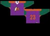
absolute garbage
Registered User
- Jan 22, 2006
- 4,415
- 1,785
I really dislike the current jerseys. The logo is very bland and while I like the colors, the way the colors are set up (the design) it looks just... kinda cheap. And bad. Also the logo is way too big in size, looks ridiculous.
I was a big fan of the original kachina logo, and those concepts on page 2 are amazing. Especially the first one with the head logo, but it needs to be a bit smaller too. The second concept's logo is the correct size. I like the idea of somewhat keeping the current color scheme, so no main black and no green, while bringing back the old logo or some variation of it. The cream color I think needs to be close to the same as Minnesota is using in their home jerseys, it looks great, and the main maroon-ish can't be too red. So really that first concept with couple of tweaks would be excellent, and its head logo would be a smooth transition from the current logo too. Would be one of the best jerseys in the league!
I was a big fan of the original kachina logo, and those concepts on page 2 are amazing. Especially the first one with the head logo, but it needs to be a bit smaller too. The second concept's logo is the correct size. I like the idea of somewhat keeping the current color scheme, so no main black and no green, while bringing back the old logo or some variation of it. The cream color I think needs to be close to the same as Minnesota is using in their home jerseys, it looks great, and the main maroon-ish can't be too red. So really that first concept with couple of tweaks would be excellent, and its head logo would be a smooth transition from the current logo too. Would be one of the best jerseys in the league!
Ad
Latest posts
-

-
 GDT: ECQF: Game 3 - New York Rangers @ Washington Capitals, 7pm ET, TNT, MSG
- Latest: Megustaelhockey
Upcoming events
-

-
 Victoriaville Tigres @ Drummondville Voltigeurs - Game 1Wagers: 1Staked: $25.00Event closes
- Updated:
-
 Game 2 Belleville Senators @ Toronto Marlies -Belleville Senators leads series 1-0Wagers: 2Staked: $40.00Event closes
- Updated:
-
-
Game 1 W-B/Scranton Penguins @ Lehigh Valley Phantoms - Lehigh Valley Phantoms leads series 1-0Wagers: 4Staked: $180.00Event closes
- Updated: