The Stig
Your hero.
The source is a very reliable one on twitter.
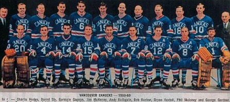
Appears to be the 1962 jersey in somewhat more current colours.
I was hoping for a flying V but I still like it. Thoughts?
Appears to be the 1962 jersey in somewhat more current colours.
I was hoping for a flying V but I still like it. Thoughts?