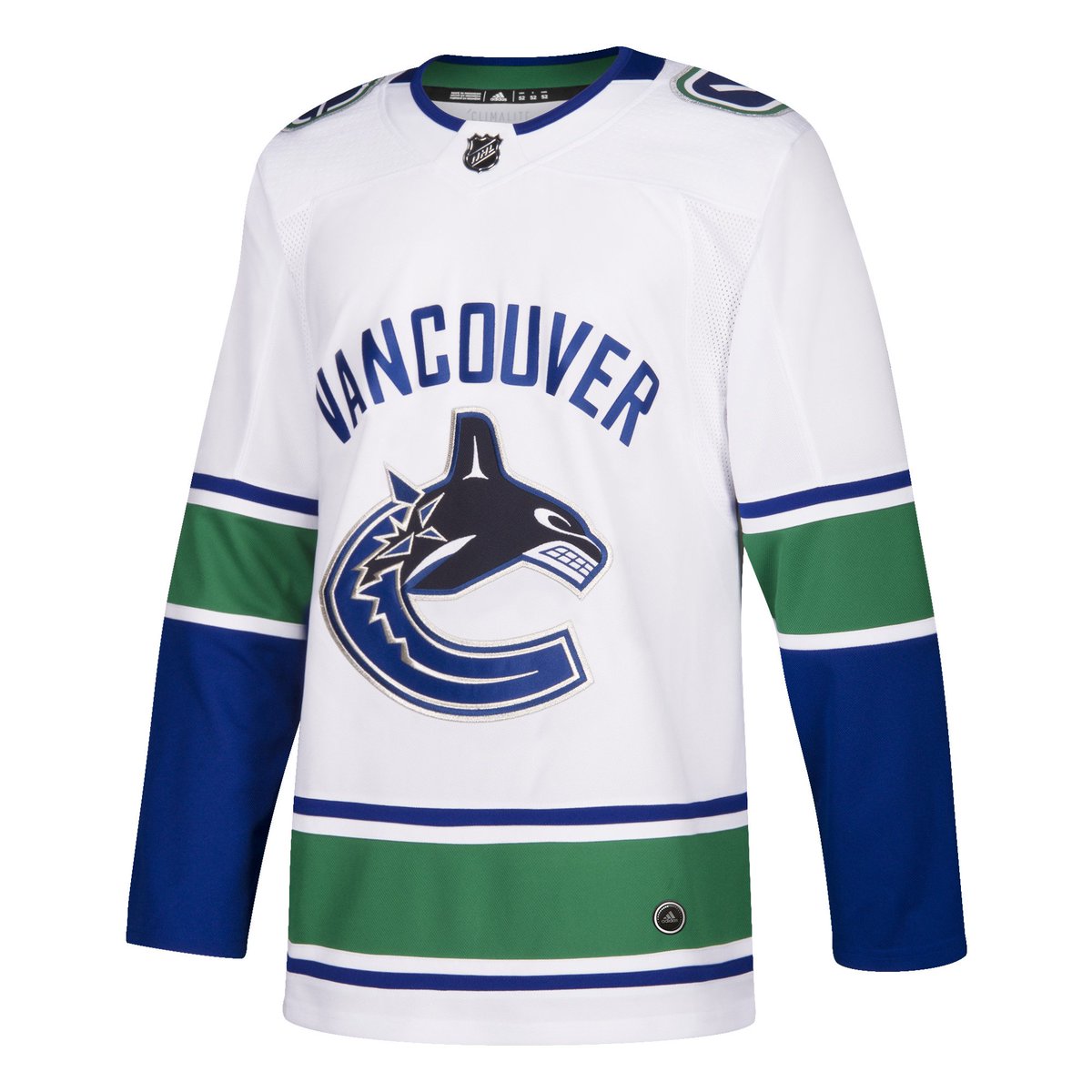
Post-Game Talk: Canucks Adidas uniform reveal

PM

Glass not 1/2 full
Apr 8, 2014
9,869
1,664
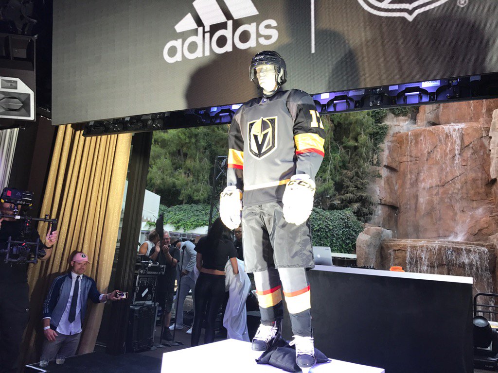
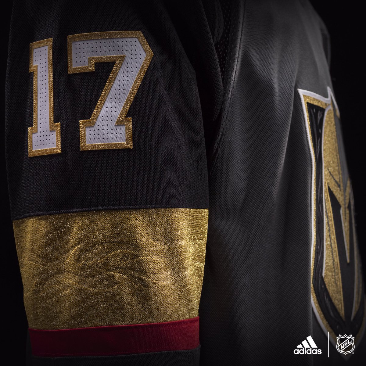
Vegas would get a passing grade if they ditched the red stripe and purpleish pit stain. Six colours one jersey is ridiculous. I like the idea of a grey jersey but the entire sleeve from top to bottom is a disaster.

The collars are all so, so bad and every jersey without a waist stripe looks like pyjamas. So much ad space though!
 

Cupless44

Registered User
Jun 25, 2014
7,154
3,298
Why do the Canucks have to be the only team in the entire NHL to have stupid, ugly, block letters on their jerseys?

Wake up ownership and management.
 

Cupless44

Registered User
Jun 25, 2014
7,154
3,298
Also, I don't care if I'm alone but I love the Vegas jerseys.

To me it's a different fresh colour scheme and suits the city well.

They lose me with the out of place red stripes on the arms. Sort of ok otherwise. Reminds me of the god awful mishmash Duck uniforms.
 

JA

Guest
DC0BI0zVwAE_7s8.jpg


DC0BYaiUwAEO9BR.jpg


DC0BaJ-U0AE8l0n.jpg


DC0BsgVUMAAebQw.jpg


cut.png


jerseys476031.jpg
 
Last edited by a moderator:

DustyMartellaughs

Flashing the leather.
Jun 12, 2009
4,953
1,246
Dawson Creek, BC
The Vegas jerseys are ugly as sin. There hasn't been an expansion jersey and logo that didn't need an immediate overhaul since the Sharks entered the league.
Kansas City, Cleveland, the Rockies, the Seals, and just about every team in the WHA had far far far nicer logos and jerseys than the garbage trotted out yesterday. "Could've been worse" is not a ringing endorsement.
This is what happens when marketing firms use focus groups to try and gauge what twelve year olds will spend their lawn mowing money on.

Somebody on the main board dismissed me as a traditionalist, and suggested that in 50 years we'll look back on the Adidas jerseys with reverence and affection.
No, we won't. Any team in the NHL that was around in 1970 looked way better that day than this day.
 

Josepho

i want the bartkowski thread back
Jan 1, 2015
14,802
8,351
British Columbia
Yeah, it just looks like there's too much going on.

I hate jerseys with a ton of prominent colours on their uniforms. The Jaguars are my least favourite NFL unis (either them or TB) for this same reason.
 

NoShowWilly

Registered User
Apr 4, 2010
12,488
2,248
North Delta
One of the only things you can get Canucks fans to agree on is that the word mark is terrible. What a wasted opportunity to get people saying something, anything, positive about the team for once.

we are going to China this fall. If it isn't about international tourists sales then i can't think of a reasonable explanation.

it is hard to find a sizeable portion of people that agree with that wordmark. The orca, sure it has been around for 20 years. but why Vancouver and only Vancouver with no Canucks anywhere?
 

Ryp37

Registered User
Nov 6, 2011
7,525
1,081
I see adidas put zero effort in

the ****s with the collars on most of these?
 

WinterEmpire

Unregistered User
Mar 20, 2011
5,997
215
Vancouver
I see adidas put zero effort in

...what...if you're talking about designs the that is 99% decided by the teams. It has nothing to do with Adidas outside of restrictions due to the material and template.

So far the template appears to be very flexible and allows for a variety of designs. A lot better than the Edge jerseys when those were first introduced. And the on-ice material is noticeably lighter yet stronger.

The only negatives I see are
-Collars are kinda weird, but those will grow on me just like the Edge collars did
-Replicas are really bad quality, but they are made by Fanatics and not Adidas. The NHL is responsible for this.

People are being so negative towards anything jersey related but the anger is misdirected if you're looking to blame Adidas. I think they did a fine job. Could have been alot worse
 

Mr. Canucklehead

Kitimat Canuck
Dec 14, 2002
40,593
31,619
Kitimat, BC
I actually like the Vegas jerseys - like that they went with a colour scheme that isn't currently being used by anyone else.

That said, agree about the random red stripe. Don't think it makes the jersey ugly overall, but it's just...so random.
 

PM

Glass not 1/2 full
Apr 8, 2014
9,869
1,664
The torso of the Knights jersey looks good although the entire collar should be black. I love the grey personally, it's what a friend and I used when making Seattle jerseys on EA NHL years ago. The sleeves are a gong show though. From the purple/grey armpits to the red stripe to the really wide gold band it's way too busy. If they actually use white gloves with those it's even worse.
 

thepoeticgoblin

Registered User
Dec 16, 2011
2,082
4
Sweden
...what...if you're talking about designs the that is 99% decided by the teams. It has nothing to do with Adidas outside of restrictions due to the material and template.

So far the template appears to be very flexible and allows for a variety of designs. A lot better than the Edge jerseys when those were first introduced. And the on-ice material is noticeably lighter yet stronger.

The only negatives I see are
-Collars are kinda weird, but those will grow on me just like the Edge collars did
-Replicas are really bad quality, but they are made by Fanatics and not Adidas. The NHL is responsible for this.

People are being so negative towards anything jersey related but the anger is misdirected if you're looking to blame Adidas. I think they did a fine job. Could have been alot worse

Why is Fanatics doing the replicas and are there any photos etc. comparing the authentic vs. the replica jerseys?
 

Horrorshow

Registered User
Jun 1, 2009
1,180
35
Also, I don't care if I'm alone but I love the Vegas jerseys.

To me it's a different fresh colour scheme and suits the city well.

Not a fan of the logo, but the design of the jerseys is certainly one of my faves in the league right now.

Those grey jerseys are hot.
 

thefeebster

Registered User
Mar 13, 2009
7,185
1,651
Vancouver
I like most of the Vegas jersey, like the grey/gold/black, the detailing on the logo and gold stripe are really nice but i find the red very unnecessary, sort of detracts away from the regal-ness of the rest of the jersey. And the armpit paneling is purple... hideous. Its like Adidas couldn't find a close color match in that fabric and said let just use this, people won't notice.

---

Some of the IRL photos popping up now... really seem to emphasize the weird material choice for the shoulder area. In the promo jersey shots, they seemed rather unnoticable, but now, you can see it looks like a golf ball with those dimples.
 

WinterEmpire

Unregistered User
Mar 20, 2011
5,997
215
Vancouver
Why is Fanatics doing the replicas and are there any photos etc. comparing the authentic vs. the replica jerseys?

http://www.espn.com/nhl/story/_/id/...-replica-jerseys-stanley-cup-champion-apparel

There are no direct comparison pictures yet but its not too different from when Reebok did both.

There are three tiers of jersey

Replica - Cheapest jersey, what you most often see in retail stores. Lighter and thinner material. Heat pressed logos and lettering. For Reebok the shoulder patches were a single layer plastic patch and the crest was fabric. The new fanatics replicas will use the plastic material for both shoulders, crest, and lettering. Its crap.

Retail Authentics - Made by Adidas in Indonesia, closely replicates the on-ice style of jersey. Last time around the main difference was that the fight strap was not double reinforced, and the neck tag. They used to go for about 300USD, the Adidas version of these are going for 220USD-260USD per team retailers, which is nice.

On-Ice Authentics - Made by Adidas in Canada, exact on ice version of the jerseys. These can only be ordered by Teams directly and not third party suppliers. Many teams will likely sell surplus through their team store(Canucks were doing this up until last season iirc), or they end up with third party resellers.
 

thepoeticgoblin

Registered User
Dec 16, 2011
2,082
4
Sweden
http://www.espn.com/nhl/story/_/id/...-replica-jerseys-stanley-cup-champion-apparel

There are no direct comparison pictures yet but its not too different from when Reebok did both.

There are three tiers of jersey

Replica - Cheapest jersey, what you most often see in retail stores. Lighter and thinner material. Heat pressed logos and lettering. For Reebok the shoulder patches were a single layer plastic patch and the crest was fabric. The new fanatics replicas will use the plastic material for both shoulders, crest, and lettering. Its crap.

Retail Authentics - Made by Adidas in Indonesia, closely replicates the on-ice style of jersey. Last time around the main difference was that the fight strap was not double reinforced, and the neck tag. They used to go for about 300USD, the Adidas version of these are going for 220USD-260USD per team retailers, which is nice.

On-Ice Authentics - Made by Adidas in Canada, exact on ice version of the jerseys. These can only be ordered by Teams directly and not third party suppliers. Many teams will likely sell surplus through their team store(Canucks were doing this up until last season iirc), or they end up with third party resellers.

Thanks!

I only have one Canucks jersey (Markstrom 35 - I was sooo hyped he was traded here so I jumped the gun) so I'd like to buy a few this season. Last time around I had a friend who studied in VAN so it was easily fixed. Now I have to order online so don't wanna get a cheap knockoff. Really appreciate your thorough reply!
 

Ad

Upcoming events

Ad

Ad