
Seattle Totems
Registered User
- Apr 14, 2010
- 3,894
- 1,138
lol, they somehow made it worse by not extending the white around the collar.

I would honestly feel embarrassed to wear a Canucks jersey with that collar. It looks completely ridiculous.
lol, they somehow made it worse by not extending the white around the collar.

Seriously, people talk about changing jerseys every so often as a cynical money grab. Well, grab my money, damnit! Why would you not take advantage of it at least to make a minor change, like in soccer?Exactly the same as our current jersey but with a terrible collar and somehow an even busier, more cluttered look. It's nearing Swedish hockey levels of clutteredness, especially with a A or C on the front. Throw on some anniversary patch and you've got a NASCAR car. Even the most avid collectors gotta think about skipping this one, right?
Seriously, people talk about changing jerseys every so often as a cynical money grab. Well, grab my money, damnit! Why would you not take advantage of it at least to make a minor change, like in soccer?
Also, didn't even take advantage of the opportunity to put something cool in the inside collar. Classic.
50th season.
Updated stick in rink . Done. Goodnight. Never change again
How ****ing hard is it to do
Soon having an Orca on a jersey will be seen as cruelty to animals and appropriating Orca culture for a violent sport.
White half collar. Why?
One of the only things you can get Canucks fans to agree on is that the word mark is terrible. What a wasted opportunity to get people saying something, anything, positive about the team for once.
50th season.
Updated stick in rink . Done. Goodnight. Never change again
How ****ing hard is it to do
[Canucks]: our fax machine broke halfway through sending our submission and the collar came out sort of ****ed up

One of the only things you can get Canucks fans to agree on is that the word mark is terrible. What a wasted opportunity to get people saying something, anything, positive about the team for once.
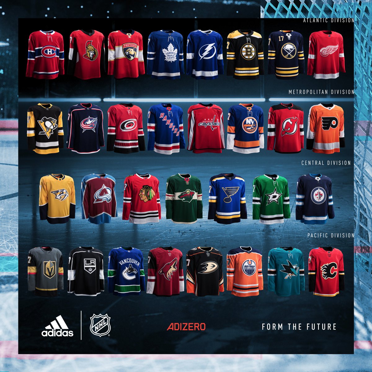
It sticks out like a sore thumb in that picture with all the jerseys. Just looks so stupid. I could get behind the logo and jersey if they would just drop the damn wordmark.
Most of the jerseys have that pajama feel to them. Very weird. And what the **** is with Edmonton's colors? I do like the Vegas color scheme though, and Colorado.