
Mr. Canucklehead
Kitimat Canuck
I’m so down for this. Love those jerseys - and McLean’s mask is an all time great for me.
Ugly color scheme, even uglier logo.
Time to put an end to that abomination.
Yeah it was so good that Calgary Flames blatantly ripped it off for their alternates last yearCompared the the stick in rink jerseys with far too much green on them, I vastly prefer the black jerseys. They look so much better.

This is the correct answer. Yes, the Flying V was a little bit worse, but not by much.Ugly color scheme, even uglier logo.
Time to put an end to that abomination.
The skate jerseys are my nostalgic favorite - first became a fan while they were in use, and all my childhood favourites wore it. The Orca came in when I was in high school. I don’t hate any of the looks we’ve had (although I’ve got most to least favorites), but seeing these bad boys out definitely makes me a happy camper. I think they look deadly.
This was the version with yellow home jerseys. Thus the reason for the yellow painted mask.shoutout to the early yellow version of the captain kirk mask
View attachment 492660
i feel like there was also one where it looked like a modern mask in the front but just straps on the back, but i might have invented that memory
Honestly think it's a far better colour scheme than blue/green.Ugly color scheme, even uglier logo.
Time to put an end to that abomination.
The stick and rink is my favourite by far (and blue/green is THE colour combination for Vancouver). But these need to make a 2-3 time a year appearance for sure.
Honestly think it's a far better colour scheme than blue/green.
Our stuff looks corny
except for this - this is great.
(if anyone has a size medium one that isn't a fake sell it to me thanks)
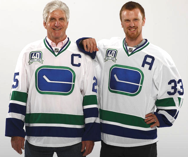
you are the first person i’ve ever seen not like the 40th anniversary onesTo me, that one looks the worst. Blue on green and green on blue all the way.
To me, that one looks the worst. Blue on green and green on blue all the way.
This was the version with yellow home jerseys. Thus the reason for the yellow painted mask.
I am pretty sure we haven’t had that Vancouver word mark for like three years or so now.Sick and rink should be our main jerseys with the black skate being the 3rd
Our current main jerseys with the orca and the Vancouver letters are terrrible.... up there with the worst in the league
I like the way they look but I really think we should stick with the blue/green colour scheme full-time.
Very fun 3rd jersey though.
