Best: Chicago black & white alternate is my single favourite jersey in the league. Pittsburgh has one of the best sets of home and away IMO
Worst: The Flames jerseys are dreadful compared to their retros, and I also really dislike the Oilers' orange jersey that they started to wear this past season.
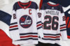
Oddly enough, the (unofficial) NHL uniforms database site does not show that version of the Jets jersey even though they've worn it several times. www.nhluniforms.com
You probably are just getting nostalgic about beating the Sabres in the ECF the first year they wore those jerseys. But you're right, they wouldn't have been so atrocious without the slug.
I understand some not liking the Wild logo for being 'too busy' but I personally like it for being creative. Not crazy about their colors though. A bit too Christmas-y.
I'm a Flames fan, but I agree 100%. I really think the orange jerseys are awful and I hate that they've darkened the blue. Boith the Oilers and Flames had it right in the 80s and our clubs need to stop f***ing around with it.
I understand some not liking the Wild logo for being 'too busy' but I personally like it for being creative. Not crazy about their colors though. A bit too Christmas-y.
This site uses cookies to help personalise content, tailor your experience and to keep you logged in if you register.
By continuing to use this site, you are consenting to our use of cookies.