Best and worst current jersey

DowntownBooster

Registered User
Jun 21, 2011
3,202
2,414
Winnipeg
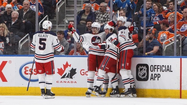
One of the nicest jerseys in the league is the Jets heritage classic

Their home/away is bottom tier

Best: Jets' white heritage jersey
Worst: Columbus home jerseys
Guilty Pleasure: Jets' third jersey (used to hate them, but they've grown on me) or

I agree. It doesn't get much better than these. :thumbu:

image.jpg
 

DowntownBooster

Registered User
Jun 21, 2011
3,202
2,414
Winnipeg
Those (above) are my favorite in the league. I was talking about the baby blue "Jets" script jerseyes.

I hear you DG. I know you mentioned the Jets thirds were your guilty pleasure. I was just highlighting your comment that one of the nicest jerseys in the league is the Jets heritage classic.
 

DannyGallivan

Your world frightens and confuses me
Aug 25, 2017
7,606
10,249
Melonville
This is without a doubt the best jersey of all time:

koivualt.jpg


I wish they bring these back.

Some may not know that this was a style used briefly in the 1940's. Difficult to find photos of them. I agree, they are super sharp. Then again, the Habs have always done very well with their two classic jerseys. This one is a worthy retro third jersey.

normal.png
 

qqaz

Think Happy Thoughts
Oct 25, 2018
2,210
2,843
Worst jersey in the league by a wide margin. Indefensibly bad. Looks like a Target knock-off that should have been a hooded sweatshirt.

View attachment 250447

Just now noticed that the crossing line of the "t" is a very subtle jet plane. It doesn't save that jersey, but it is interesting.

I’m sure I am on my own. But I liked Buffalo’s jerseys (07) ones. Can’t remenber what year they started wearing them. They didn’t last long though.

You mean the buffaslug?

images


I liked that one a lot, too. If that's the one you mean, then you aren't alone. The logo clearly has some issues. (here's an article about the logo, if you're interested.) But overall the jersey is nice, the colour scheme worked. I wish they had stuck it out with those, just needed a tweak for the slug (and it wasn't that bad to begin with).
 
  • Like
Reactions: tardigrade81

Trocity

Registered User
Nov 24, 2016
504
514
Worst is definitely Vegas' trash grey jersey.

If counting WC/SS, Sharks retro, Jets old school, Blues as well.

If not, maybe the Pens or the Bruins. The black and gold is so sharp.
 

JianYang

Registered User
Sep 29, 2017
17,983
16,483
I know the title says "current", but these were worn by the Habs of all teams:

habs1912.png

They were called the barber poles, but to me, they were the "where's waldos".

The habs wore a bunch of their older jerseys in their 100th season, including this one. The waldos only existed one season in the late 1920s, I believe.
 

Dynamite Time

Where Is My Mind?
Jan 23, 2018
3,599
1,779
Austin, TX
Not including long time teams like BOS, CHI, DET, MTL, NYR, etc.

Worst - Coyotes/Canucks
Best - Capitals
Guilty- Hurricanes/Blue Jackets

I miss old jerseys from the Stars, Coyotes and Avalanche.
 

tardigrade81

Registered User
Jun 12, 2019
16,530
21,131
Saskatchewan
Just now noticed that the crossing line of the "t" is a very subtle jet plane. It doesn't save that jersey, but it is interesting.


You mean the buffaslug?

images


I liked that one a lot, too. If that's the one you mean, then you aren't alone. The logo clearly has some issues. (here's an article about the logo, if you're interested.) But overall the jersey is nice, the colour scheme worked. I wish they had stuck it out with those, just needed a tweak for the slug (and it wasn't that bad to begin with).
Thanks for posting! That is definitely the one..... and ya I see what you mean by slug lol. But I agree the colours and everything just seem to work. I miss those regardless.
 
  • Like
Reactions: qqaz

JianYang

Registered User
Sep 29, 2017
17,983
16,483
I love that logo but don't like the color scheme - what if they kept the blue green and silver/white but went back to the skate logo? I think that'd be bad ass.

This is the only time I've said this about any sweater, this but those white jerseys just seemed to go really well with the Pacific Coliseum. There's just something to do with that combination of arena lighting, and the milky ice at the coliseum that complimented that jersey perfectly. The whites just won't look as good in Rogers arena to me, although I'd still like them.

I liked the road blacks too. They were unique colour combo, and they had an imposing feel to them. I know the logo was neutral, but something about those colours gave a "mean" feel.

Then there's also that intangible feel to the skate jerseys. The club had a more intimate feel to them with a family run ownership. The death of those jerseys marked majority foreign ownership, and a colder, corporate feel.
 

turkleton85

Registered User
Dec 12, 2017
1,008
523
best: Sharks, Wings, Bruins, rangers

worst: coyotes, predators, lightning (boring), ducks, blue jackets, stars (old ones were sooo much cooler)
 

Axe Man

Registered User
Sponsor
Jul 31, 2009
1,275
319
Nearby
Best- Red Wings away

Worst- a whole crap load of unnecessary 3rd jerseys and teams that can’t decide which jersey to go with.

Guilty pleasure- I like Nashville’s home jerseys. They are unique.
 
  • Like
Reactions: Ice and Whiskey

Montag DP

Sabres fan in...
Apr 4, 2007
11,855
4,069
...Maryland
Thanks for posting! That is definitely the one..... and ya I see what you mean by slug lol. But I agree the colours and everything just seem to work. I miss those regardless.
You probably are just getting nostalgic about beating the Sabres in the ECF the first year they wore those jerseys. But you're right, they wouldn't have been so atrocious without the slug.
 
  • Like
Reactions: tardigrade81

Ad

Upcoming events

Ad

Ad