Avalanche unveil Stadium Series jerseys

Hatfield

Registered User
Jan 27, 2007
1,101
1,092
It wouldn't be that bad if:
1) the tip of the "A" stopped short of the collar. It looks like a bib hanging out.
2) the maroon area right under the crossbar of the "A" were made of the same material as the rest of the jersey. There are basically two different layers, and the cutoff is in a bad spot.
 

Sega Dreamcast

party like it's 1999
May 6, 2009
46,198
5,869
Charlotte
The article implies that the leaked pics are of youth replicas, which can explain why they look so cheap.

Overall, I like the concept but some small tweaks could make a huge difference.
 

haveandare

Registered User
Jul 2, 2009
18,939
7,468
New York
The idea isn't so bad but this looks more like it should be an initial draft rather than the final thing.

The white not coming to a point is rough. Looks like a bib and loses the idea of the A as a mountain with a peak. Also the mountains between the legs of the A are just kind of arbitrarily balanced and don't look great.

I'm all for getting ballsy with designs for one off event jerseys, but this one just doesn't look polished enough to be done.
 

KennyWu

Registered User
Oct 14, 2010
1,066
2,153
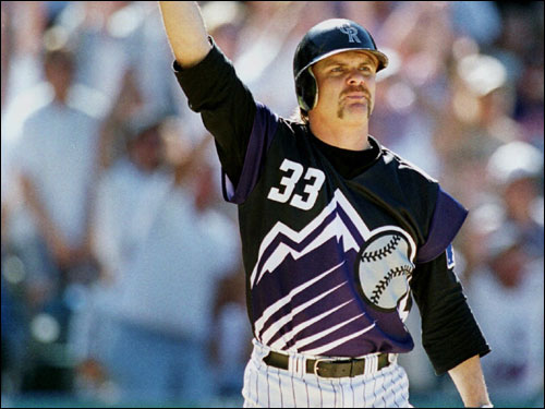
Reminds me of these...

TATCRockies_original.jpg
 

tarheelhockey

Offside Review Specialist
Feb 12, 2010
85,309
138,957
Bojangles Parking Lot
I actually took a couple of days before responding to this thread because this jersey is so... whatever it is. I almost needed my eyes to adjust to it.

This jersey is ugly. It's instantly dated. It feels underdesigned.

But here's the thing... I love it. I ****ing love it. I have no idea why. I would never wear this in public. I don't want to see this on my team. But it's a fantastic design.

The modern history of hockey jersey design is a story of tension between horizontal stripes and vertical stripes. I'll use Colorado's 2012 set as an example of both principles:

Avalanche12.png


Traditional hockey jersey, middle = all horizonal.
Modern hockey jerseys, top and bottom = all vertical.

What the Avs have done here is create a masterstroke of incorporating both horizontal AND vertical elements into a single design, with none of the components in conflict:

jersey.png


What's brilliant here is that they managed to do this while also creating a unified design. This isn't just sticking horizontal stripes underneath the piping... they used the "A" to achieve both elements in a single, continuous, graceful line that runs across the entire jersey. And with the color placement, that line transforms into a scene which calls right back to the traditional Avs jersey elements:

Avalanche01.png


Basically you have an entire Colorado Avalanche jersey history rolled up in a single uniform, and it looks coherent. You get the sleekness and motion of modern vertical design, and also the groundedness and solidity of traditional striping, and also the total-picture coherence of the Avs mountain jersey or the Dallas star jersey. As a sort of crazy lab experiment, this is a home run so long that the ball lands in the bleachers of a different stadium.

This is way ahead of its time, and being a one-off I doubt it will have the impact it ought to have. But this is right up there with the 1930 Pirates, 1968 Flyers, 1974 New York Golden Blades, 1994 Mighty Ducks, 1994 All Stars, and 1996 Avalanche as far as galaxy-braining completely out of their own era and into a future that we can't quite recognize just yet.
 
  • Like
Reactions: AD Skinner

PuckItUp27

Registered User
Sep 26, 2017
593
750
OMG

It's like Ray Charles and Stevie Wonder played Pin the Tail on the Donkey with CVS receipts and a blank jersey
 

Albatros

Registered User
Aug 19, 2017
12,565
7,995
Ostsee
One of the best jerseys in recent years, great to see the designers do something that is not just recycling existing designs. For the same reason it's not a template for others to follow, but in its own context this works really well.
 

FerrisRox

"Wanna go, Prettyboy?"
Sep 17, 2003
20,340
13,063
Toronto, Ontario
It's...different. I like the idea. So there's that. But lordy, those are an eyesore. Especially that blank lower half after all that whatever-it-is on the rest of the sweater. A small mountain balanced on 3 other mountains?

The Rocky Mountains are a mountain range, not a single mountain. The cluster of three mountains you are seeing are the exact same design as found in the Avalanche's third jersey.

Personalized-Mens-Colorado-Avalanche-Authentic-Blue-Third-Jersey.jpg
 

aufheben

#Norris4Fox
Jan 31, 2013
53,648
27,348
New Jersey
I actually took a couple of days before responding to this thread because this jersey is so... whatever it is. I almost needed my eyes to adjust to it.

This jersey is ugly. It's instantly dated. It feels underdesigned.

But here's the thing... I love it. I ****ing love it. I have no idea why. I would never wear this in public. I don't want to see this on my team. But it's a fantastic design.

The modern history of hockey jersey design is a story of tension between horizontal stripes and vertical stripes. I'll use Colorado's 2012 set as an example of both principles:

Avalanche12.png


Traditional hockey jersey, middle = all horizonal.
Modern hockey jerseys, top and bottom = all vertical.

What the Avs have done here is create a masterstroke of incorporating both horizontal AND vertical elements into a single design, with none of the components in conflict:

jersey.png


What's brilliant here is that they managed to do this while also creating a unified design. This isn't just sticking horizontal stripes underneath the piping... they used the "A" to achieve both elements in a single, continuous, graceful line that runs across the entire jersey. And with the color placement, that line transforms into a scene which calls right back to the traditional Avs jersey elements:

Avalanche01.png


Basically you have an entire Colorado Avalanche jersey history rolled up in a single uniform, and it looks coherent. You get the sleekness and motion of modern vertical design, and also the groundedness and solidity of traditional striping, and also the total-picture coherence of the Avs mountain jersey or the Dallas star jersey. As a sort of crazy lab experiment, this is a home run so long that the ball lands in the bleachers of a different stadium.

This is way ahead of its time, and being a one-off I doubt it will have the impact it ought to have. But this is right up there with the 1930 Pirates, 1968 Flyers, 1974 New York Golden Blades, 1994 Mighty Ducks, 1994 All Stars, and 1996 Avalanche as far as galaxy-braining completely out of their own era and into a future that we can't quite recognize just yet.
Who the hell thought that background would make the mockup easier to see lol. Looks cool tho. I’m gonna open up this picture I feel like there’s some fractal shit going on.

Edit: Not perfect I guess they tweaked a few parts to make it look more natural. Makes a pretty dope 'A' though too.
RIQvqEL.png
 
Last edited:

Ad

Upcoming events

Ad

Ad