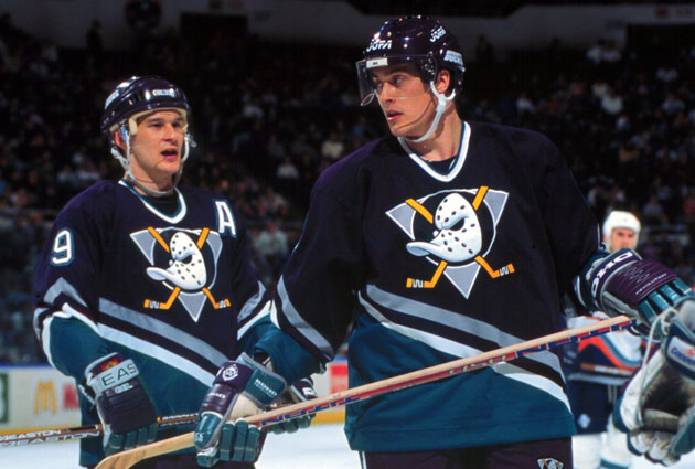
Anaheim bringing back the Mighty Ducks logo for third jerseys

jumb0

Registered User
Feb 3, 2017
2,325
1,229
Have to? No. They've always held the trademarks. But the new ownership definitely wanted to distance themselves and rebrand themselves as a 'serious' hockey team.


That was my question I guess. I was always under the assumption that when Disney sold the team they kept the Mighty Ducks brand/trademark/license what have you and that's why they changed to just the Ducks.
 

kducks

Duck Off
Sep 19, 2007
32,381
980
OC
Question and a commen t:

Comment - the Ducks are on the verge of becoming like the Canucks - suffering from an identity crisis. One minute they're purple and turquoise, the next they're Gold and Orange, the next they're pure orange, the next they're black, silver and turquoise

Question - how are the Ducks "bringing back the Mighty Ducks logo" when they were already using that exact same logo last year on their orange sweaters?

Ducks never wore purple & turquoise. They were never gold & orange. Orange is used as our third jerseys and it sounds like it will continue the next season after this one.

These are third jerseys that will only be used this year for the 25th anniversary. The owners seem to be relenting on using the logo for our third jerseys, but not for our primary logo. It seems to people that they are bring it back since it incorporates our original colors in it too.
 

Asheville

Registered User
Feb 1, 2018
2,056
1,358
080213_ducksalltime.jpg

The only correct version.
 

Pilky01

Registered User
Jan 30, 2012
9,867
2,319
GTA
I feel obligated to love it because it’s a move in the right direction....but it’s tweaked in all the wrong ways. Looks like Wal-Mart knock of.
 

Captain And Coke

Registered User
Apr 29, 2011
3,509
1,235
Question and a commen t:

Comment - the Ducks are on the verge of becoming like the Canucks - suffering from an identity crisis. One minute they're purple and turquoise, the next they're Gold and Orange, the next they're pure orange, the next they're black, silver and turquoise

Question - how are the Ducks "bringing back the Mighty Ducks logo" when they were already using that exact same logo last year on their orange sweaters?

Speaking of the Canucks, I wish they would go back to the classic black with the skate logo.

It wasn't pretty but it is light years better than anything they have had since.
 

HomeAndHome

All aboard the Lane train! WooWoo
Mar 10, 2017
1,017
927
London, ON
I actually don't mind these jerseys, although I'm a sucker for most alternate jerseys and am happy they're being brought back.
 

No Fun Shogun

34-38-61-10-13-15
May 1, 2011
56,372
13,230
Illinois
Truth be told, I view these as just a decent look, and one that gets a major nostalgia goggles boost due to the cultural impact of the logo.

That being said, the Ducks fell into what I'd consider to be an incredibly dull look when it comes to uniform design after they dropped the "mighty." As such, any flash of creativity is automatically a huge improvement over what they were wearing, so by comparison this is a huge improvement for them.

Team jerseys can be too dull and they can be too busy, too. All about finding the right middle ground wherever on the spectrum the team's look lands. Simple can be good, complex can be good.
 

Ad

Upcoming events

Ad

Ad